Ibercaja.
Good banking and social vocation
Driving social impact and closeness to people through the brand.
BrandFor Value Journey
Brand Diagnosis, Brand Strategy, Brand Architecture, Visual Identity, Verbal Identity
Sector
Finance
Ibercaja, a Spanish financial entity with 150 years of history and one of the country's leading banking groups, faced the challenge of strengthening its brand through its human, social and customer service essence.
A brand strategy that reflects Ibercaja’s purpose
Together with BrandFor, Ibercaja committed to unlocking the full potential of its brand by launching a comprehensive and collaborative branding process: a unique vision focused on highlighting the bank’s social vocation and customer service, while updating the strategy, architecture, and visual and verbal identity of the brand.
In this way, and under Ibercaja’s purpose “to help people build the story of their lives, because it will be our story”, the brand positioning was defined as a bank that supports each person and creates value for everyone.
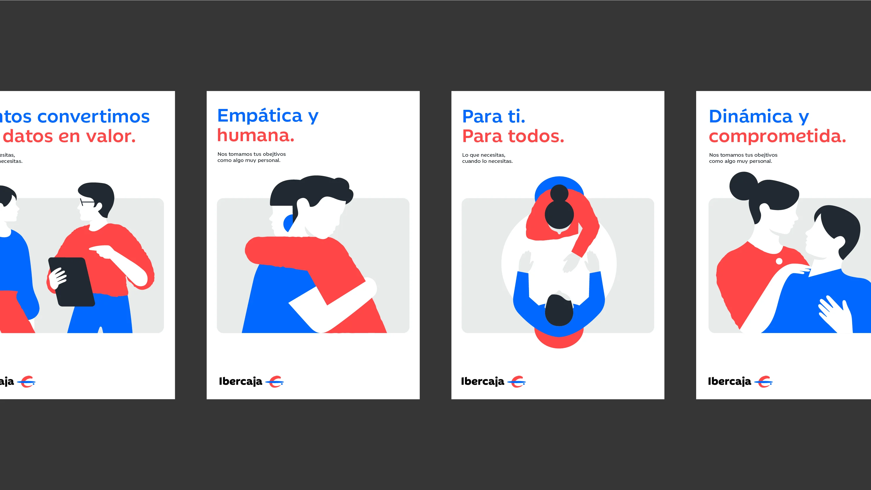
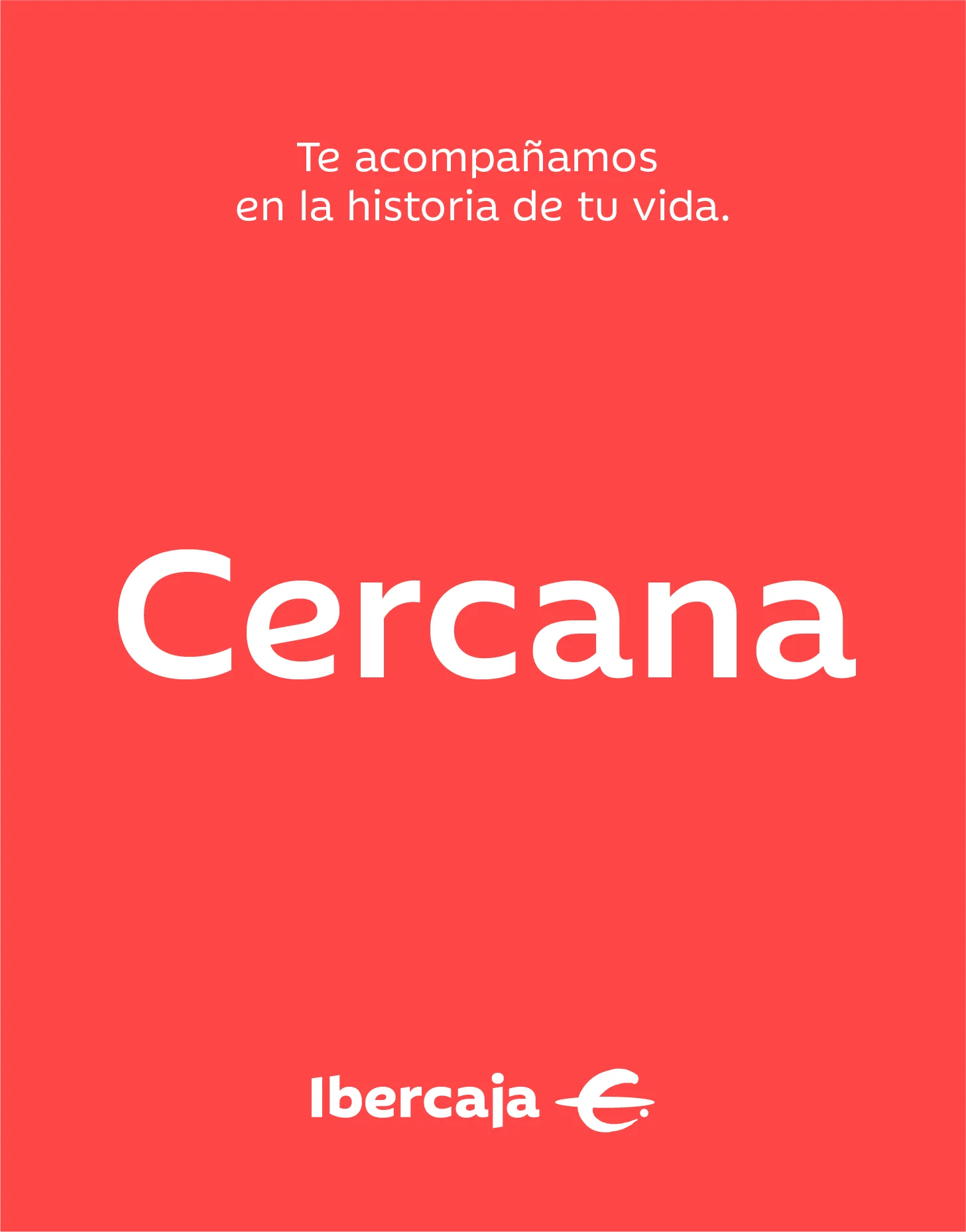
Closeness, authenticity, vocation and drive are the four values that strategically define the Ibercaja brand. “Closeness”, enhancing the essence of a brand that understands and supports people in every decision; “Authenticity”, highlighting its human nature and acting with honesty to build relationships of trust; “Vocation”, conveying its social essence and commitment to delivering the best service, contributing to improving society’s financial culture; and “Drive”, to contribute to the growth of businesses, people and society with agility and dynamism. A unique combination of values brought to life through an empathetic, human, committed and dynamic brand personality.
The brand architecture process was approached from a strategic and analytical perspective, aiming to strengthen the brand’s fundamental and cross-cutting role across different audiences and customer segments.
The result: a brand that reinforces its commitment to people, accompanying them throughout their lives and helping them make the best financial decisions through a professional, comprehensive and expert banking model that seeks to generate positive and sustainable impact.
A renewed visual identity that connects past, present and future
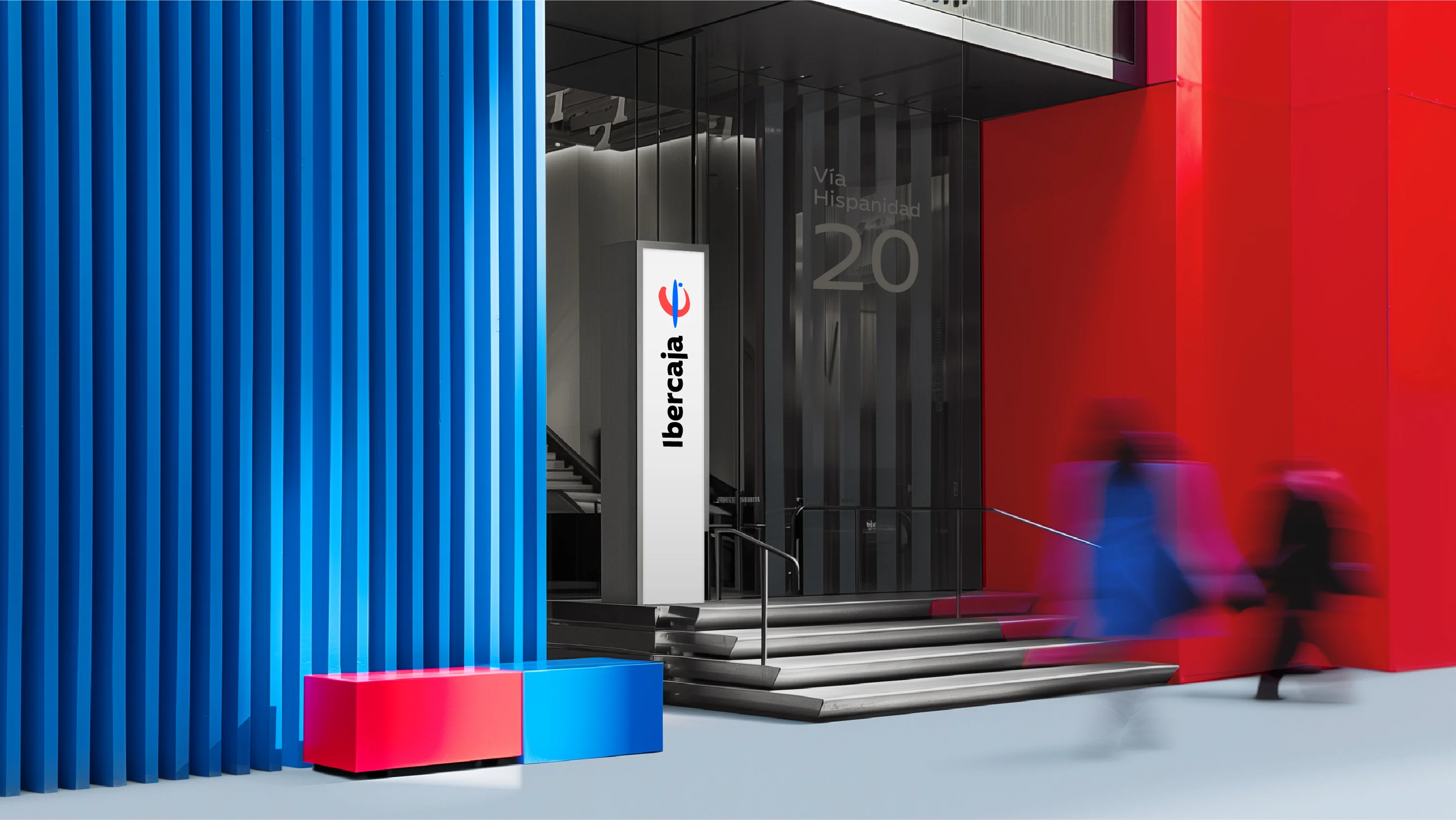
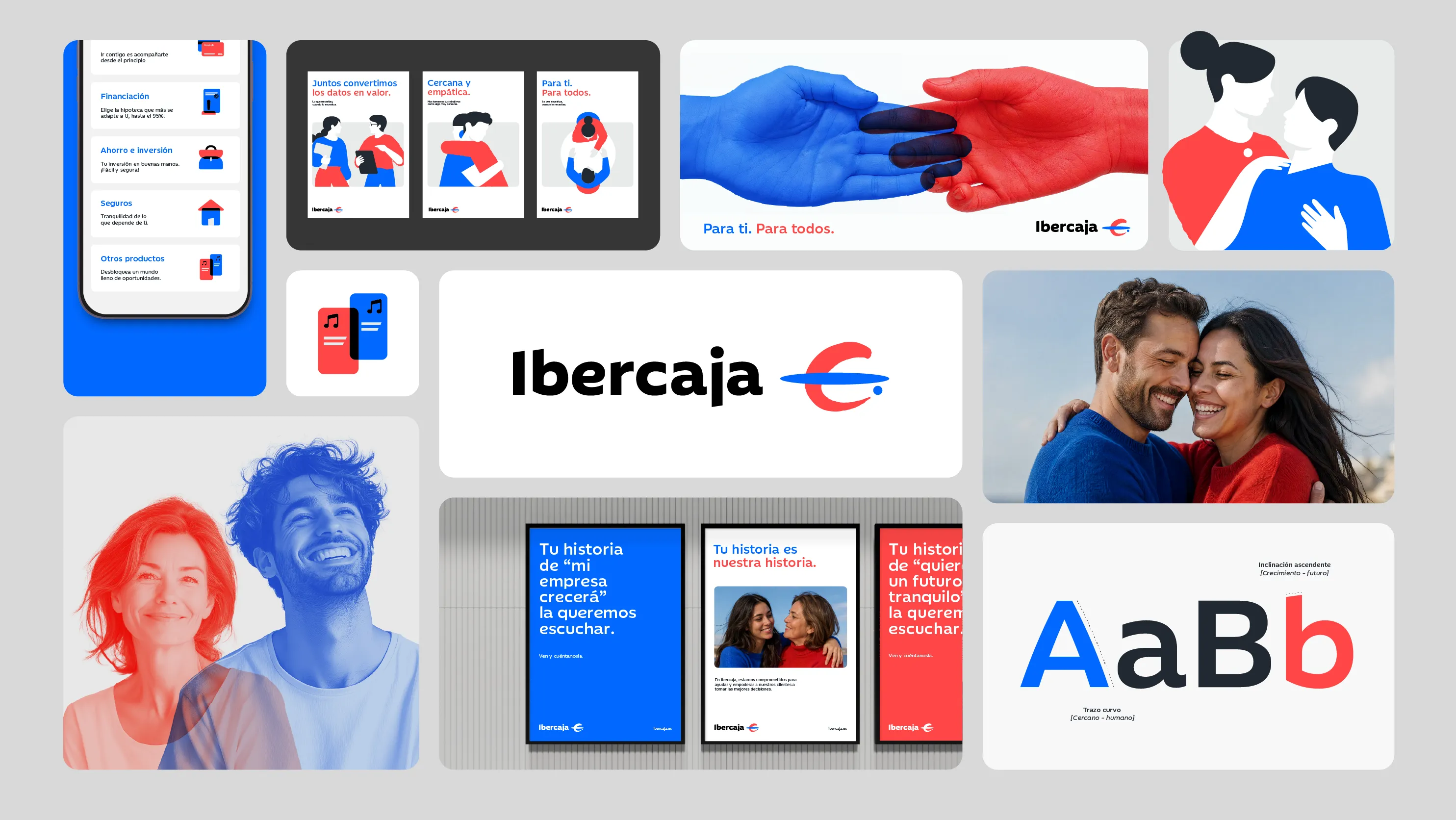
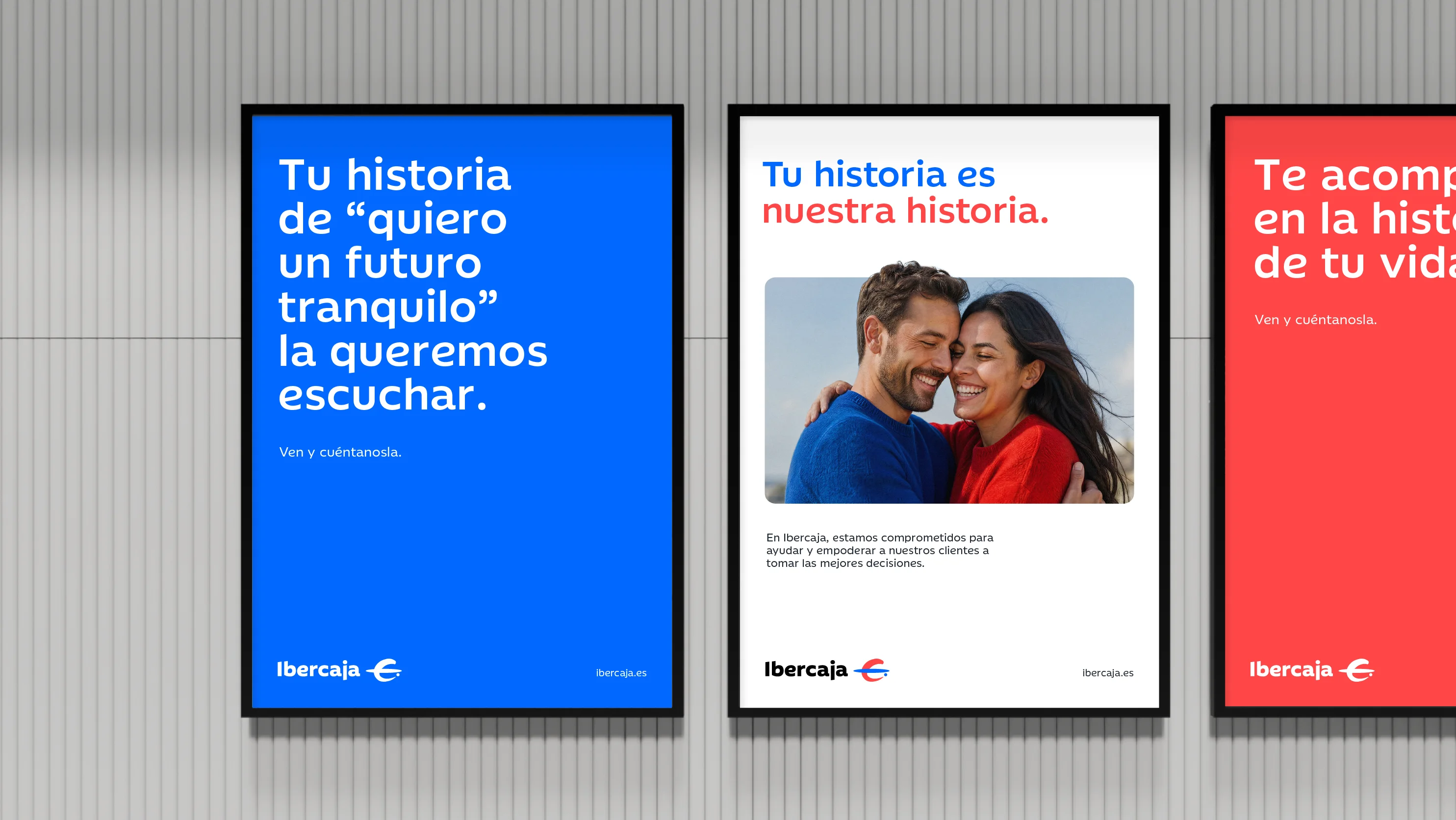
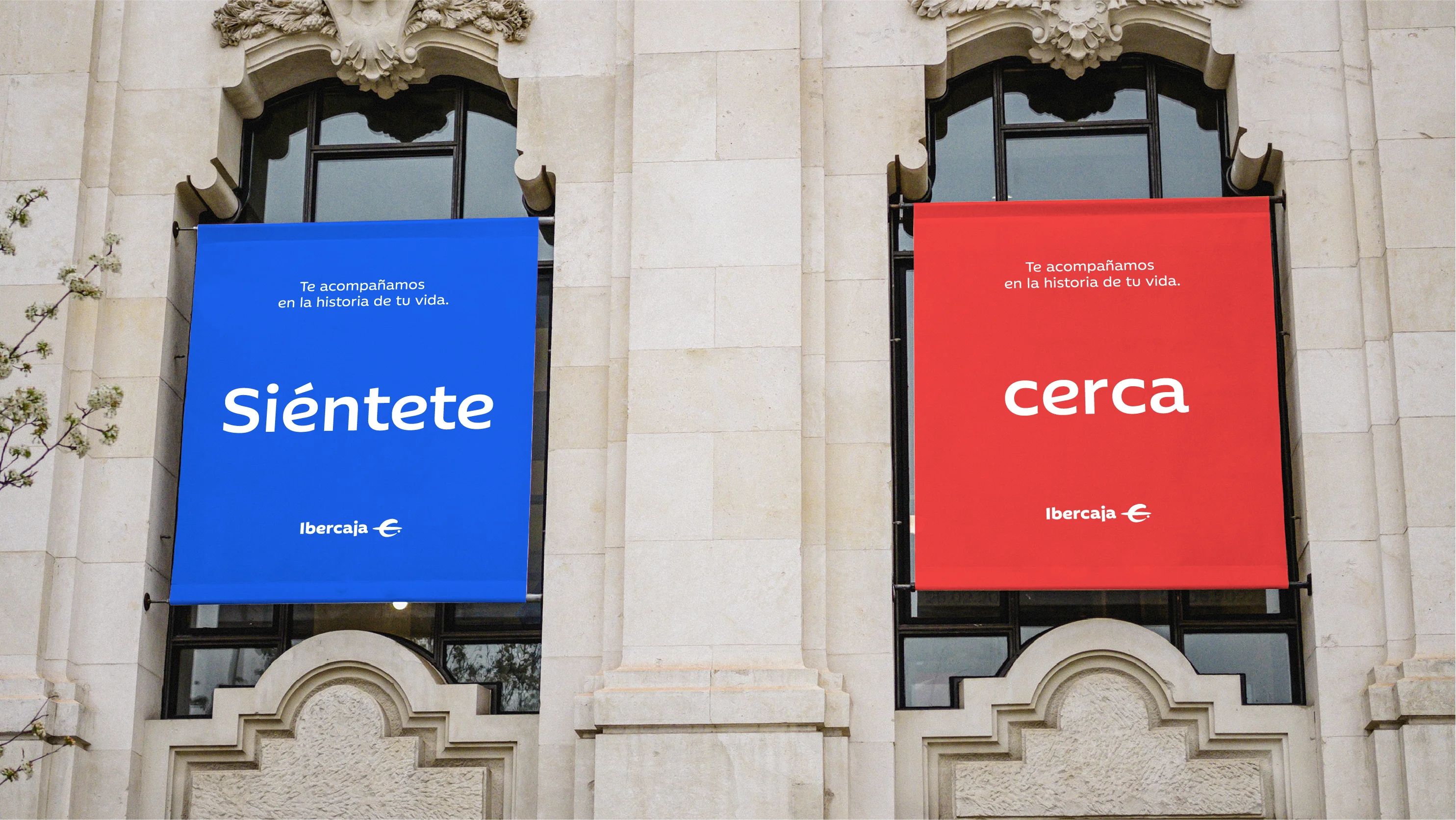
On one hand, Ibercaja’s brand colors have been amplified and updated, reflecting its unique essence through the harmony, solidity and complementarity between blue and red. “Río Ibercaja” blue, associated with trust, security and stability, is balanced by the energy, closeness and vitality of “Tierra Ibercaja” red, while white remains the transversal color.
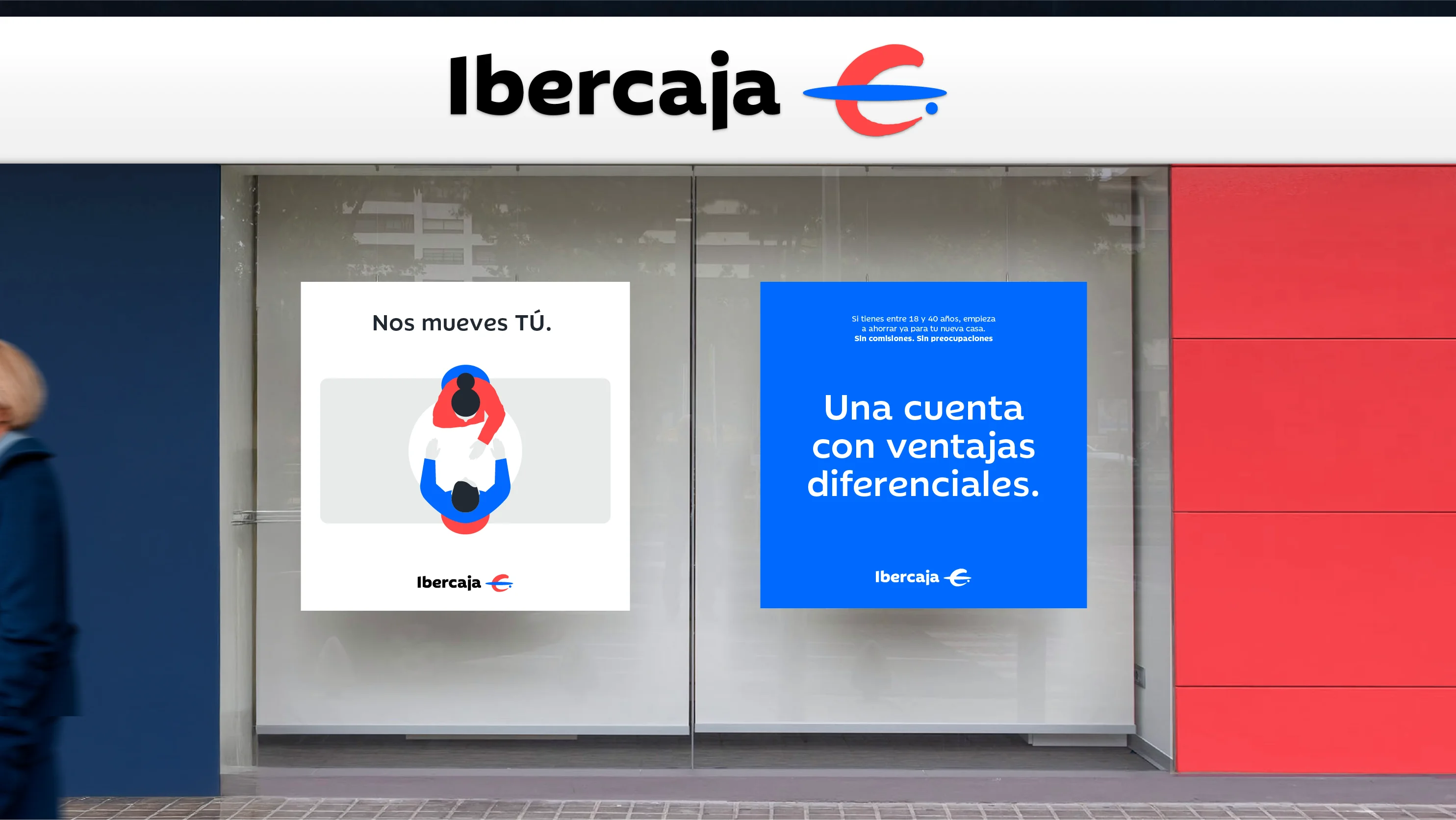
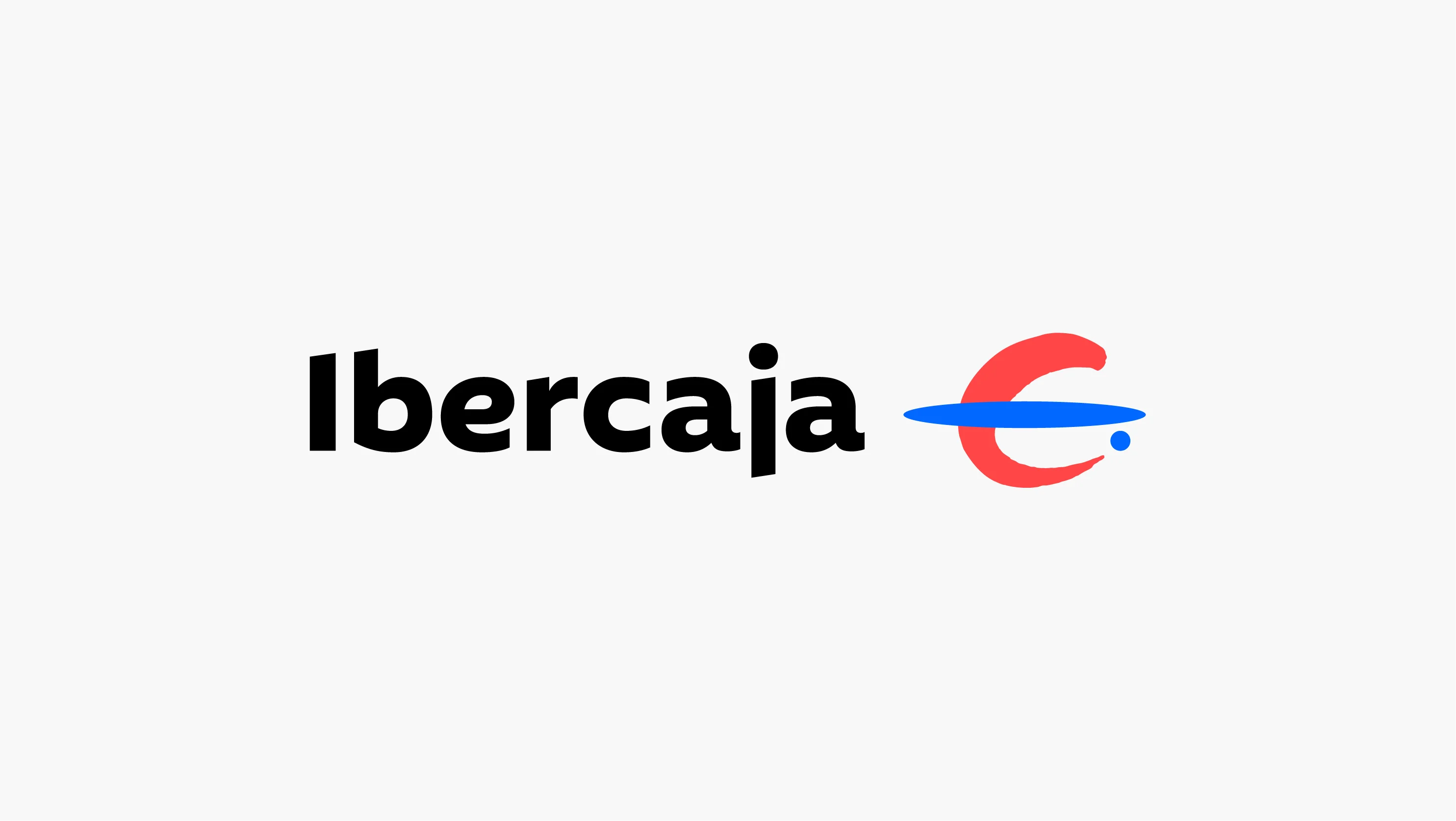
On the other hand, the logo, whose wordmark emerges from a custom-designed corporate typeface developed exclusively for Ibercaja, presents a design that seeks to project the perfect balance between stability, trust and a forward-looking vision.
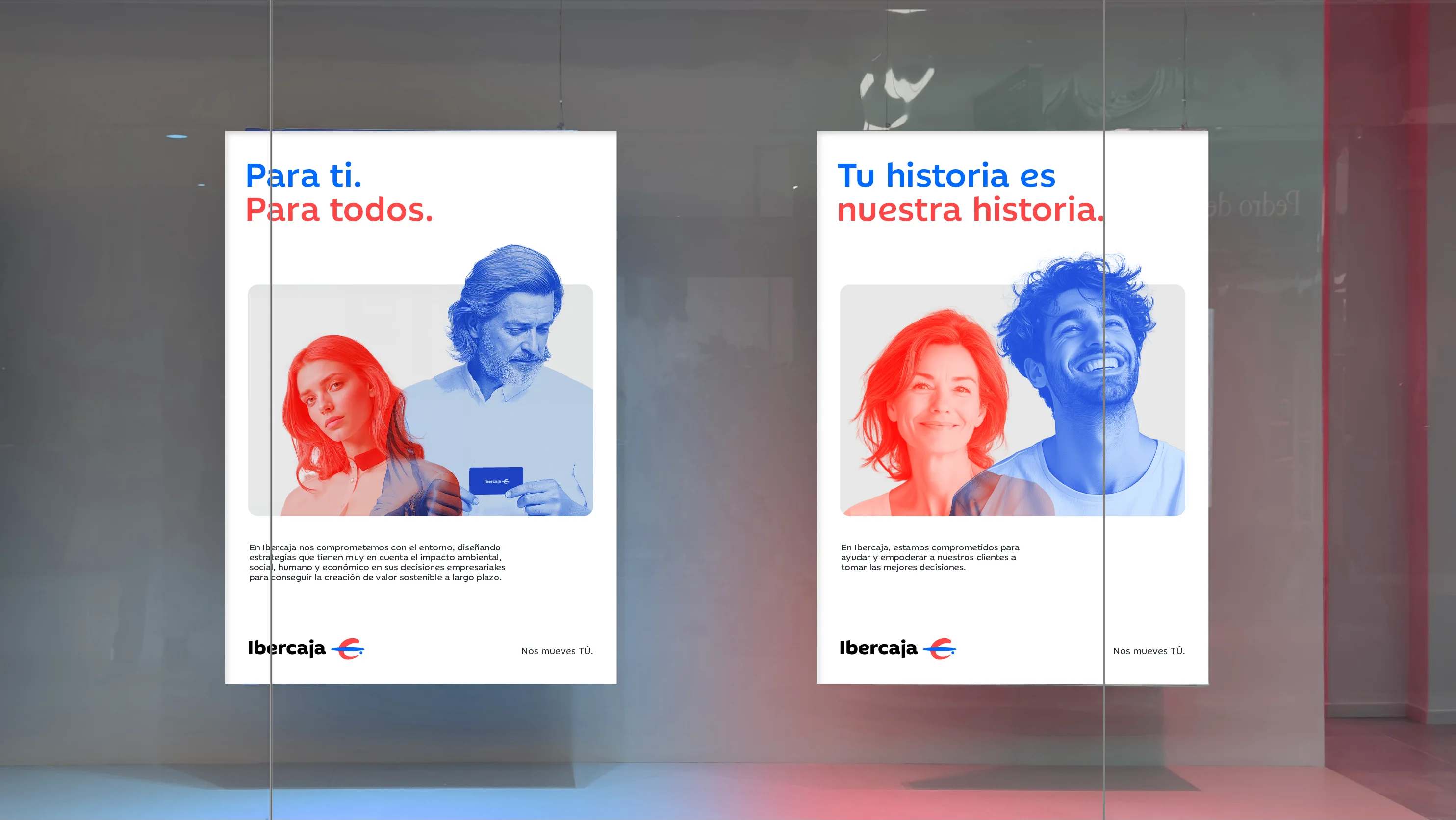
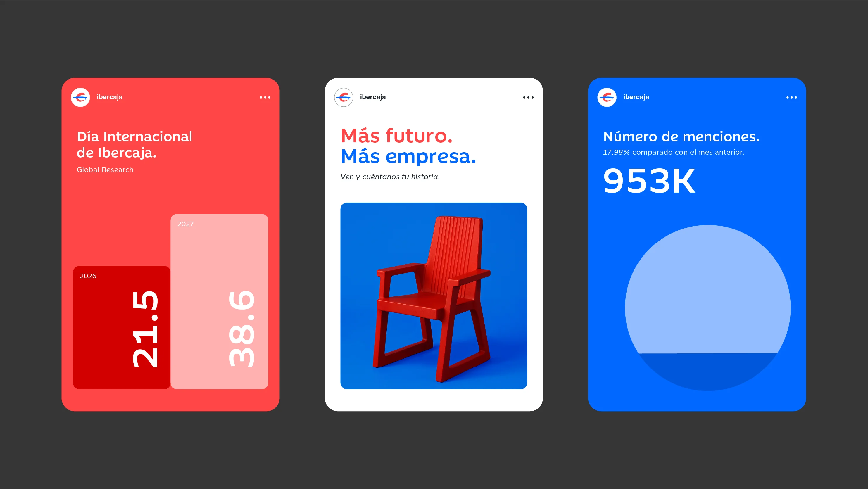
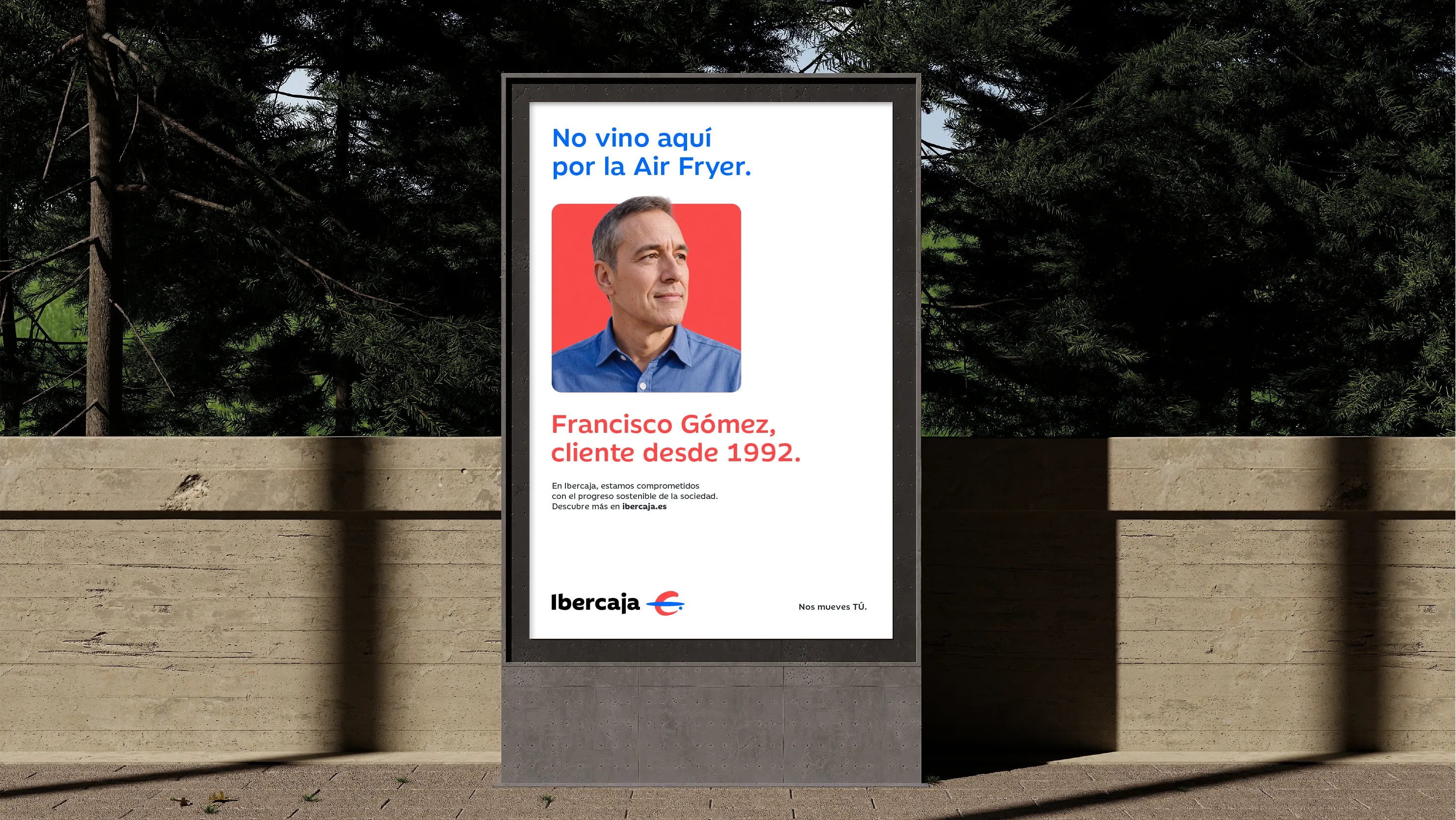
In addition, the new visual identity evolves and strengthens through a unique and expressive language: a photographic style that captures the essence of everyday life in a close, authentic and real way, and an illustrative style born from the Ibercaja symbol that represents a universal and friendly language. In short, a refreshed and enriched universe that provides the brand with a graphic system that embodies the spirit, vocation and personality of the Ibercaja brand.

“There are reasons that move us more than money: people”
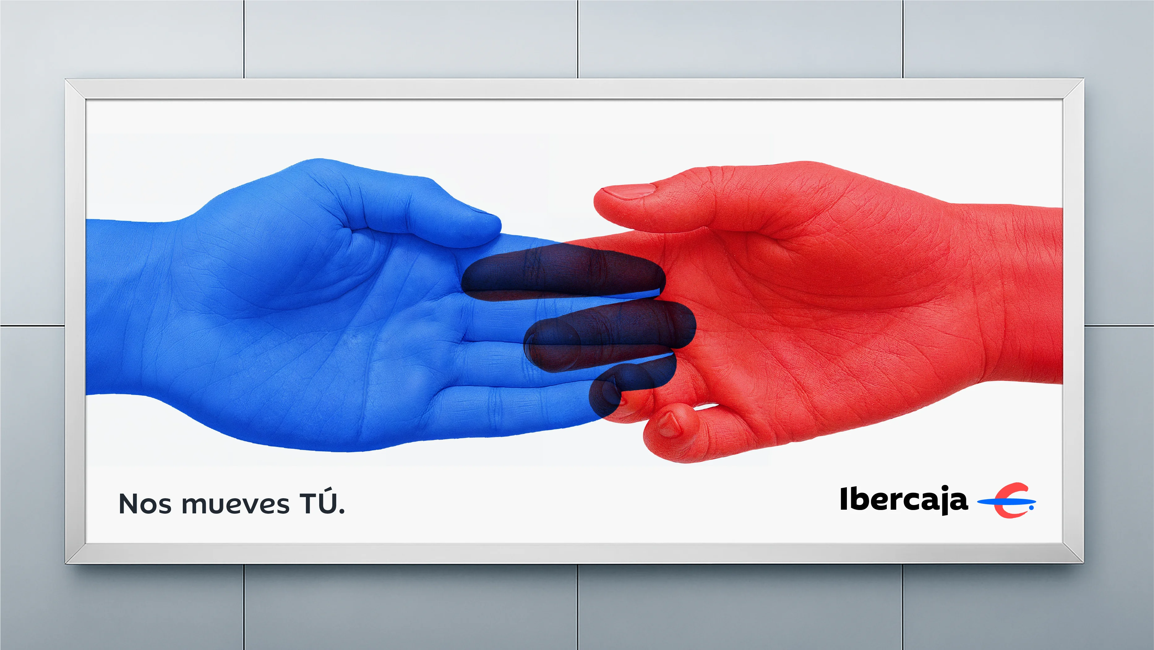
Ibercaja’s rebranding process has been accompanied by a new positioning campaign developed in collaboration with the bank’s creative agency. Under the claim “Nos mueves tú”, it communicates its distinctive way of banking “focused on closeness, expert advice, and the reinvestment of 100% of its profits into society”.