Dialprix.
Delightfully Simple
Enhancing the shopping experience through the brand.
BrandFor Value Journey
Brand Diagnosis, Brand Research, Brand Strategy, Brand Architecture, Visual Identity, Verbal Identity, Brand Implementation
Sector
Food Retail and Distribution
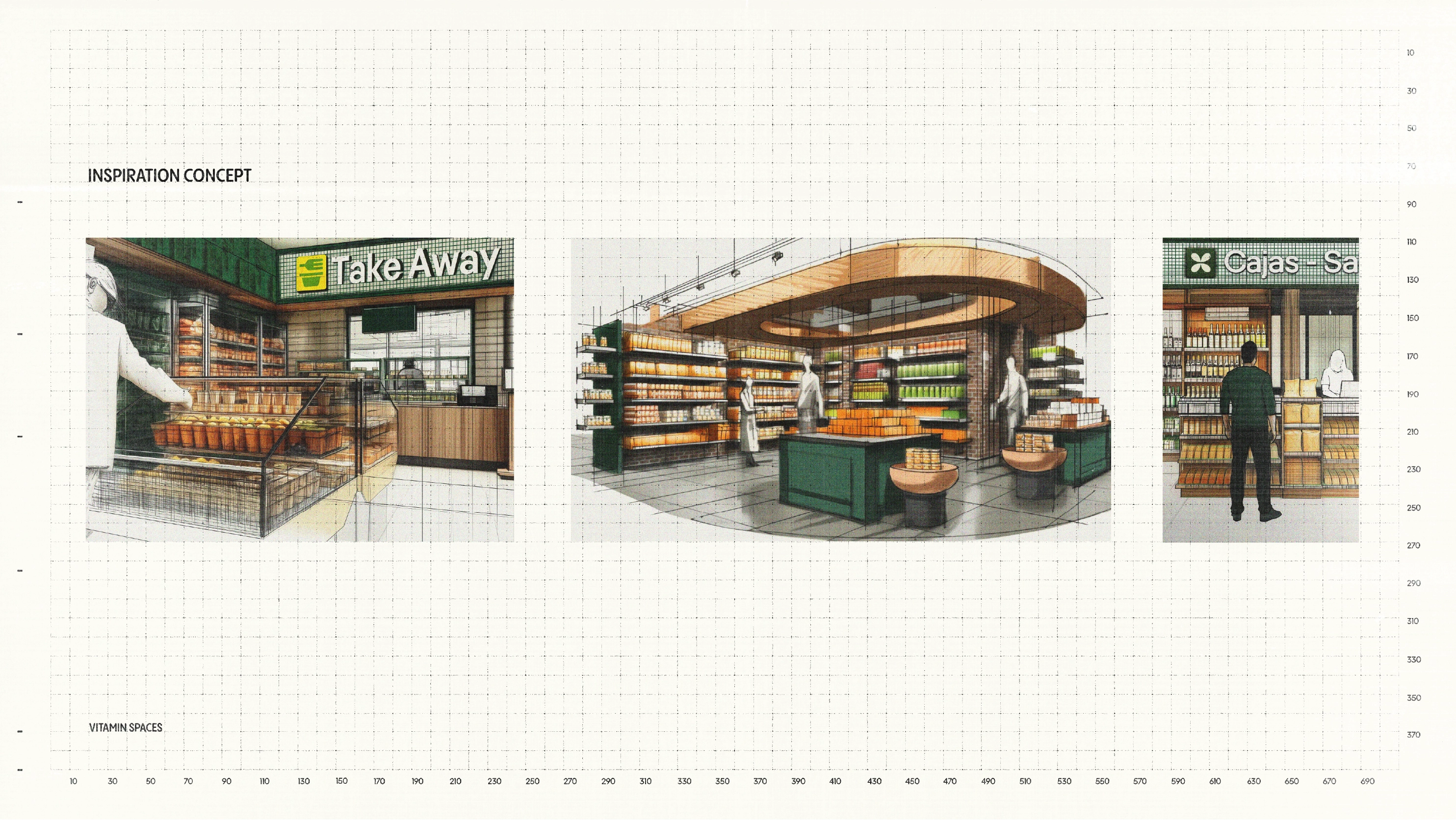
Dialprix, one of Spain’s leading supermarket chains and part of Musgrave, the sector-leading group in Ireland, operates in over 110 stores across the Valencian Community, the Region of Murcia, and the Canary Islands. As an established expert in local supermarkets, Dialprix faced the challenge of redefining its value proposition and identity to strengthen its position in a highly competitive sector and deliver a distinctive shopping experience.
A brand strategy that drives simplicity and inspiration
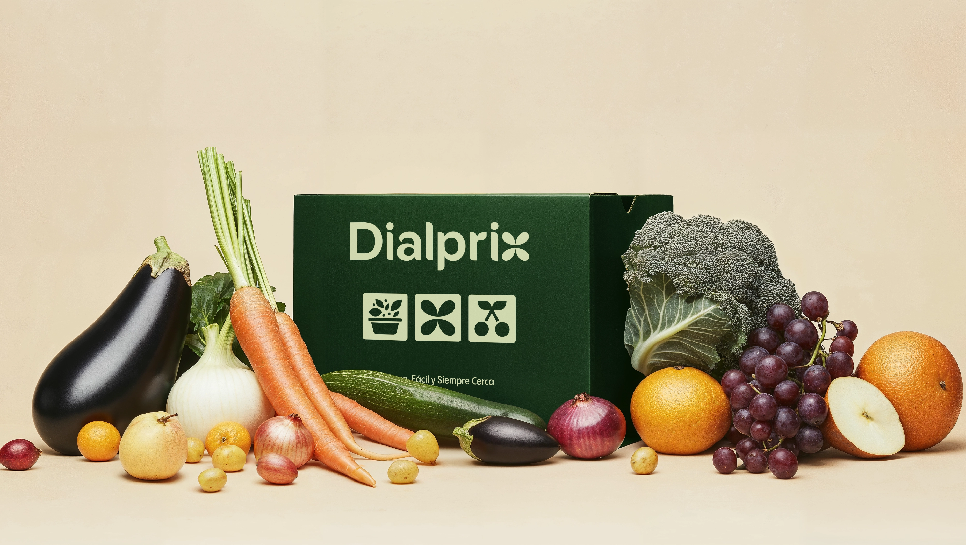
At BrandFor, we supported Dialprix in redefining its brand with a strategy that emphasises accessibility and the joy of shopping. The new value proposition is encapsulated in the brand idea “Delightfully Simple,” reflecting its commitment to making the shopping experience easier, more enjoyable, and more convenient, all through four key brand values: freshness, local essence, quality-for-price, and proximity.


A visual identity that conveys freshness and naturalness
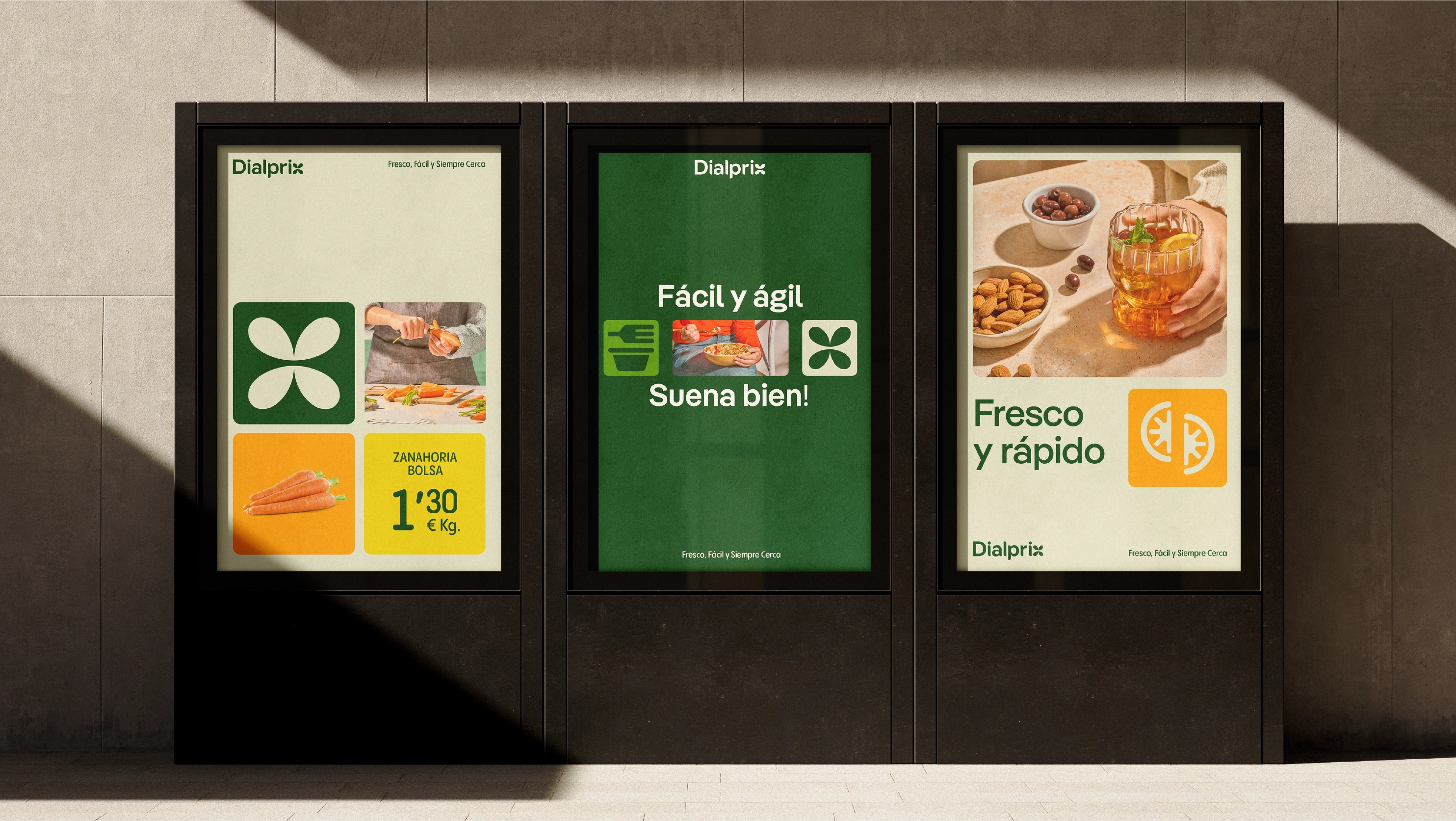
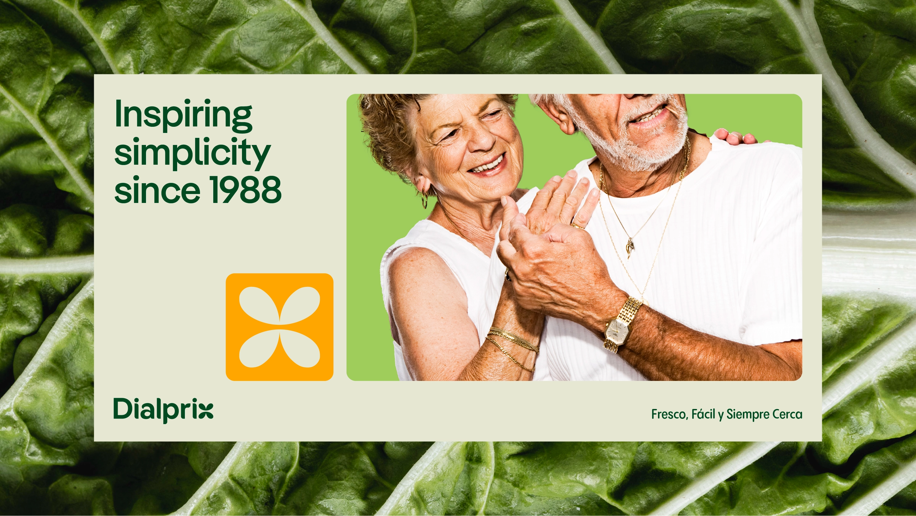
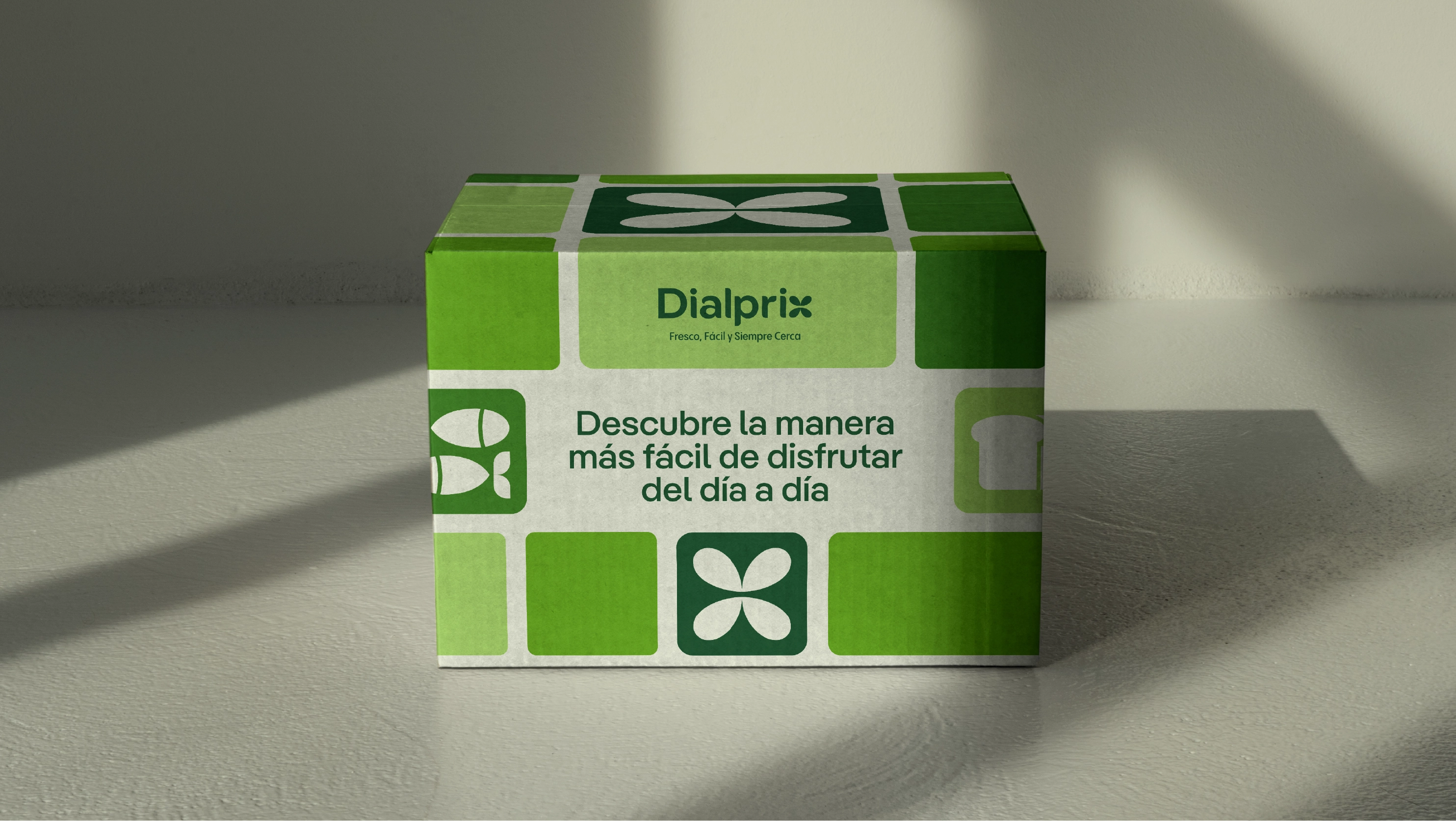
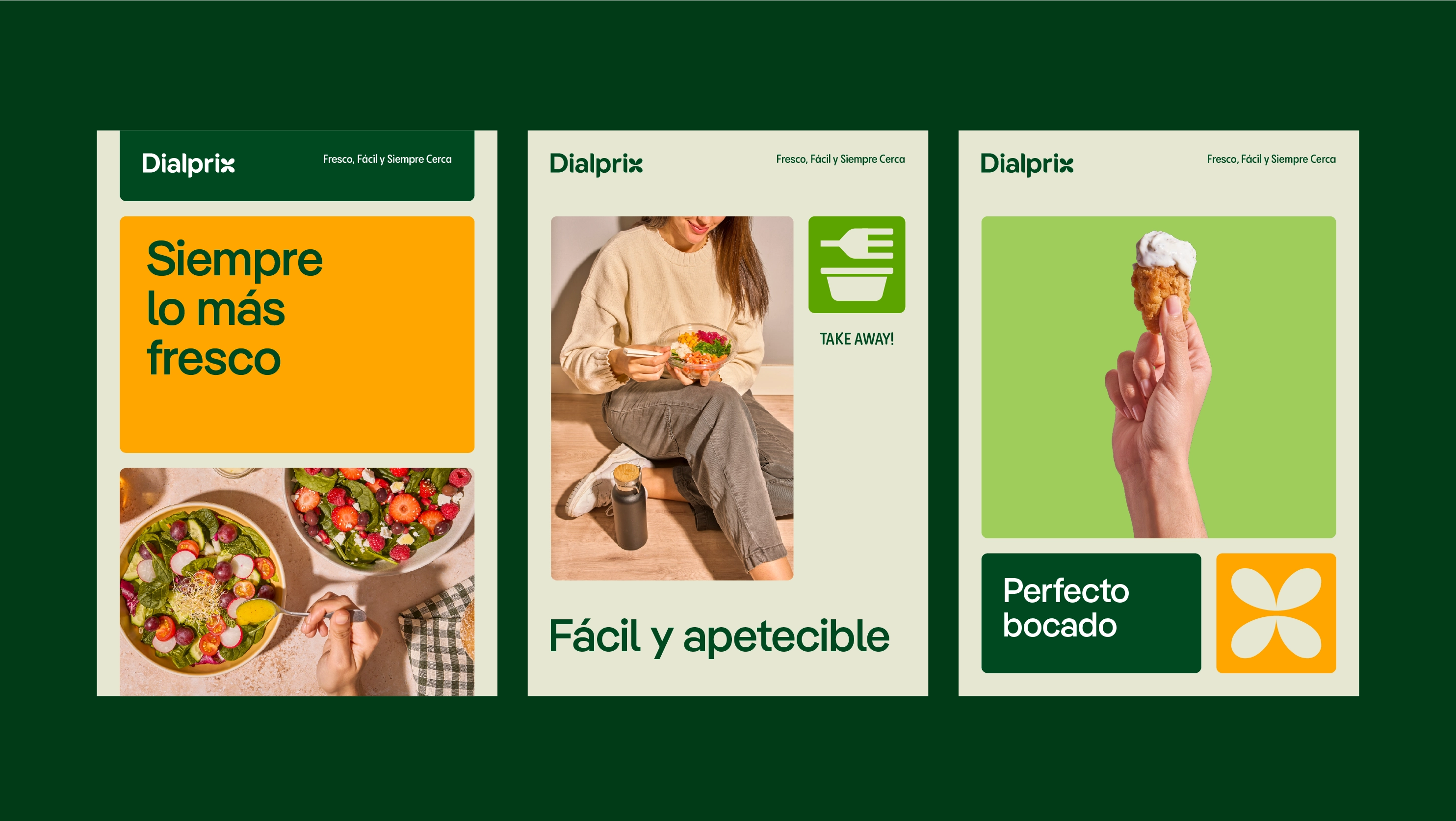
The new visual identity reinforces Dialprix’s position as a neighbourhood supermarket that places people at its core. The logotype’s typography, inspired by organic forms, evokes freshness and authenticity. Accompanying the logo, the clover symbol offers multiple interpretations, such as a butterfly or fresh produce, further strengthening the brand’s essence.
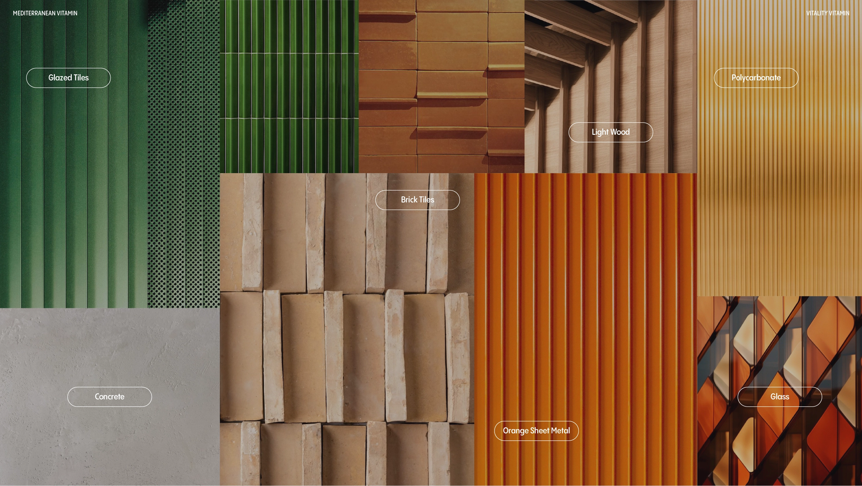
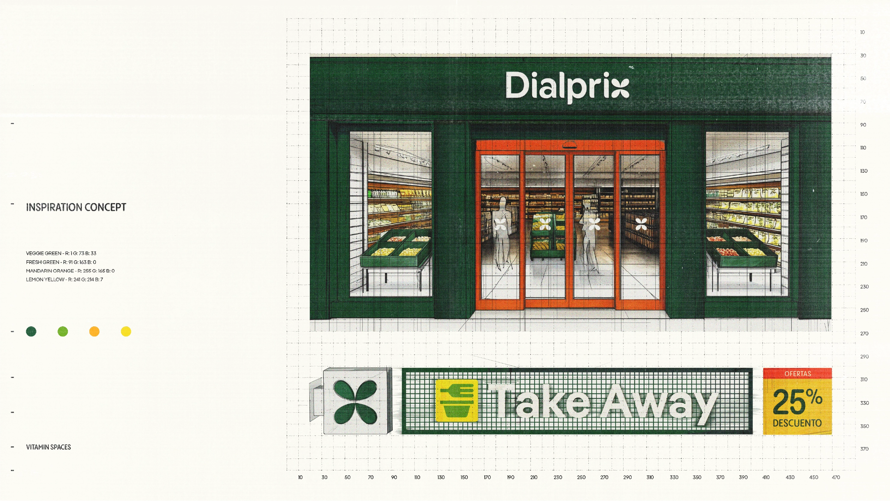
The colour palette consists of a deep green, evoking the natural hues of fresh in-store products, complemented by warm yellow-orange and reddish-orange tones, highlighting the balance between freshness and value. This combination creates an authentic and appealing identity.

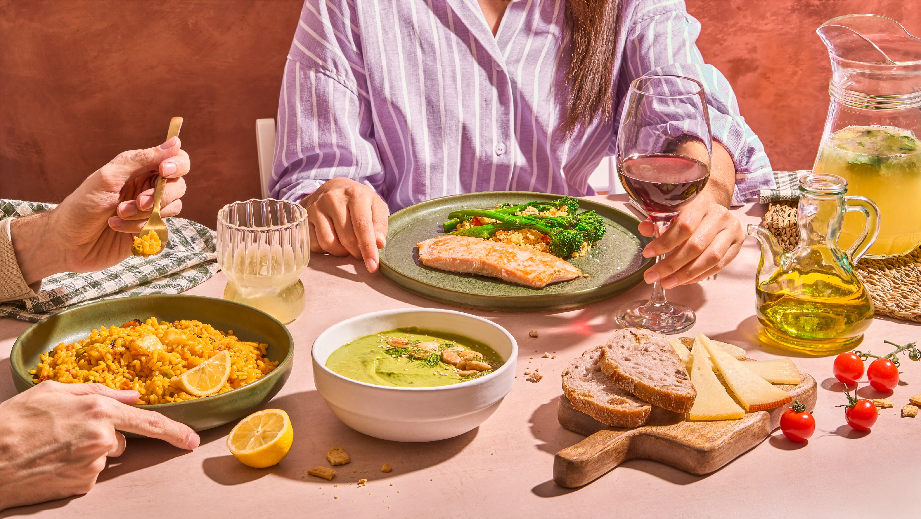
A visual system that enhances the shopping experience
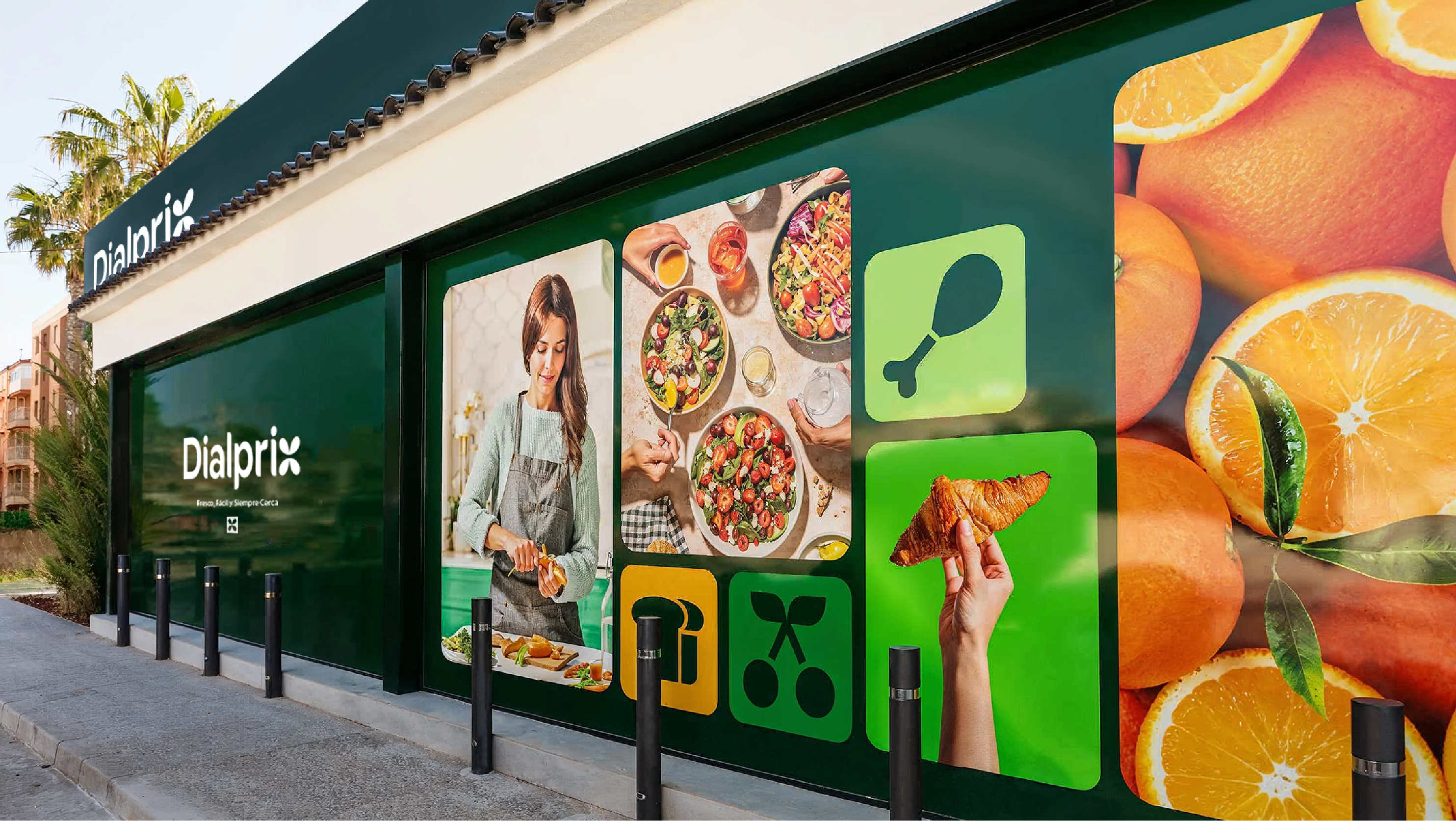
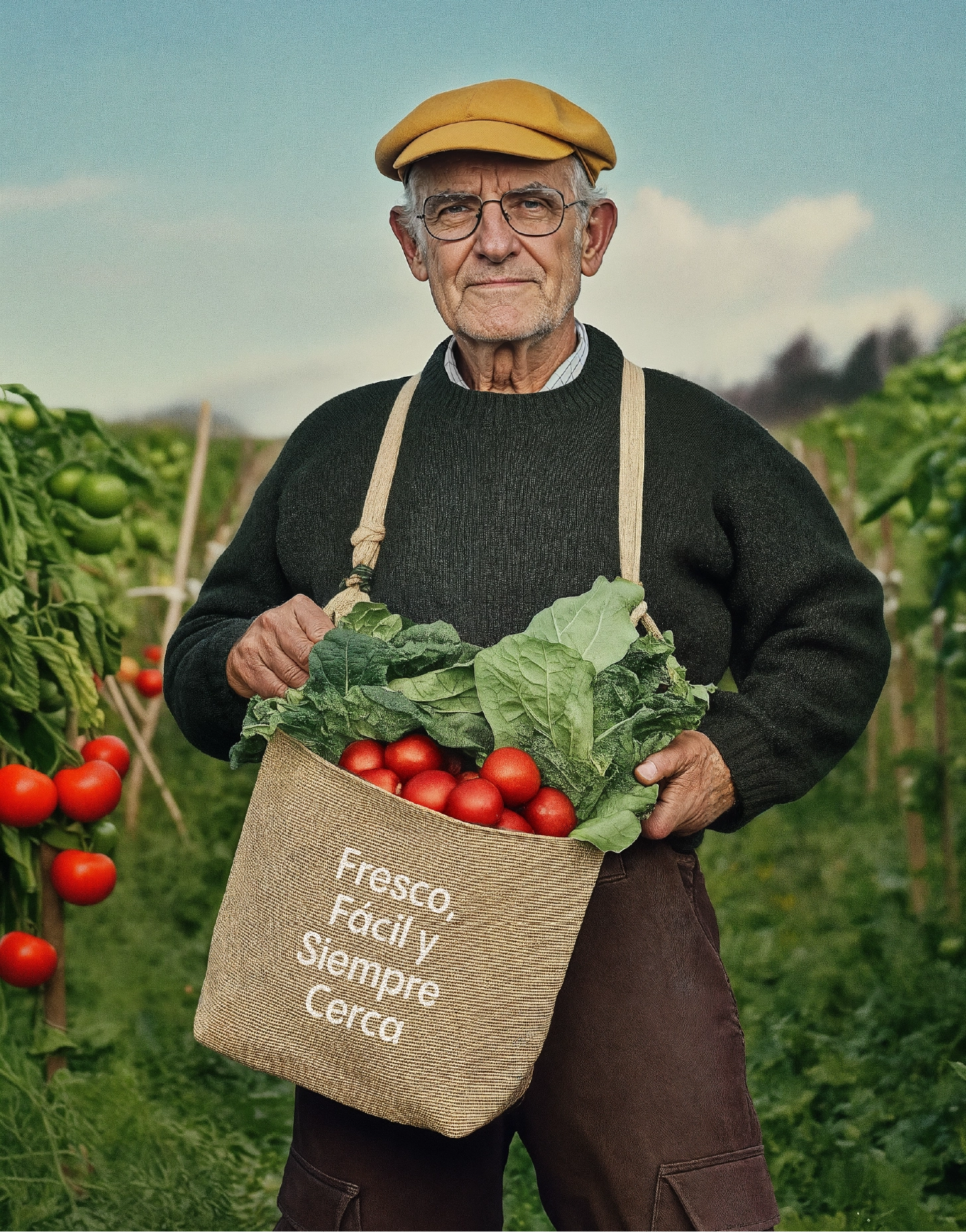
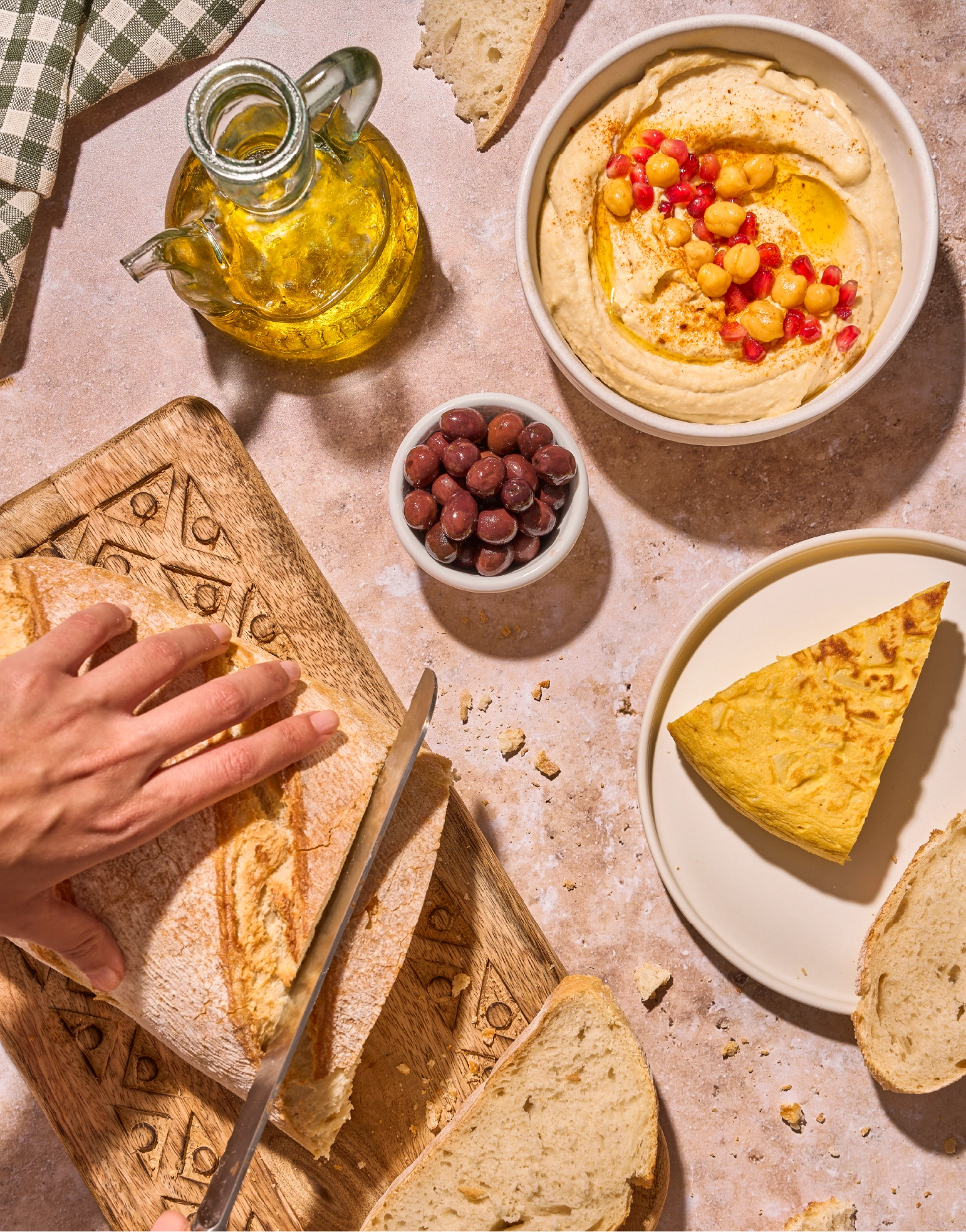
Dialprix’s visual system balances design, art, and everyday life, creating a flexible graphic language aligned with its value proposition. Photography plays a central role, with images characterised by natural light, striking shadows, and aesthetic realism. The portrayal of products in their natural state, complete with visible imperfections, reinforces the brand’s authenticity.
Dialprix’s evolution has been designed to connect effectively with its audiences, highlighting its essence of freshness and closeness. At BrandFor, we crafted a coherent and compelling identity that transforms the shopping experience, offering a proposition that is, above all, simply delightful.