Ginos.
Siente Italia
Discovering, tasting, and feeling the authentic Italy.
BrandFor Value Journey
Brand Strategy, Visual Identity, Verbal Identity, Brand Implementation, Retail
Sector
Restaurant Industry
Ginos, a renowned restaurant chain specialising in Italian gastronomy, was founded in the late 80s and has grown to over one hundred restaurants across Spain and Portugal. Its proposition has always been defined by the authenticity of its recipes and experiences. In an increasingly competitive market, the brand set out to evolve its identity in order to strengthen its connection with the public and stand out through a narrative inspired by genuine Italian authenticity.
Italian authenticity as a strategic pillar
At BrandFor, we carried out a strategic redesign process with a clear focus: to highlight Ginos’ Italian authenticity and make it the central pillar of its positioning. This led to the concept “Feel Italy”, an invitation to immerse oneself in true Italian culture through culinary experiences, evocative settings, and recipes faithful to tradition. A brand that celebrates Ginos’ commitment to product quality and authentic moments.
This repositioning not only redefined the brand’s values — authenticity, commitment, and vitality — but also materialised in a completely renewed visual identity. A brand universe that invites us to discover, taste, and experience the authentic Italy.
A visual identity that conveys and activates the Italian essence
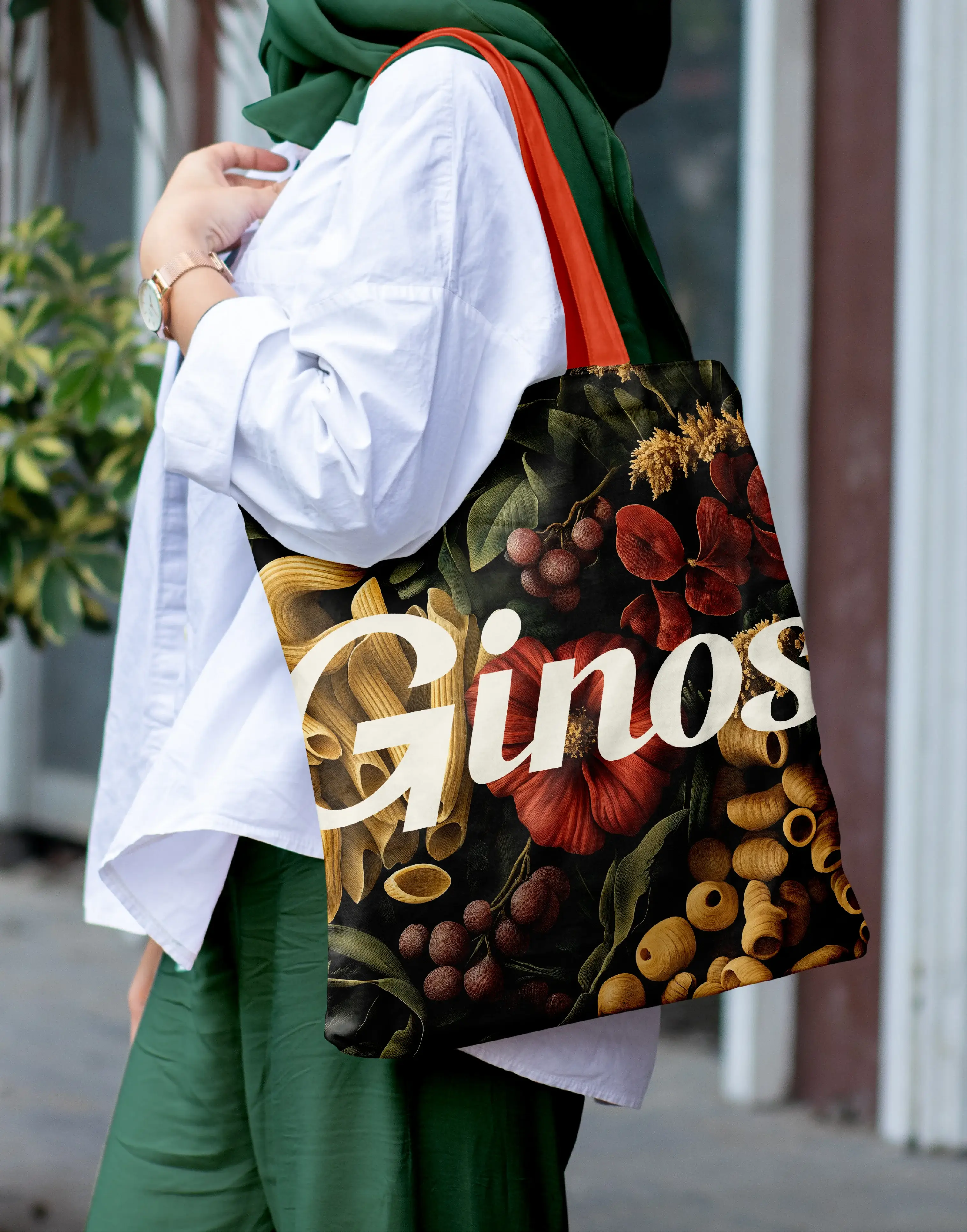
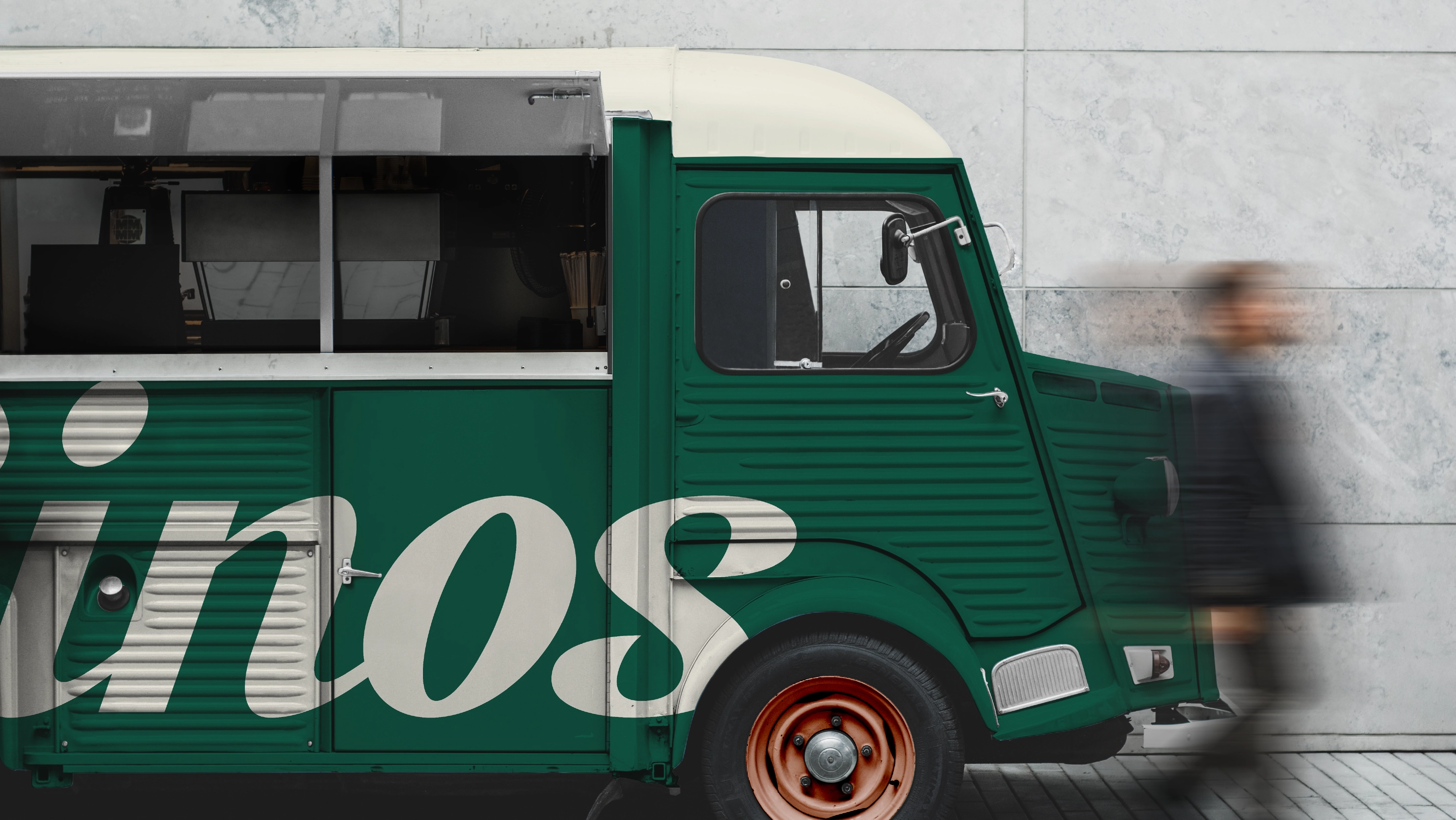
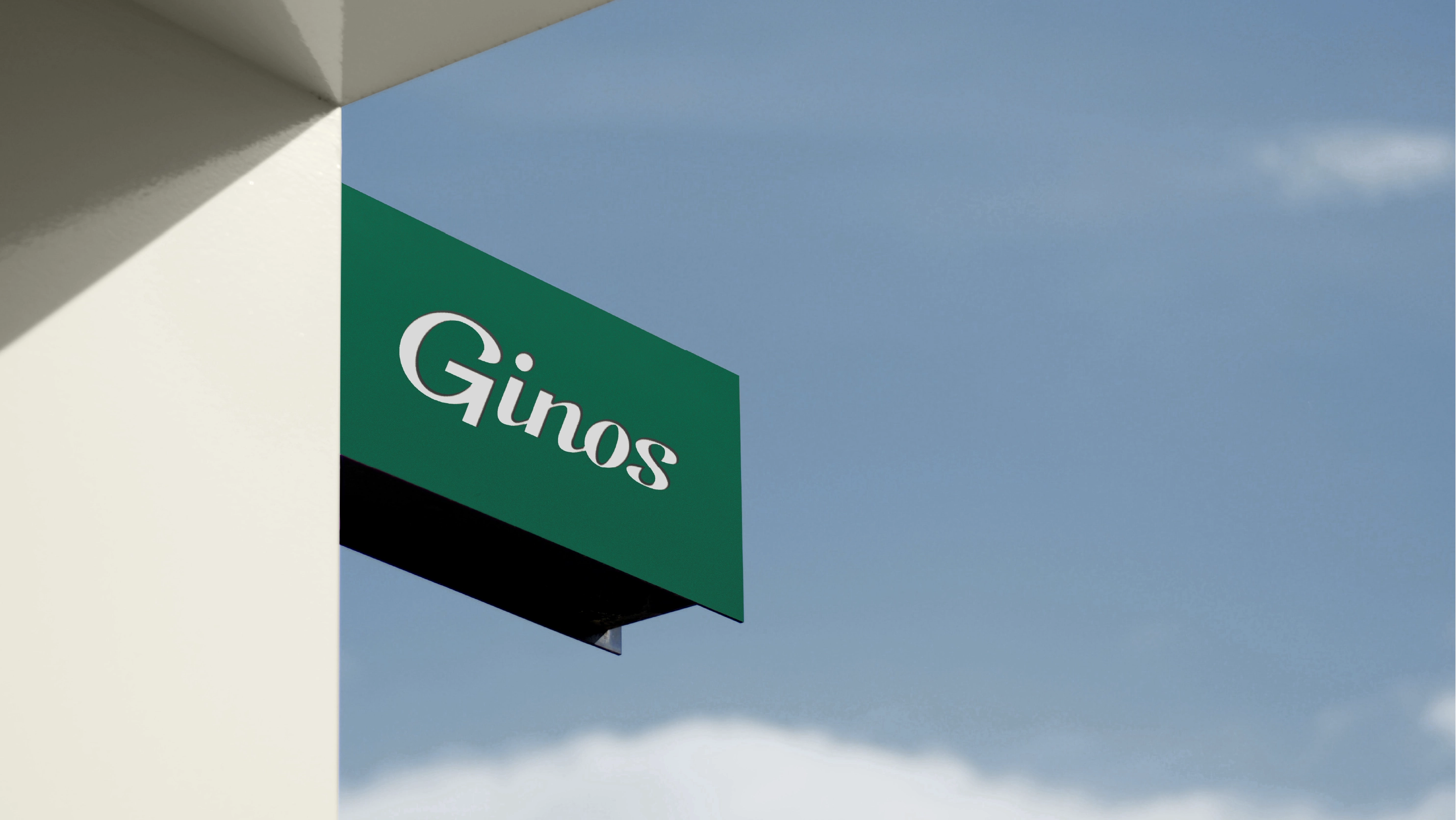
The logotype was redesigned with a calligraphic typeface inspired by mid-20th-century Italian signage, eliminating graphic symbols to enhance its artisanal and approachable character. Its tilted and dynamic strokes convey energy and passion, reflecting the brand’s vibrant essence.
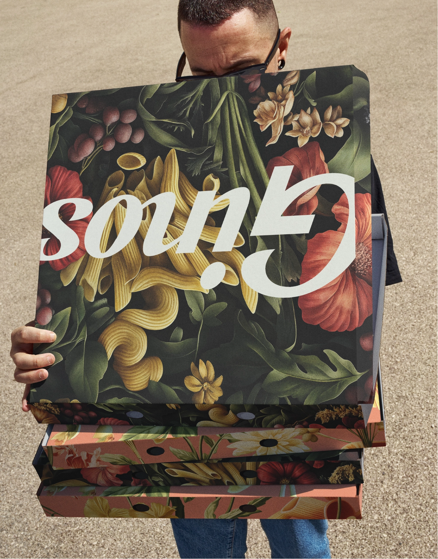
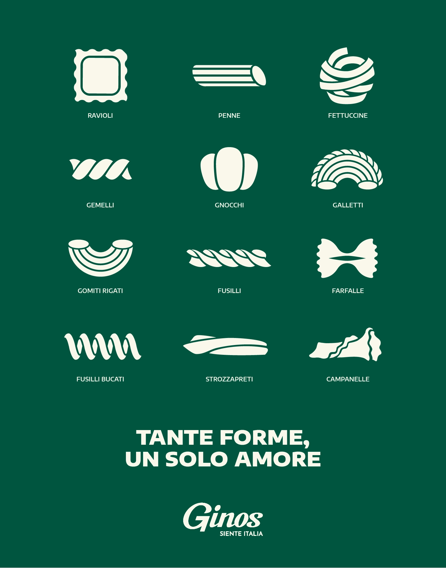
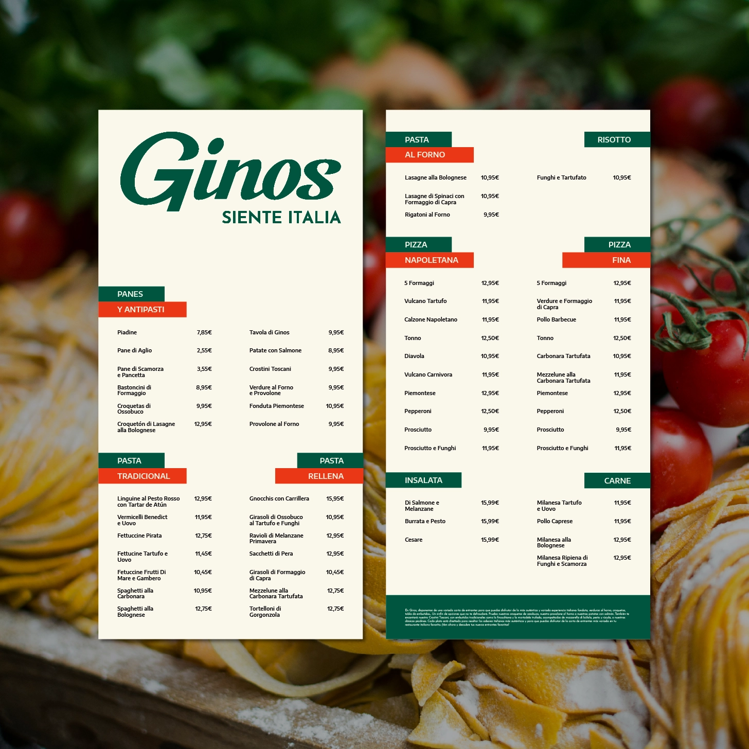
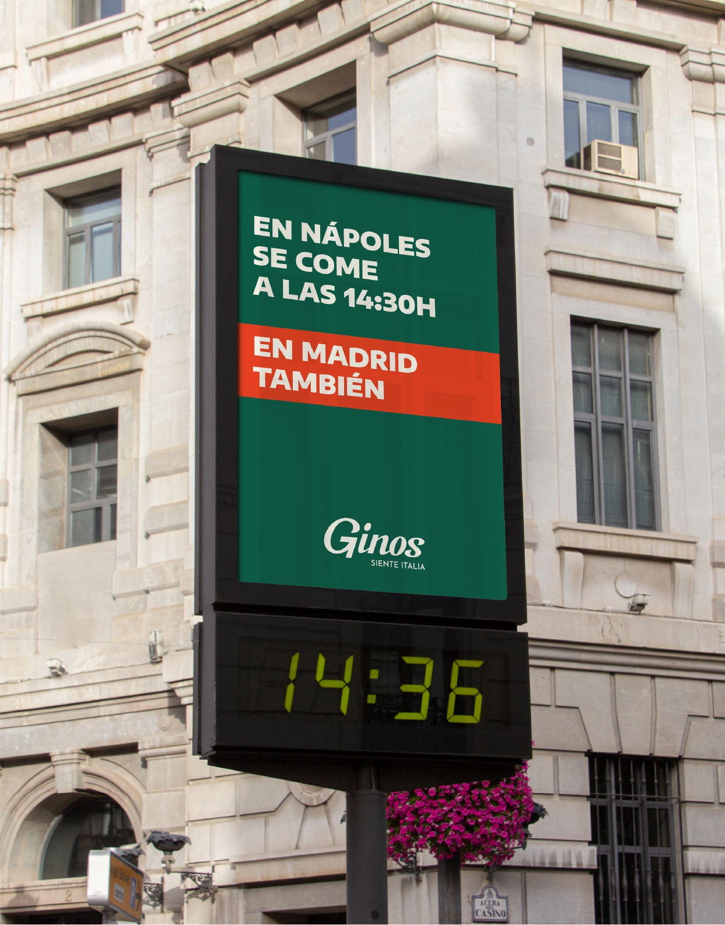
The colour palette introduces the shade “Pesto” as the main tone, accompanied by warm accents such as “Arrabiata” and “Carbonara,” evoking iconic ingredients of Italian cuisine. This scheme strengthens the visual identity with a balance of warmth and vitality, ensuring consistency across all graphic applications. In terms of typography, the combination of Encode Sans Expanded, with its humanist style, and Josefin Sans, elegant and geometric, provides flexibility and hierarchy across various communication formats.
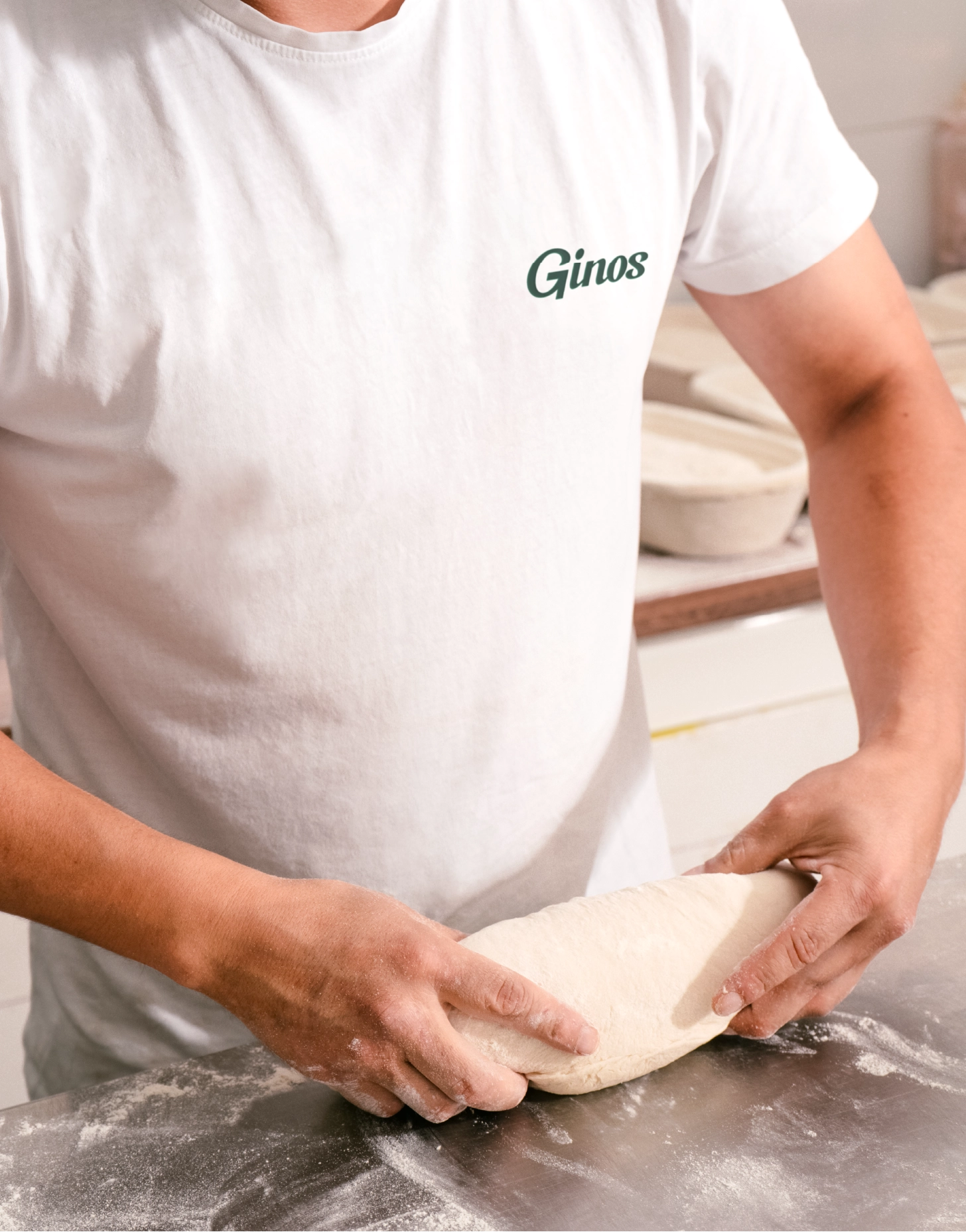
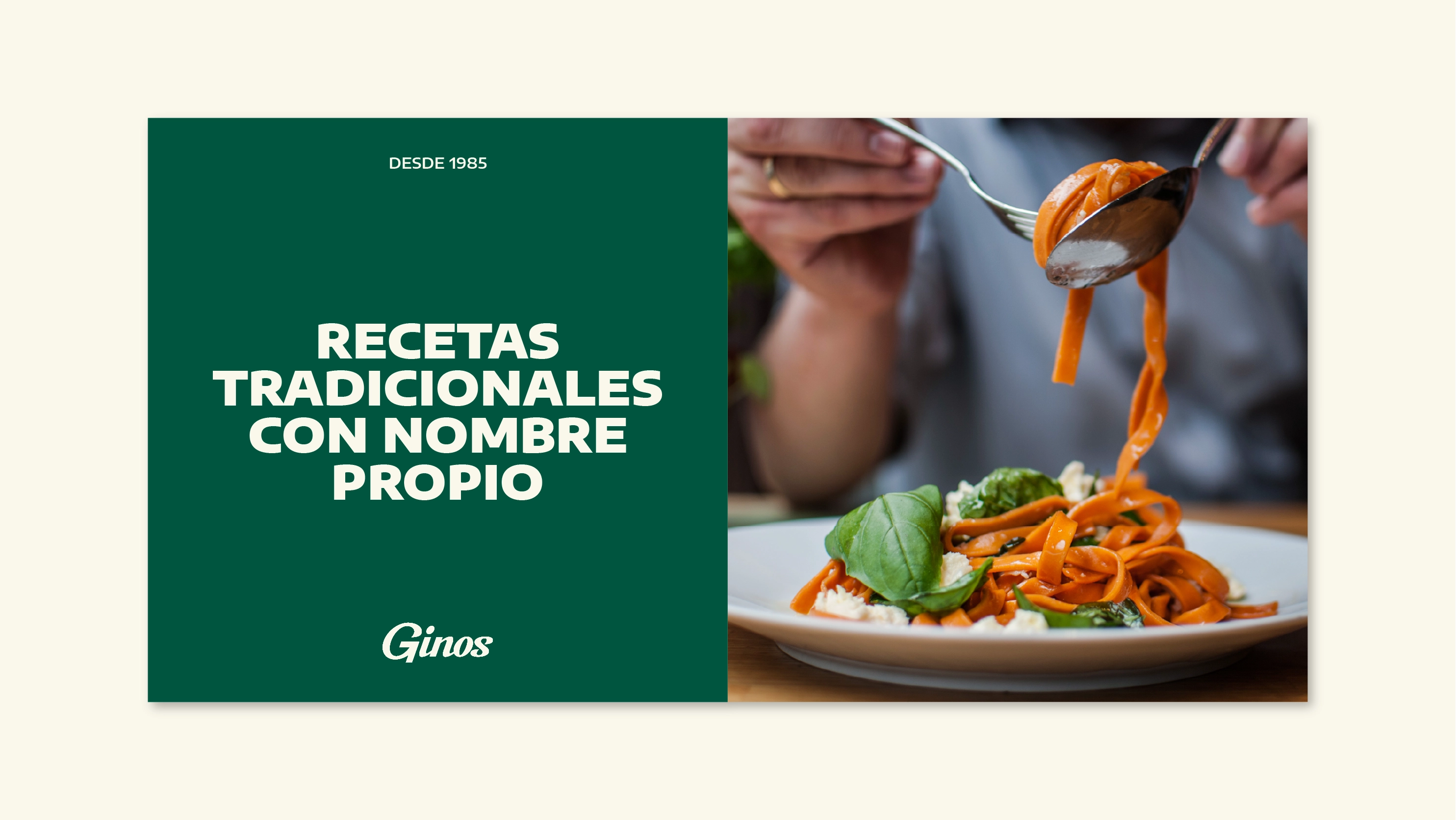
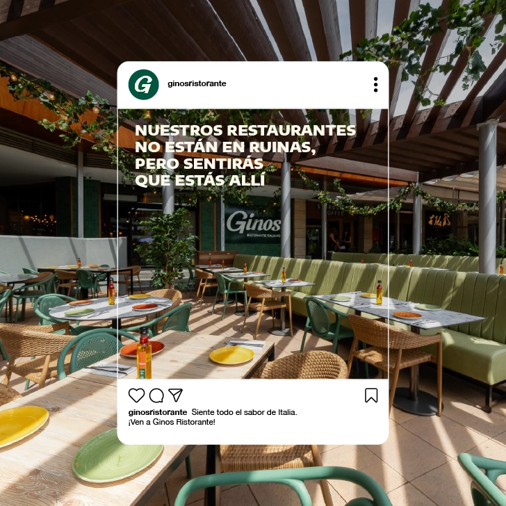
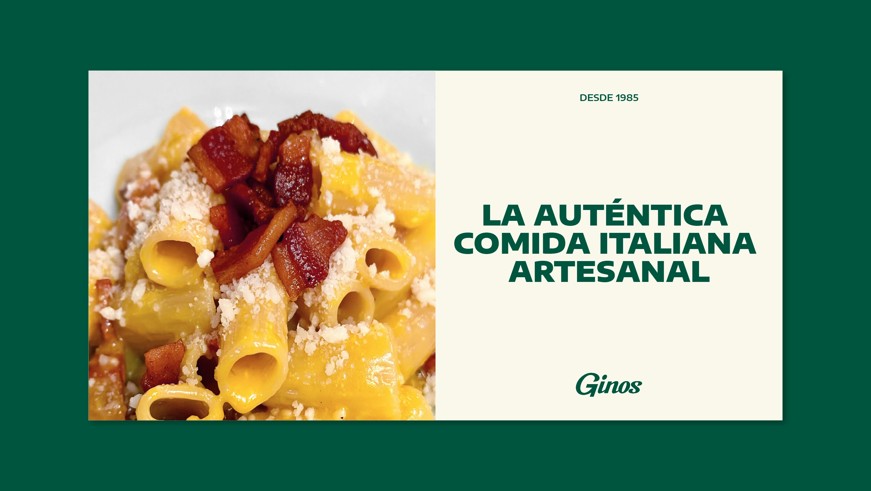
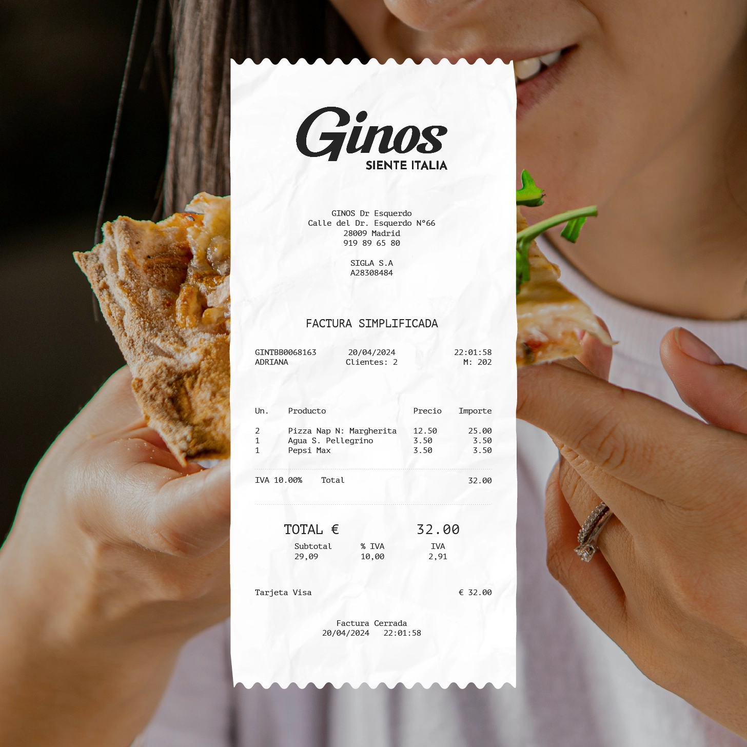
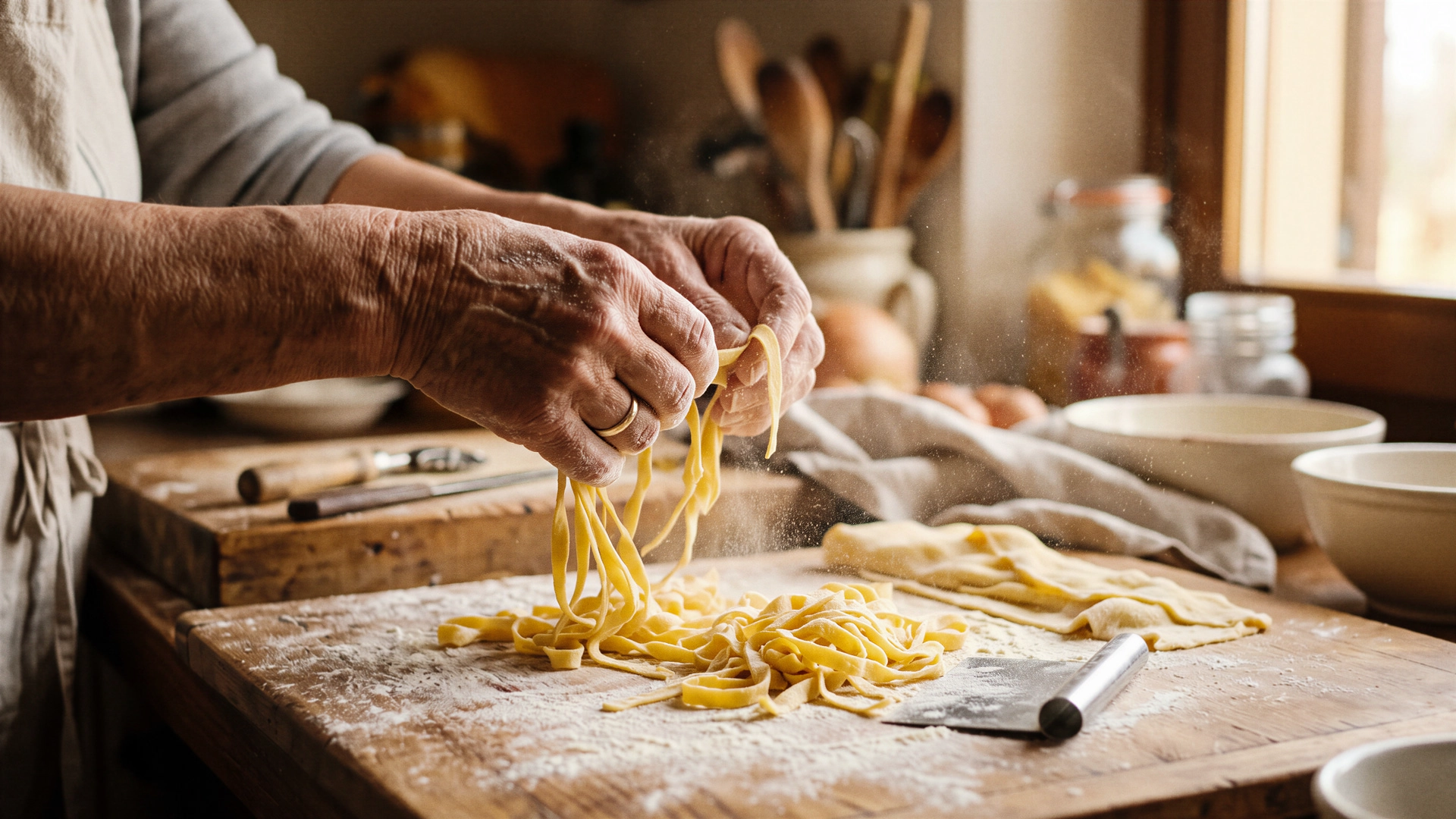
The brand’s visual language is complemented by photographic art direction focused on the sensory experience: medium shots capturing the texture and colour of the dishes, images with human presence to reflect the warmth of the moment, and natural lighting that enhances the appeal of each culinary offering.
Thanks to this transformation, every brand touchpoint becomes a direct connection to the true Italy, conveying the passion, flavour, and essence of its gastronomic culture.