AIVORIQ.
Together. Beyond.
Driving the new era of dental laboratories.
BrandFor Value Journey
Brand Diagnosis, Brand Naming, Brand Strategy, Brand Architecture, Visual Identity, Verbal Identity, Brand Implementation
Sector
Dental Health, Dental Laboratories
AIVORIQ was born with the ambition to lead the transformation of the dental laboratory sector in Spain, promoting a more integrated, professionalized model prepared for the future.
At BrandFor we led a comprehensive strategic branding project that covered everything from identifying a new name and brand territory, to defining the architecture, value proposition and strategic narrative, and creating a unique and recognizable visual and verbal identity.
From a fragmented landscape to a shared vision
The project was developed within the investment strategy of Alantra Private Equity, which identified a structural shift in a highly fragmented sector undergoing a transition toward digitalization. After several years of accelerated growth through the integration of more than 20 laboratories and an intense phase of operational integration, the group reached a critical scale that required the next strategic step.
The challenge: to create a brand capable of bringing the ecosystem together, projecting a shared vision and supporting the project’s ambition for growth and international expansion, while preserving the specialization and reputation of each integrated laboratory.
The prosthetic dental lab industry is one of the most advanced and precise in the world, yet one of the least understood. Aivoriq reframes this hidden category by transforming the lab into an atelier: a place where technology enhances human mastery.
AIVORIQ: an iconic name to lead the transformation of the dental sector
A name that combines a reference to ivory (the natural material of teeth, a symbol of dental health) with IQ (intelligence, knowledge) and AI (artificial intelligence, digitalization).
AIVORIQ evokes craftsmanship and future vision. Tradition and technology. Specialization and innovation. A memorable, registrable and internationally scalable name with deep strategic meaning.
A brand designed to act as the unifying axis of an ecosystem of leading prosthetic and digital laboratories, capable of preserving their specialization and expertise while projecting a shared, solid and recognizable vision.
A brand strategy articulated around the concept “Together. Beyond.”
A brand territory that expresses AIVORIQ’s ambition to energize and elevate the standards of dental health through a more collaborative, more innovative model with greater impact on people’s well-being.
“Together” reflects the integration of laboratories under a shared vision, preserving their specialization while enhancing synergies.
“Beyond” projects anticipation of change, constant innovation and the ambition to go further with every solution.
This positioning is supported by four strategic values: expertise, as the essence of craftsmanship and accumulated knowledge; empathy, to deeply understand dentists, clinics and patients; anticipation, to foresee needs with a forward-looking mindset; and innovation, placing digitalization and technology at the service of dental health. An integrated, human and digital proposition.
A strong, consistent and flexible brand architecture
Defining a clear and optimized brand architecture allowed us to organize a growing portfolio and facilitate the integration of new laboratories while preserving their value, reputation and specialization.
AIVORIQ acts as the corporate and umbrella brand, reinforcing the coherence of the ecosystem while maintaining the value and specialization of each integrated laboratory.
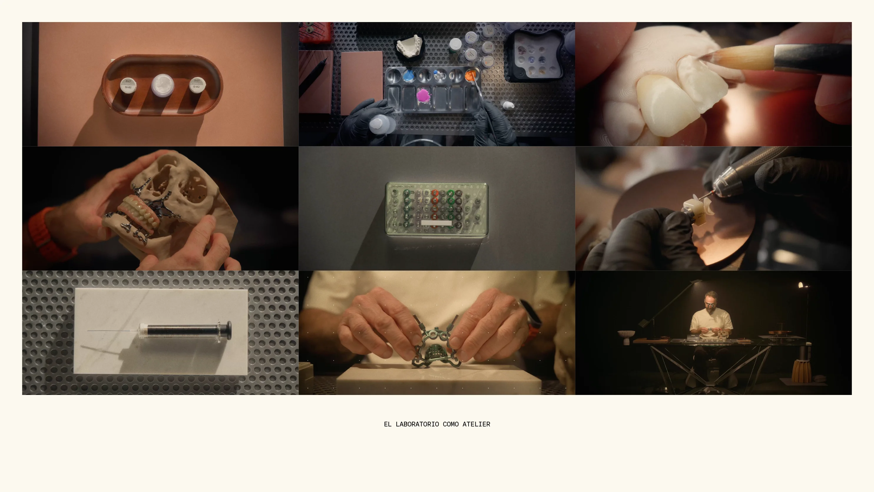
The laboratory as an atelier
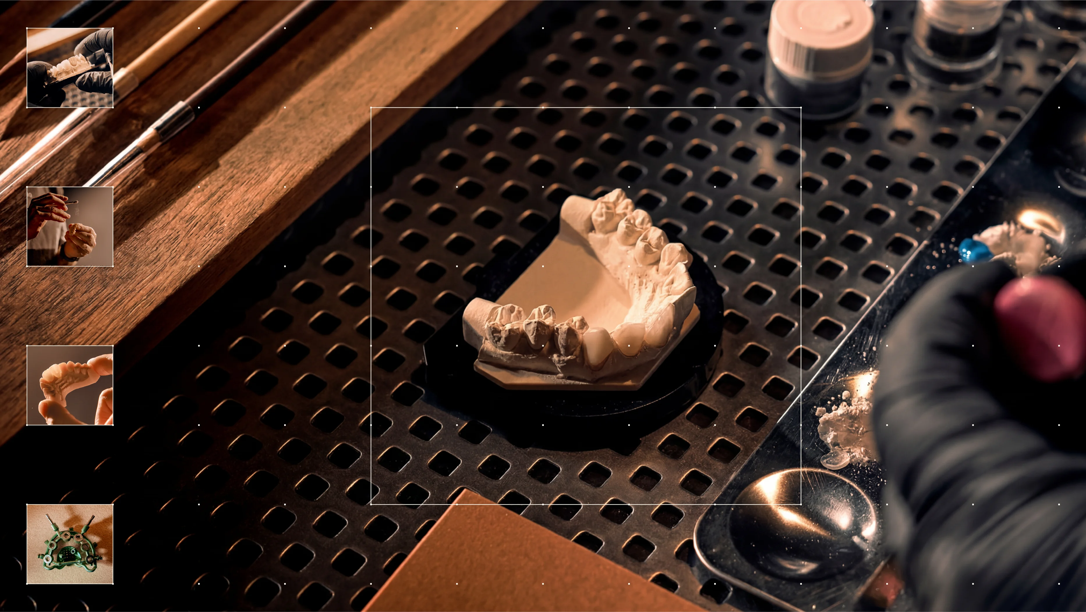
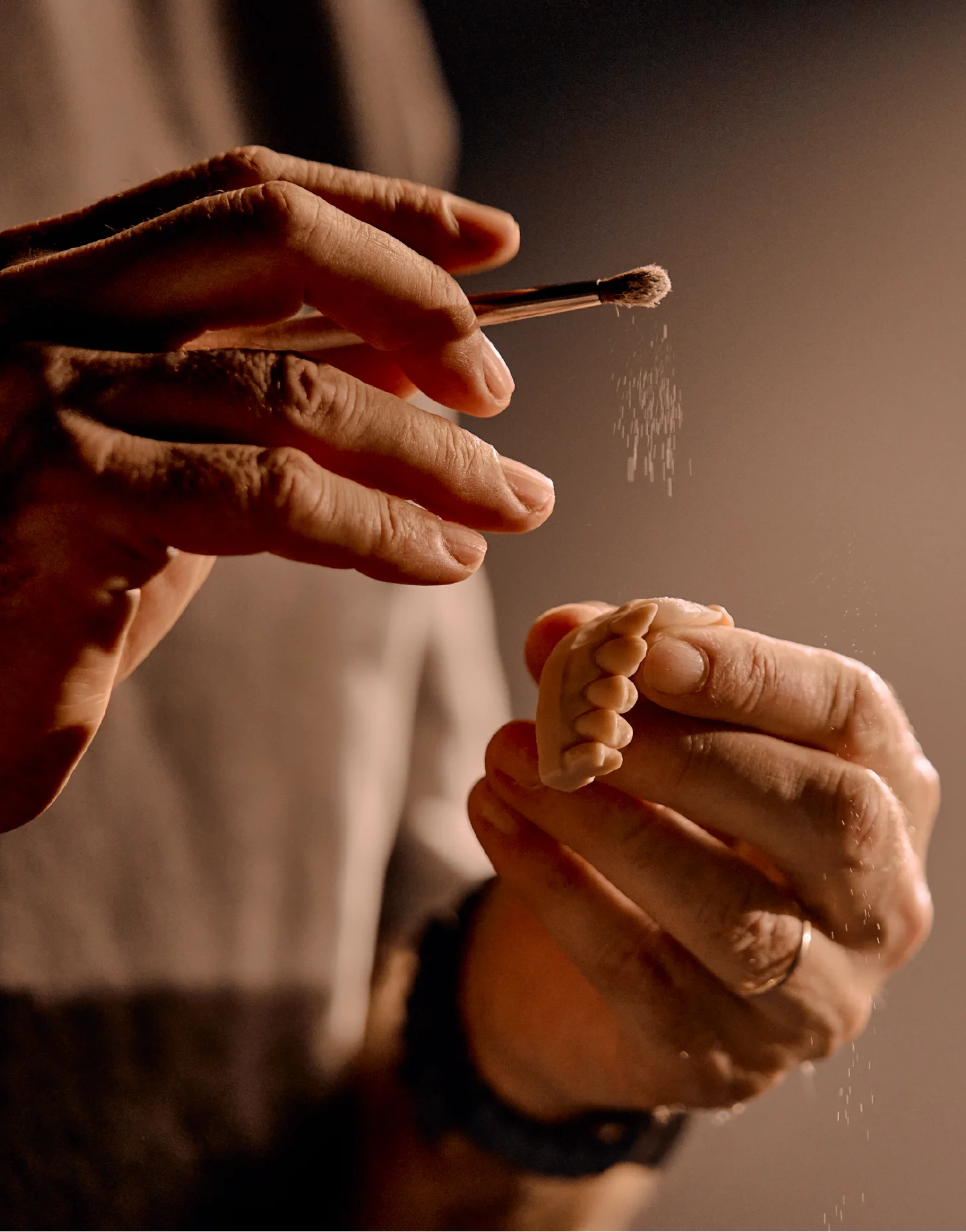
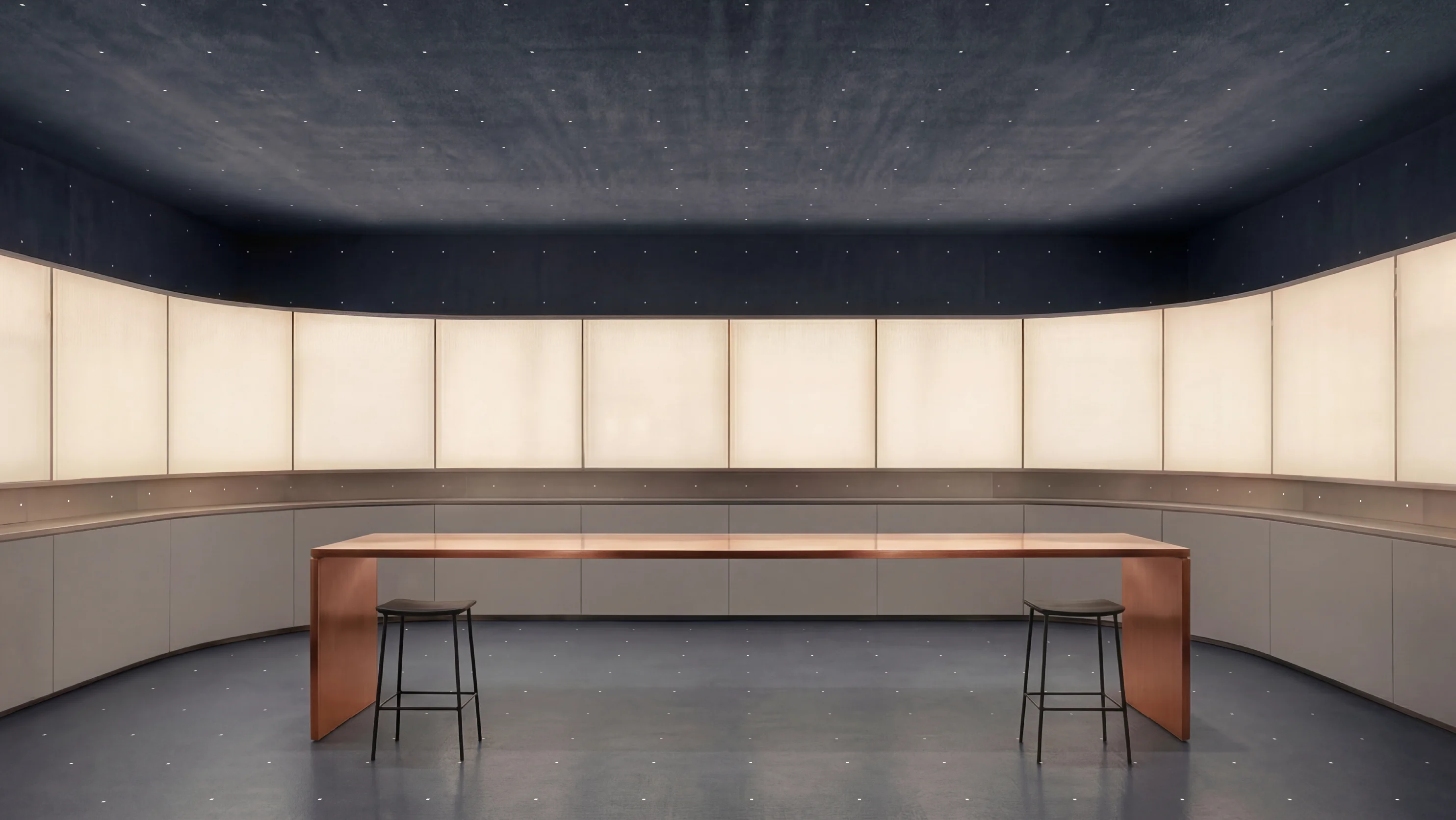
The visual identity is based on a simple idea: understanding the laboratory as an atelier. A space where technical precision and craftsmanship coexist within the same process. Just like in a creative workshop, each piece is designed, modeled and refined through expert knowledge and specialized tools.
This concept reinterprets the laboratory through a contemporary lens, moving away from purely clinical imagery and bringing it closer to the territories of design, craft and material precision.
Designing a system for a brand of brands
The identity needed to represent an ecosystem of specialized laboratories without diluting it: a brand capable of unifying the network while reflecting the collaborative and specialized logic that defines its operation.
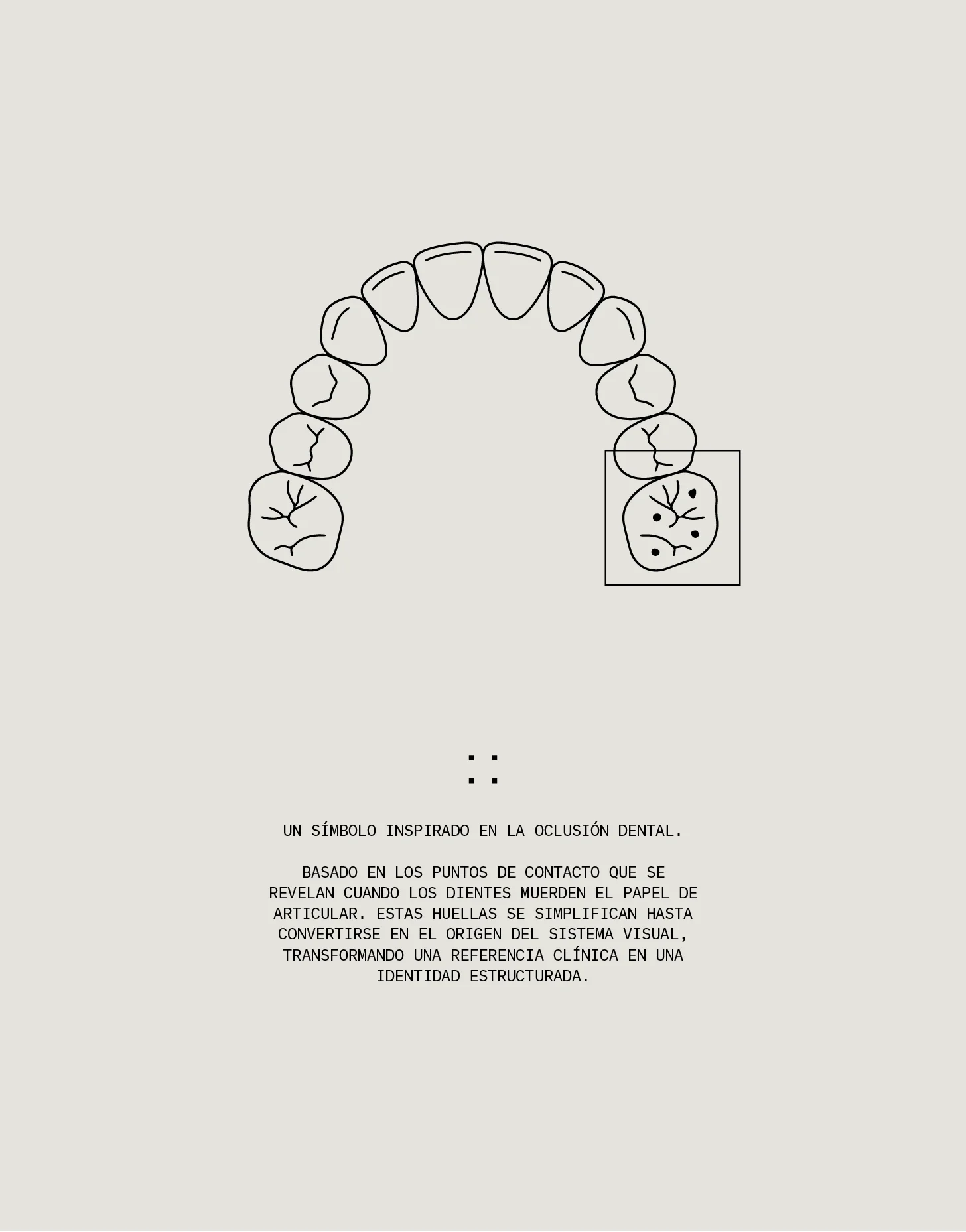
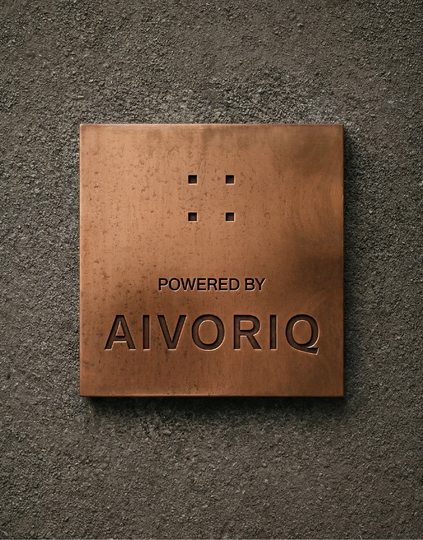
The four-point symbol introduces the structural idea behind the project: a system of coordinated units. Each point represents an autonomous entity that gains meaning in relation to the others. This gesture becomes the organizing principle of the entire identity. The symbol does not simply sign the brand; it introduces a logic of module, grid and system that visually constructs the network of connected laboratories.
From the logotype onward, a graphic language unfolds where every element responds to the same underlying structure.
An antimicrobial color
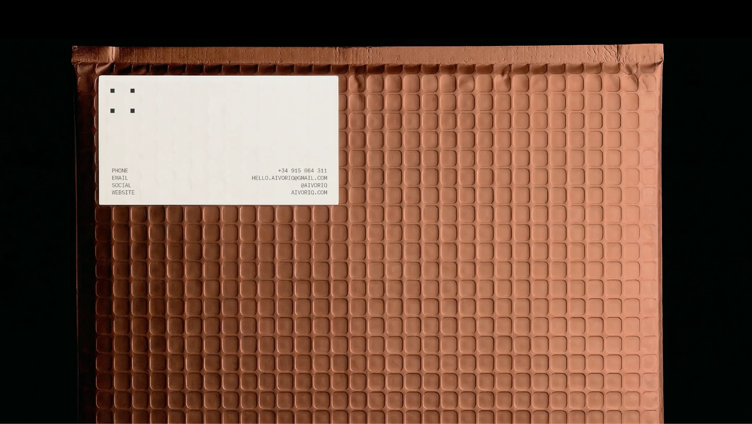
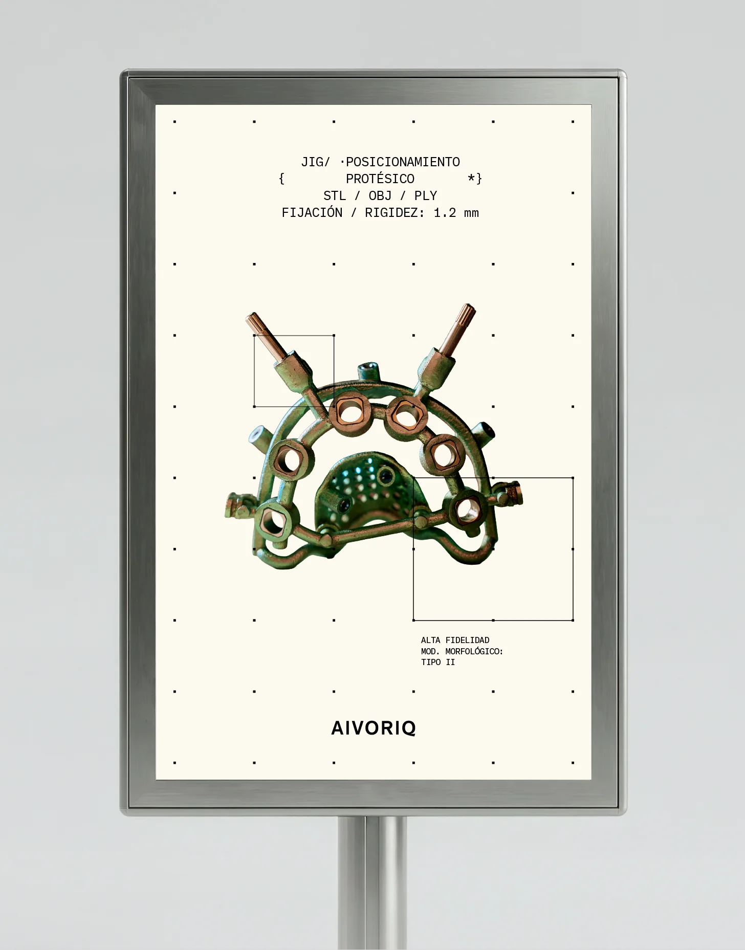
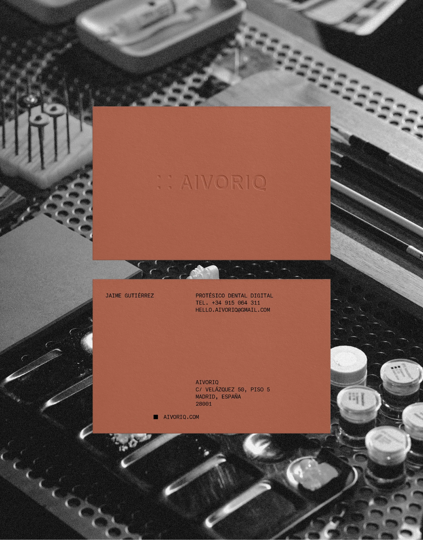
The color identity is built around an element rarely used in the category: copper. In dentistry, copper is used in various technical applications, from restoration alloys to components and clinical instruments, thanks to its resistance and antimicrobial properties.
Within the identity, the metal acts as a bridge between technology and craftsmanship, adding a material presence that connects the visual system with the precise, manual work carried out in laboratories.
A visual language built from the system
Dental labs are largely invisible to the public and often associated with clinical, uncomfortable imagery. This obscures the craftsmanship, technology and expertise behind each piece, leading to a misunderstood, undervalued category.
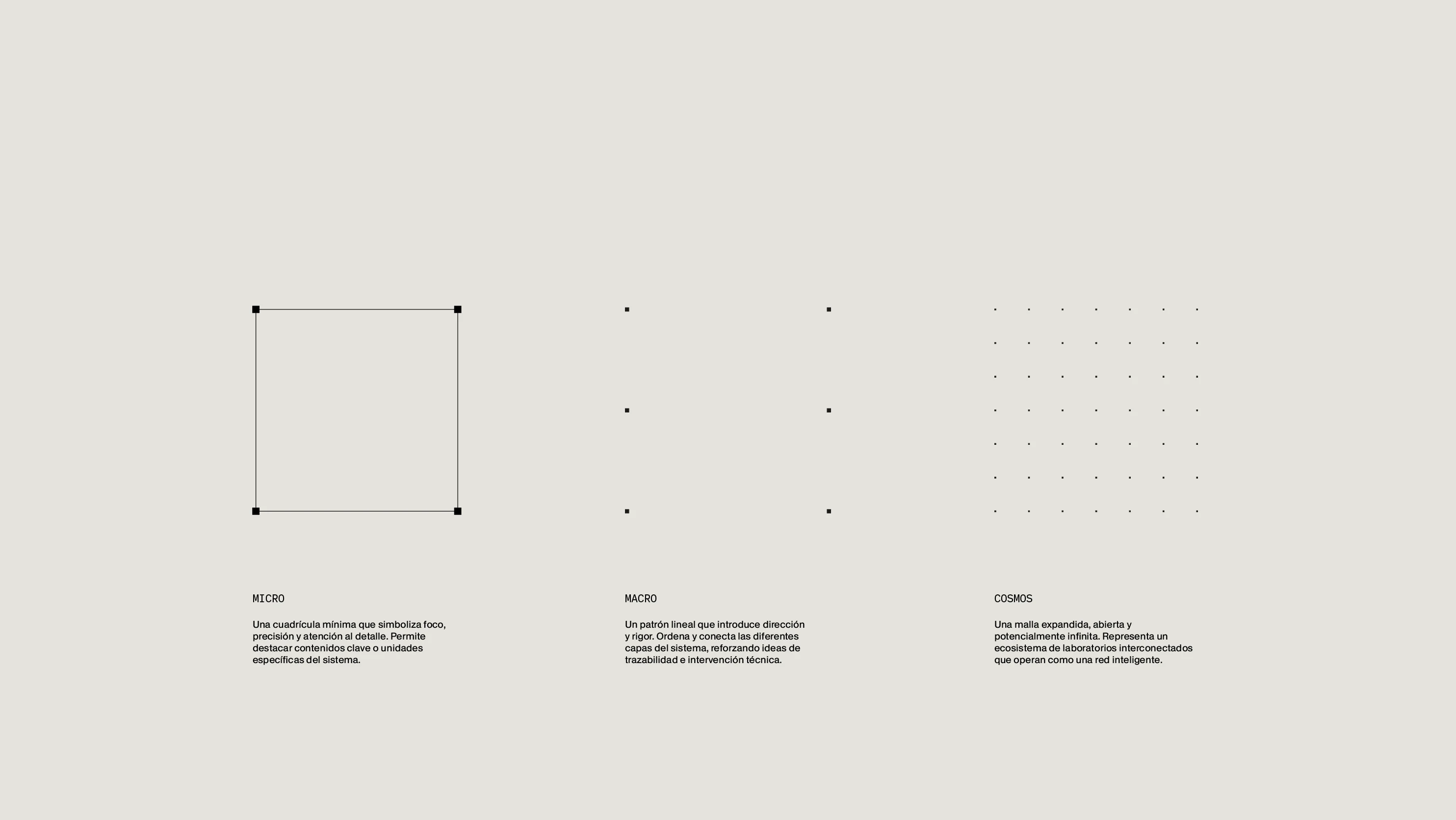
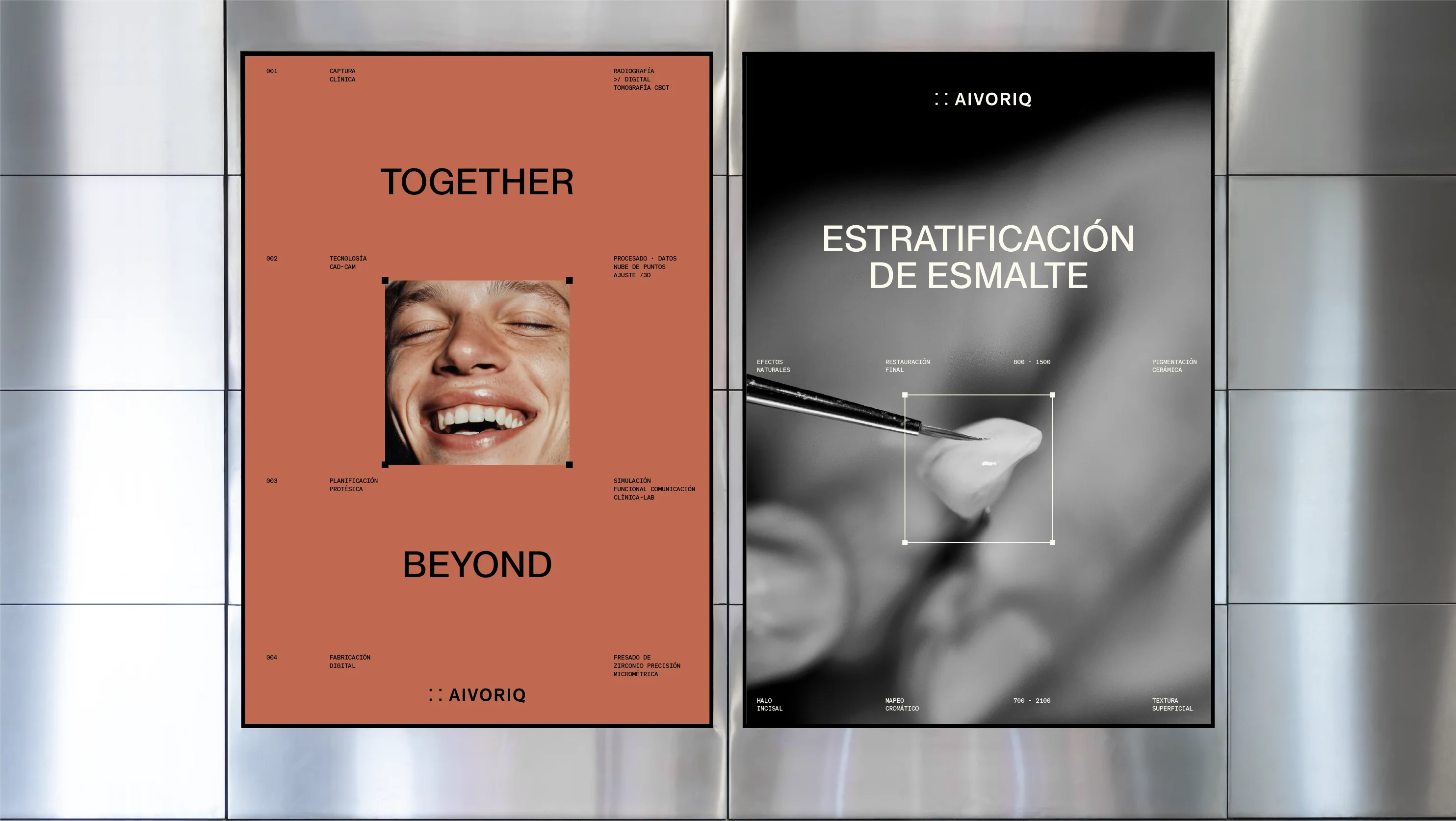
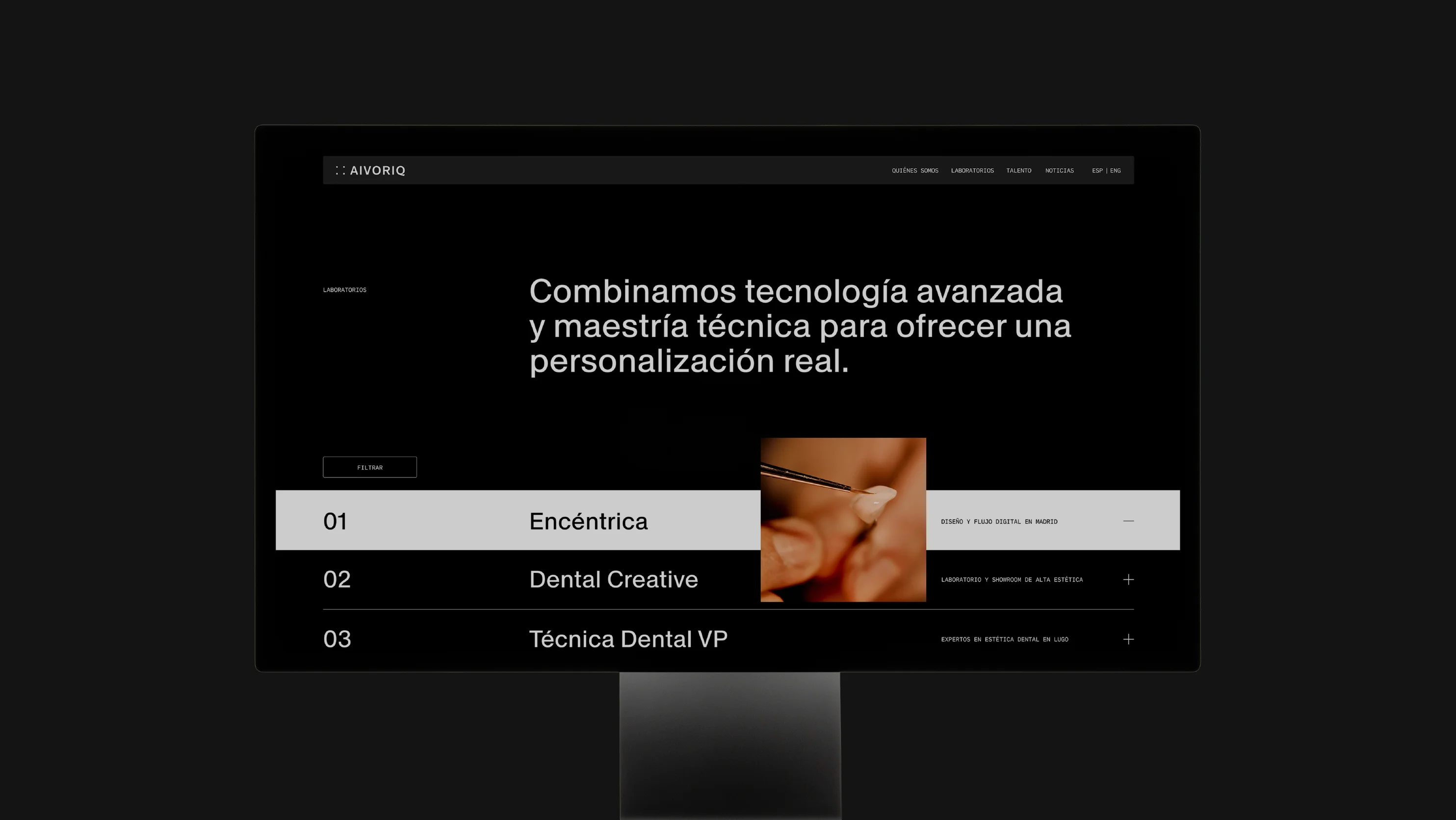
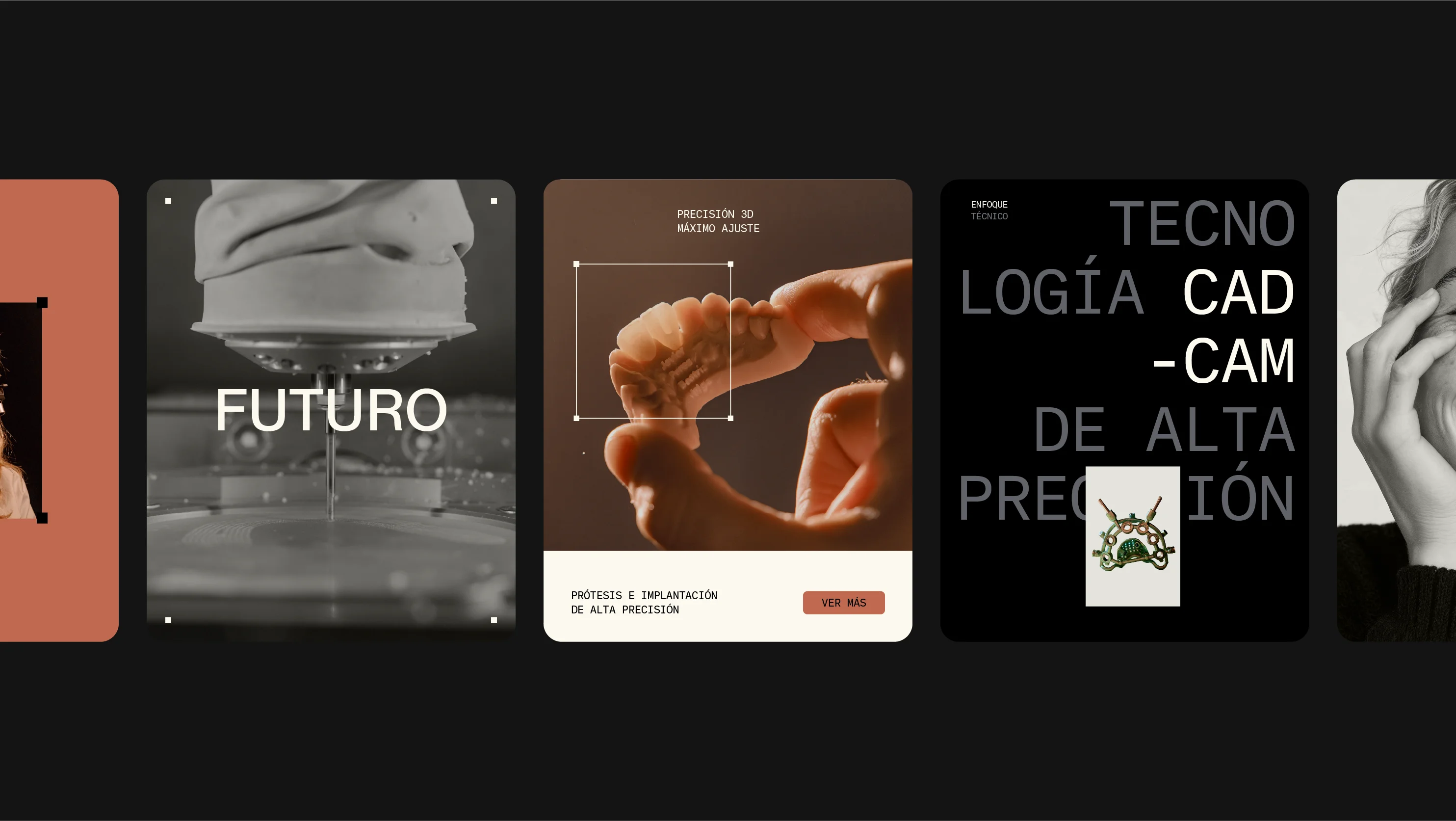
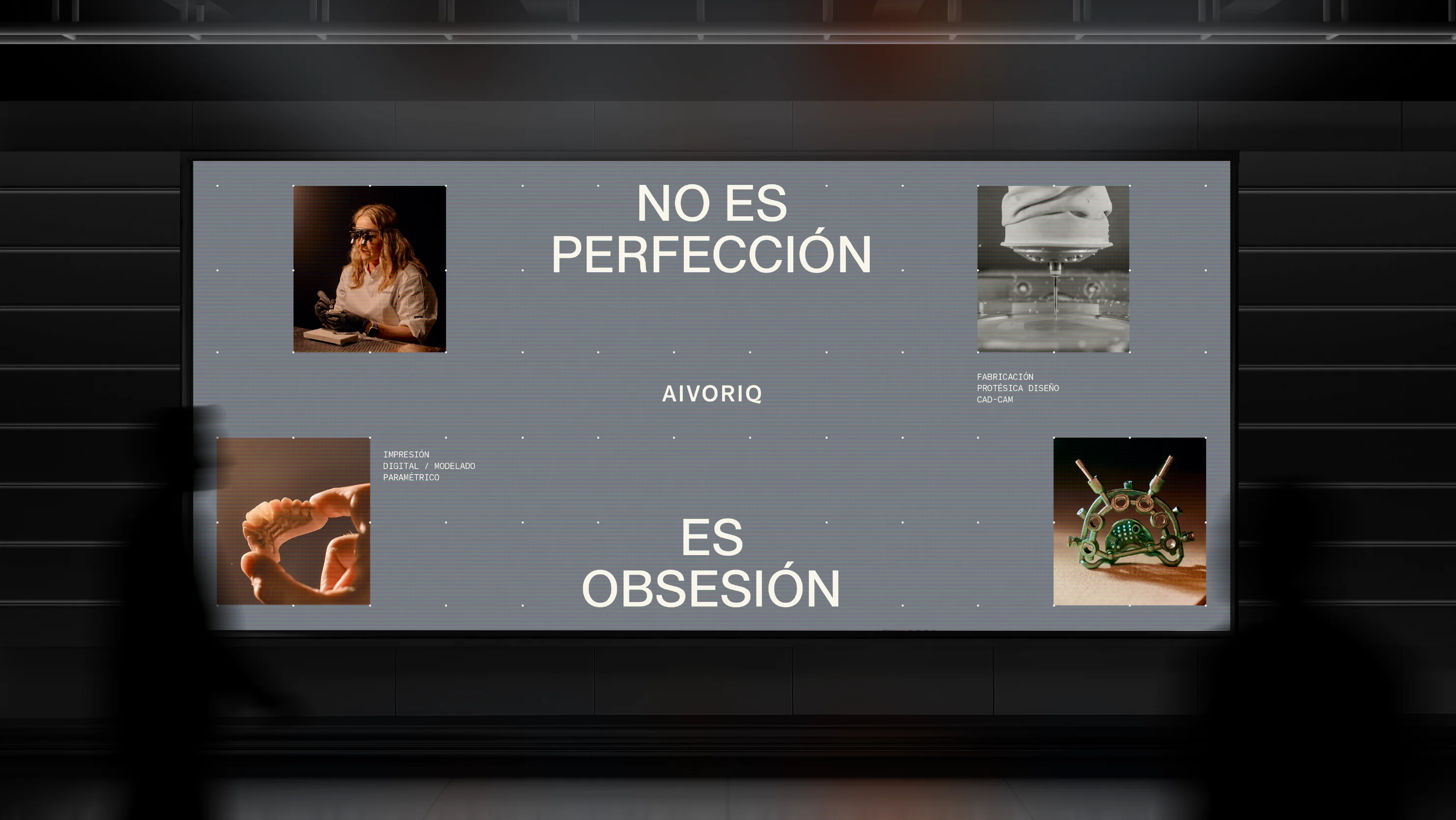
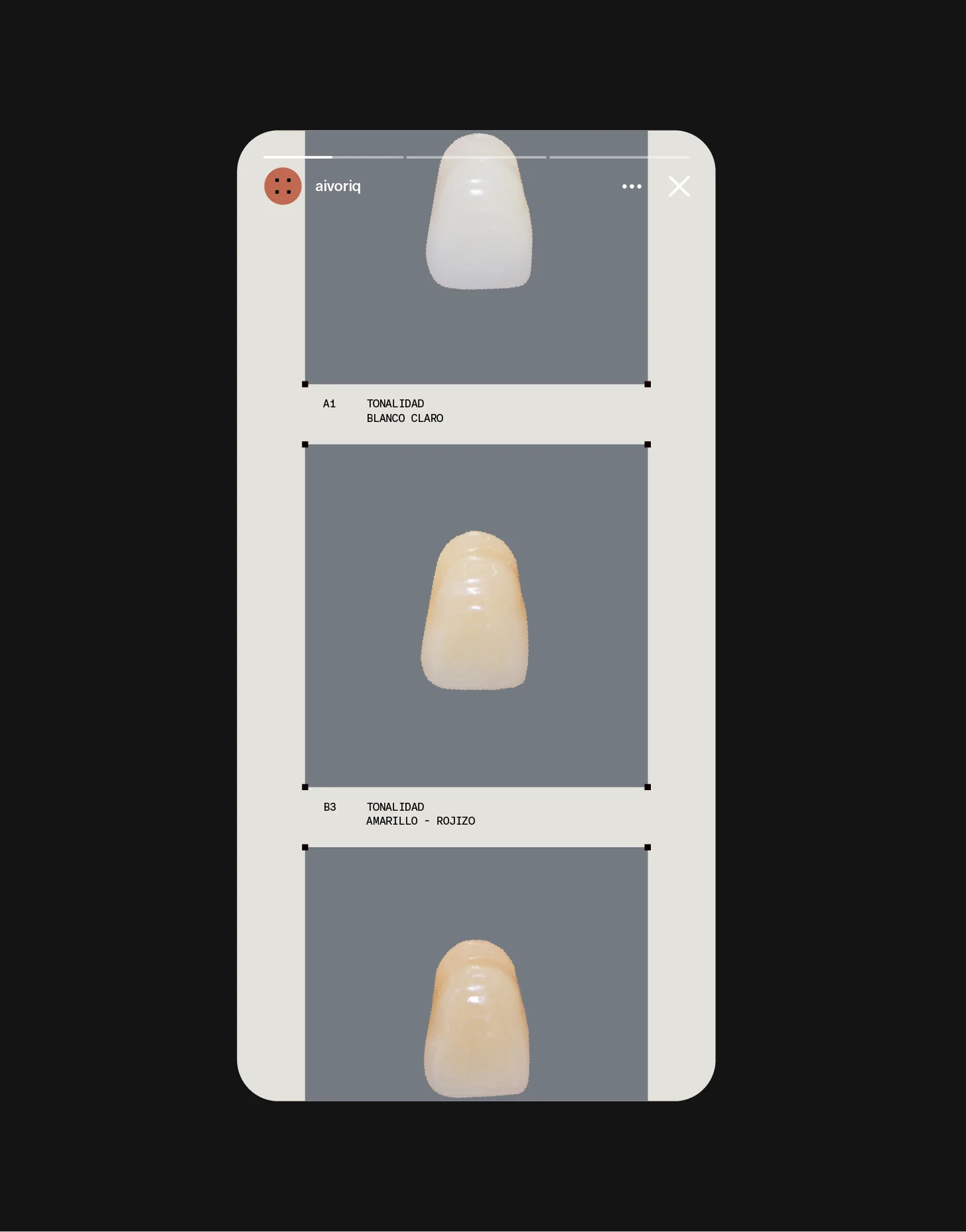
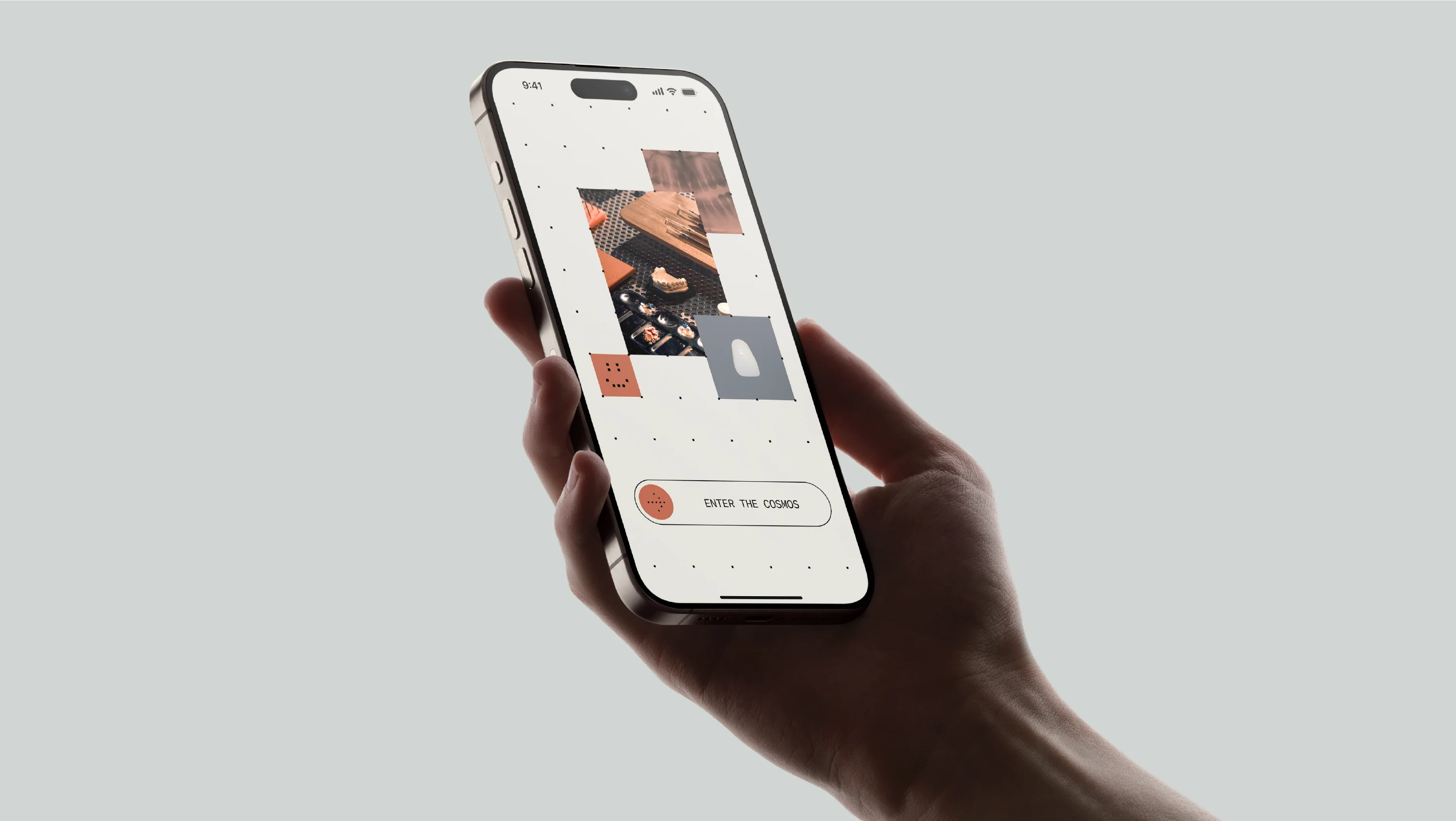
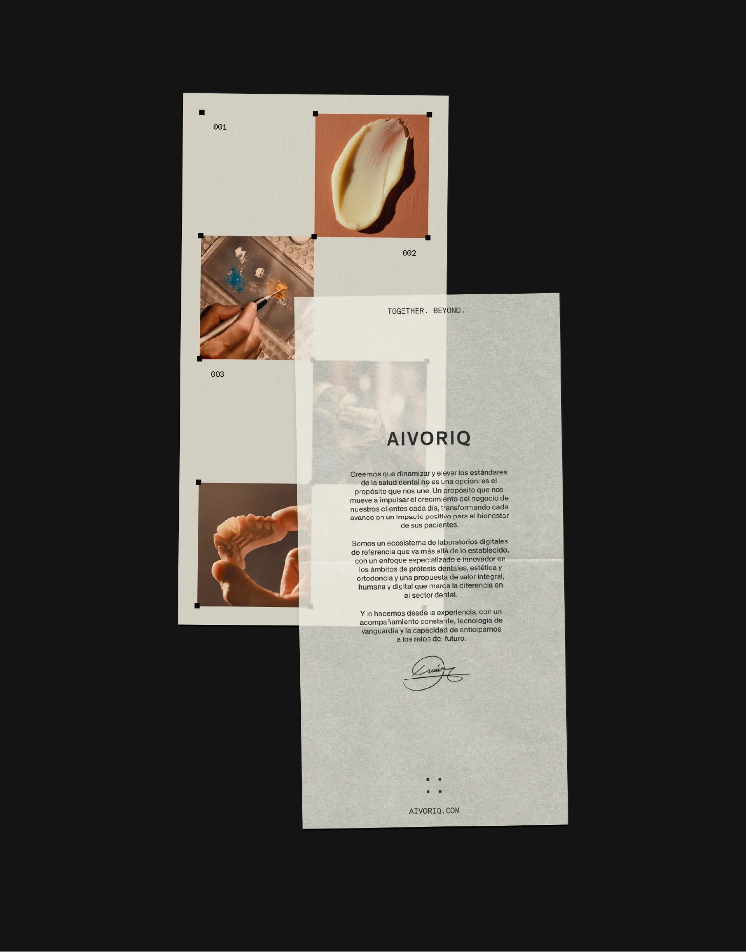
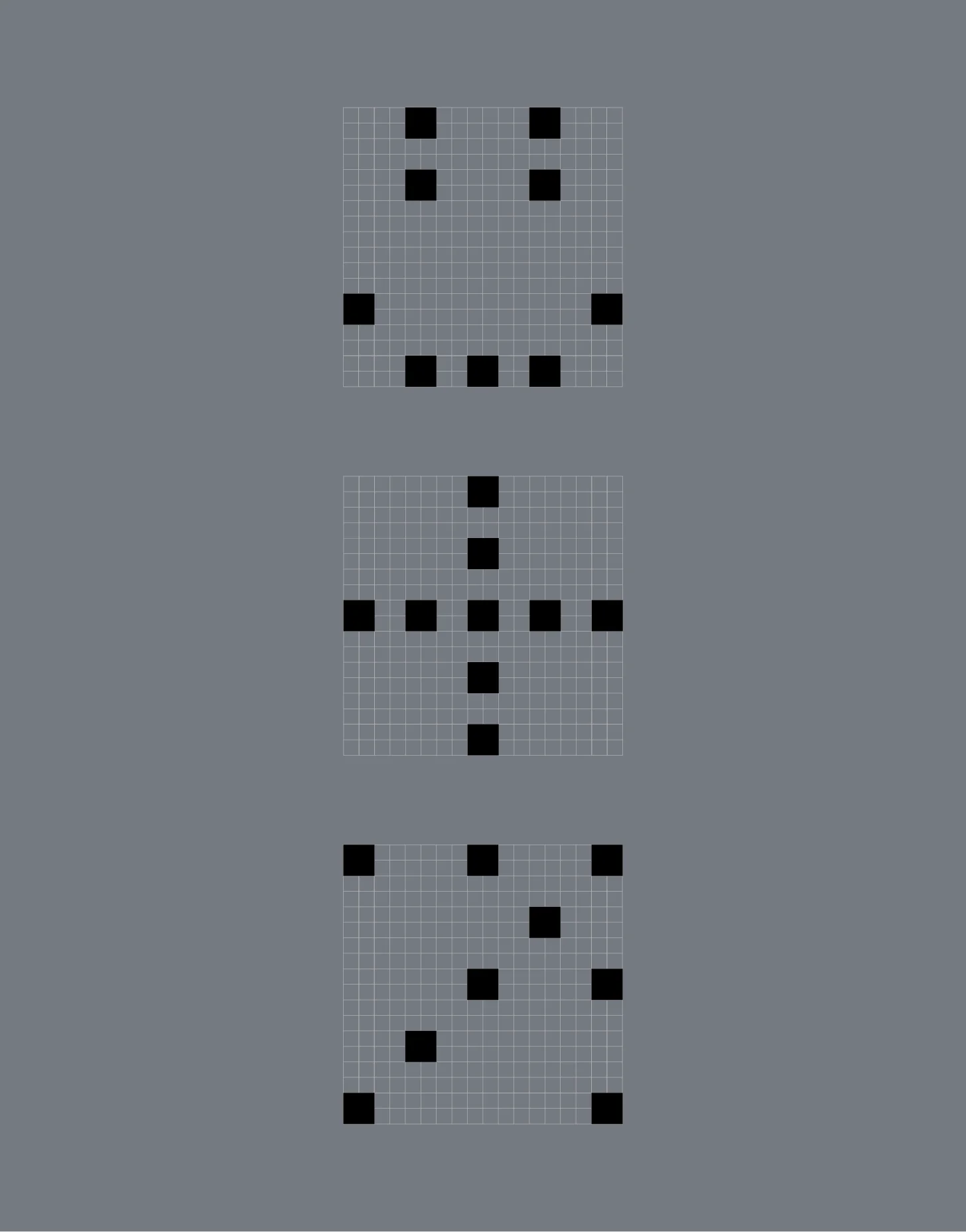
The four points evolve into a modular grid that organizes compositions, layouts and visual hierarchies. This grid is not only a structural tool; it becomes an expressive resource present in editorial pieces, interfaces, signage and motion graphics.
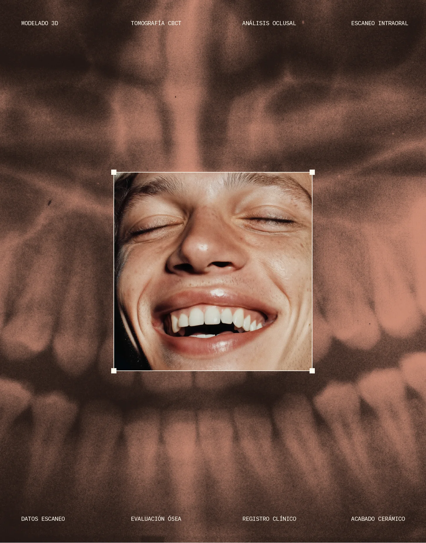
From this structure emerges a language based on square patterns derived from the symbol, visually reinterpreting digital processes in the sector such as 3D scanning, modeling and micrometric precision. The system allows the technical complexity of laboratory work to be visualized while building a coherent visual universe across all brand applications.
Technique and craftsmanship as a visual narrative
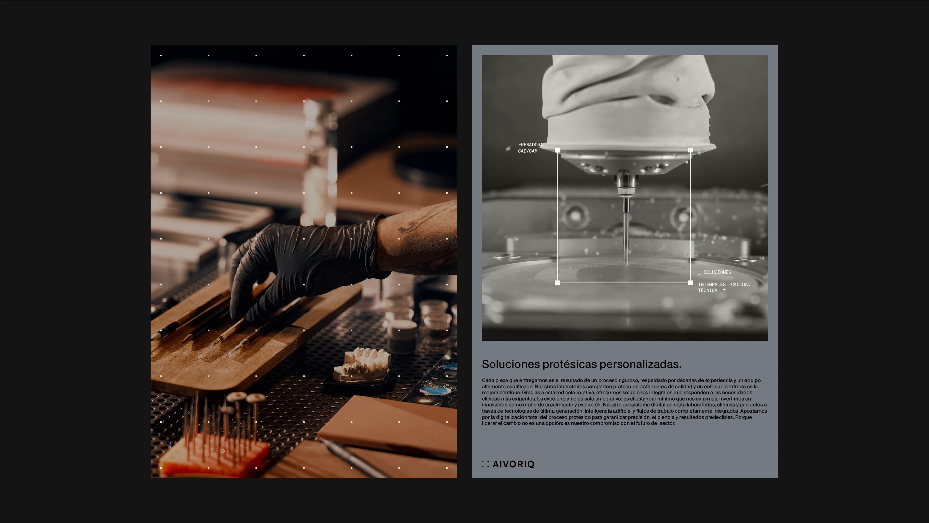
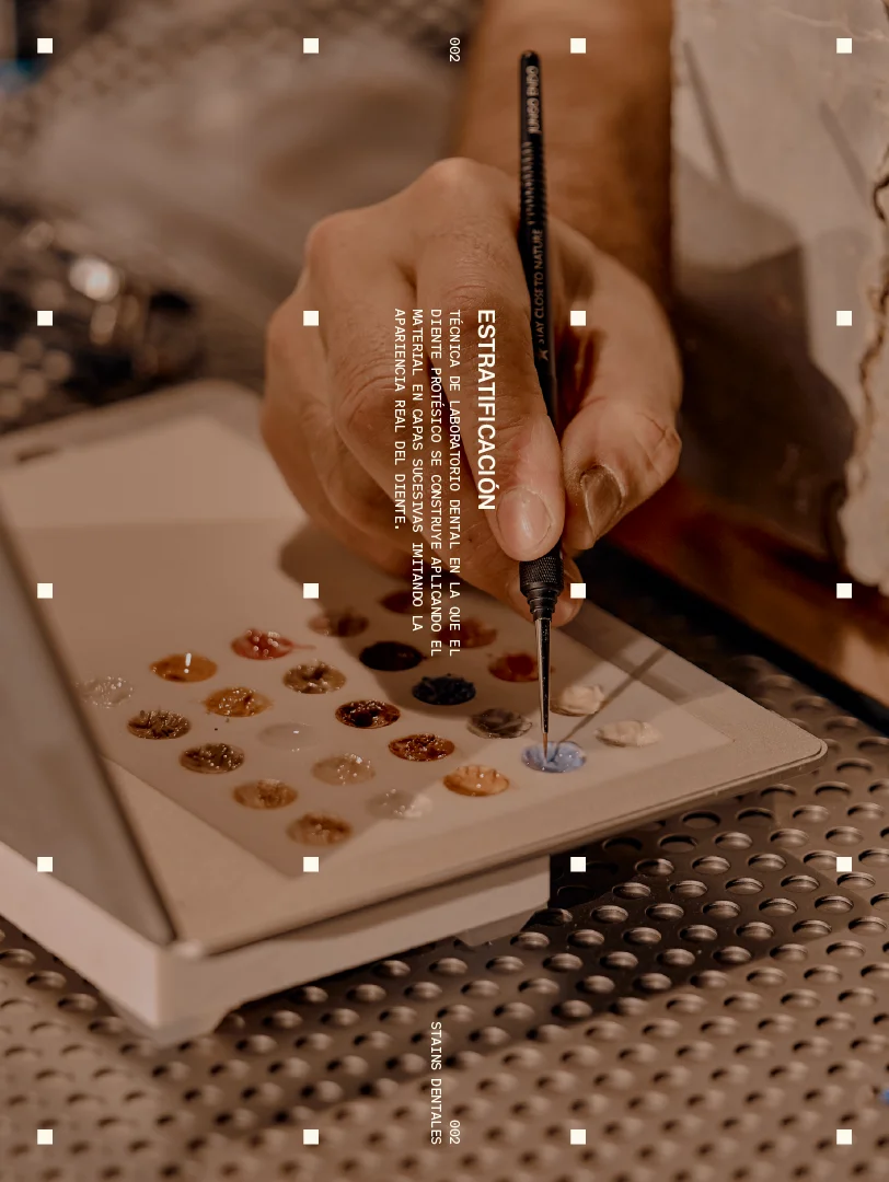
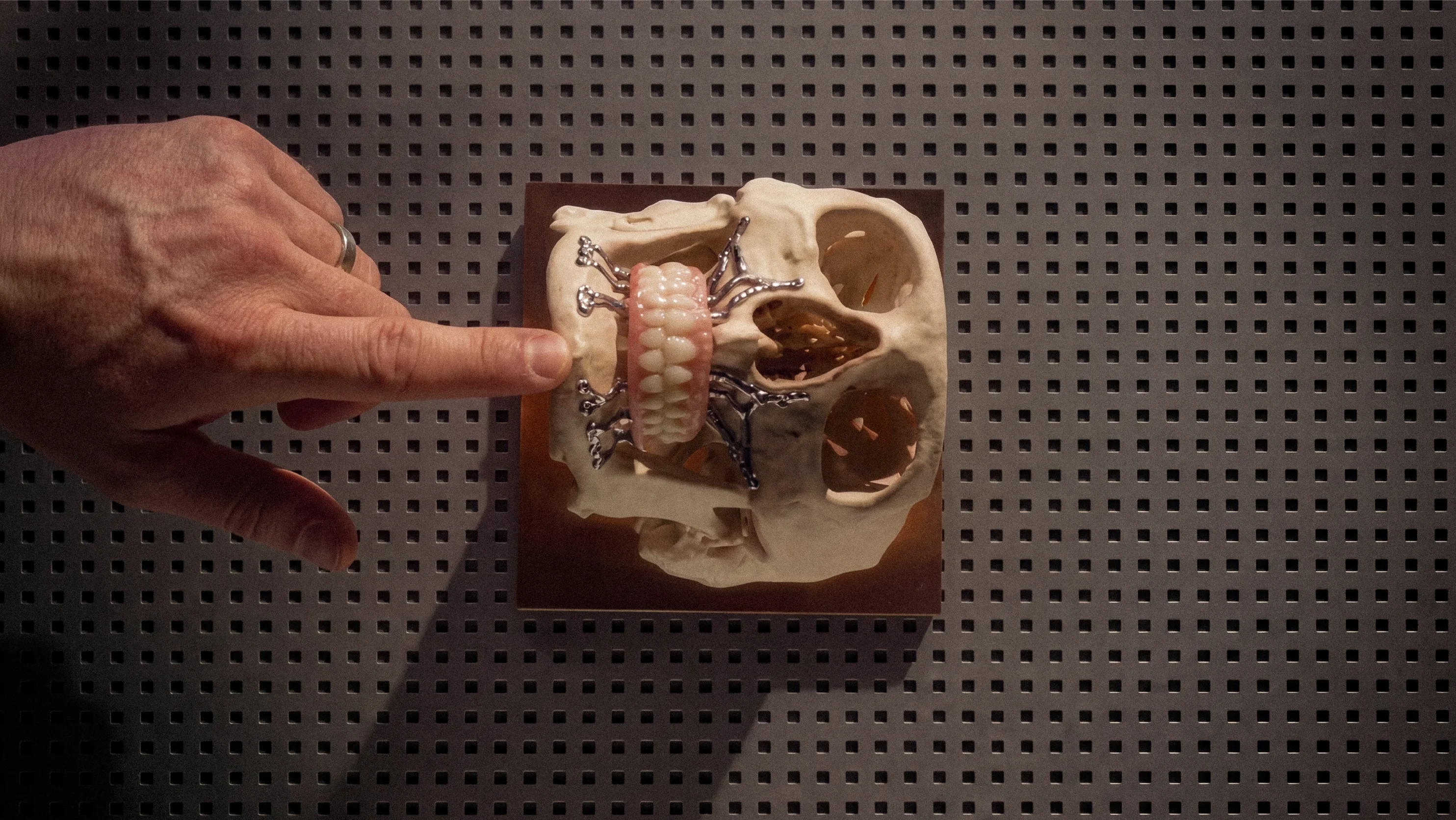
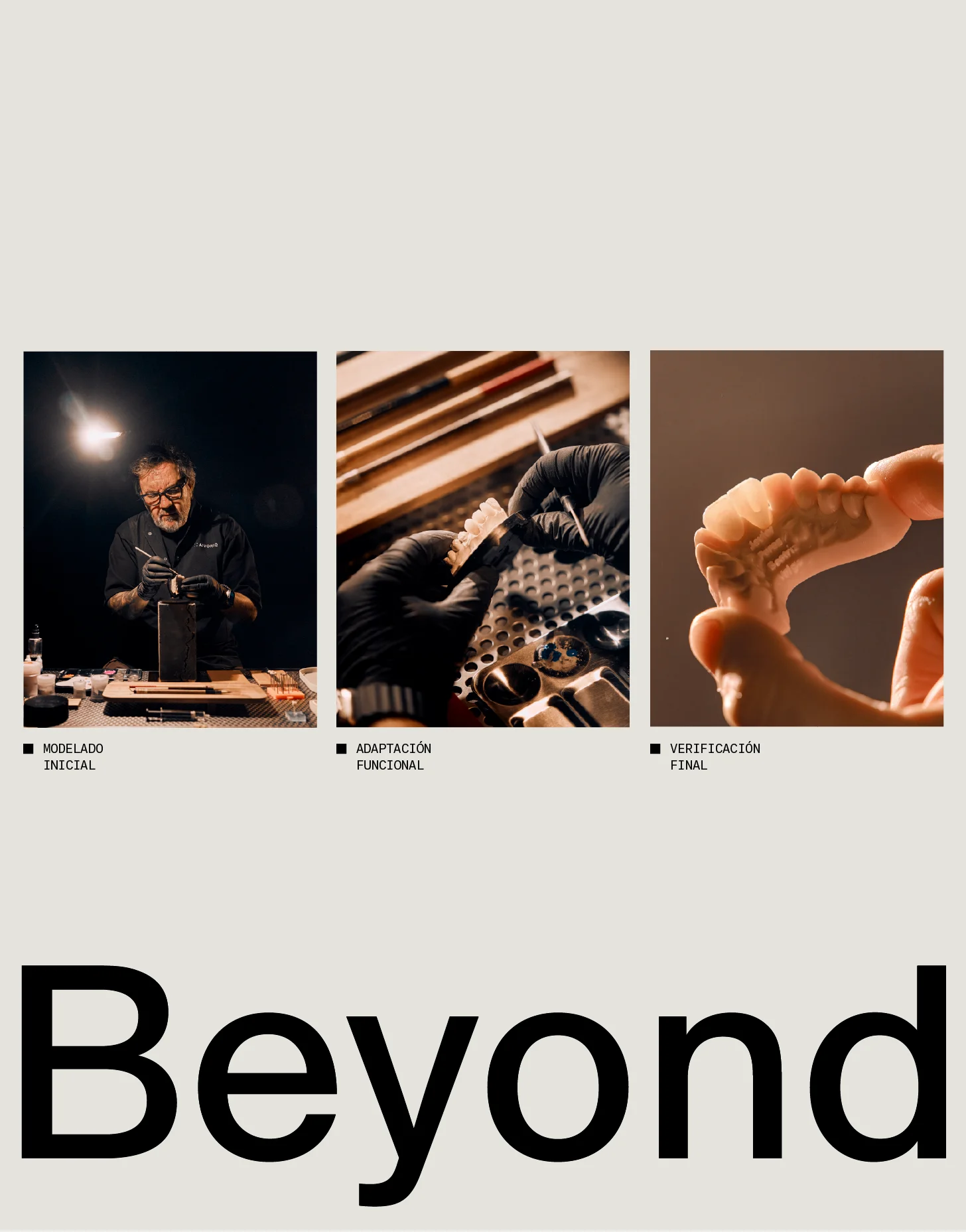
The dental sector is often represented through purely clinical aesthetics: medical imagery, photographs of final results or excessively technical representations, often supported by raw close-ups that can be uncomfortable for viewers. However, behind each piece lies a far more complex process: modeling, fitting, ceramic sculpting, pigmentation and manual finishing.
The art direction focuses on revealing this process, presenting the laboratory as a place where advanced technology and artisanal expertise coexist. In some pieces, this logic is also translated into motion: objects and people rotate within the grid structures to visualize technical processes from a more engaging and contemporary perspective.
Redefining the category
The result is a different way of representing the world of dental laboratories: a language that acknowledges the sector’s technical precision while highlighting the craftsmanship behind each piece.
AIVORIQ introduces a concept rarely seen in the category: a perspective where technology, system and craft coexist within a single visual language.