Urbaser.
Making Circularity Real
Driving Urbaser’s transformation through the brand, making circularity a reality.
BrandFor Value Journey
Brand Diagnosis, Brand Strategy, Brand Architecture, Visual Identity, Verbal Identity, Brand Implementation, Culture and Employee Value Proposition, Social Action Diagnosis & Strategy
Sector
Environmental and Urban Services Management
Urbaser, a global leader in environmental solutions, faced the challenge of consolidating its position in a highly competitive and constantly evolving sector, while projecting its vision and firm commitment to sustainability. This was an opportunity to highlight and amplify its impact that reaches 70 million people across 15 countries, backed by over 50,000 employees.
A brand strategy, narrative, and architecture to generate positive impact
Leading Urbaser’s rebranding process resulted in a new Brand Strategy under the claim of “Making Circularity Real”. This positioning was designed to reinforce its leadership, elevate the value of business circularity, and position Urbaser as a real agent of change.
The new Brand Architecture was crafted to enrich and strengthen the value proposition through the concept of “Urbaser Circular Solutions”, connecting its two main business lines Urban Services and Waste Treatment and driving the core idea of circularity. This approach enhances the company’s positive impact and aligns its global purpose: to create a more sustainable environment through innovative solutions.
To ensure coherence and robustness, we defined four key Brand Values: “Experience”, “Commitment”, “Reliability”, and “Inspiration”. We also consolidated the brand’s evolution with a comprehensive Launch Strategy, designed to position circularity as a fundamental pillar in people’s lives and to strengthen Urbaser’s commitment to building a more sustainable future.
A new visual identity that drives change
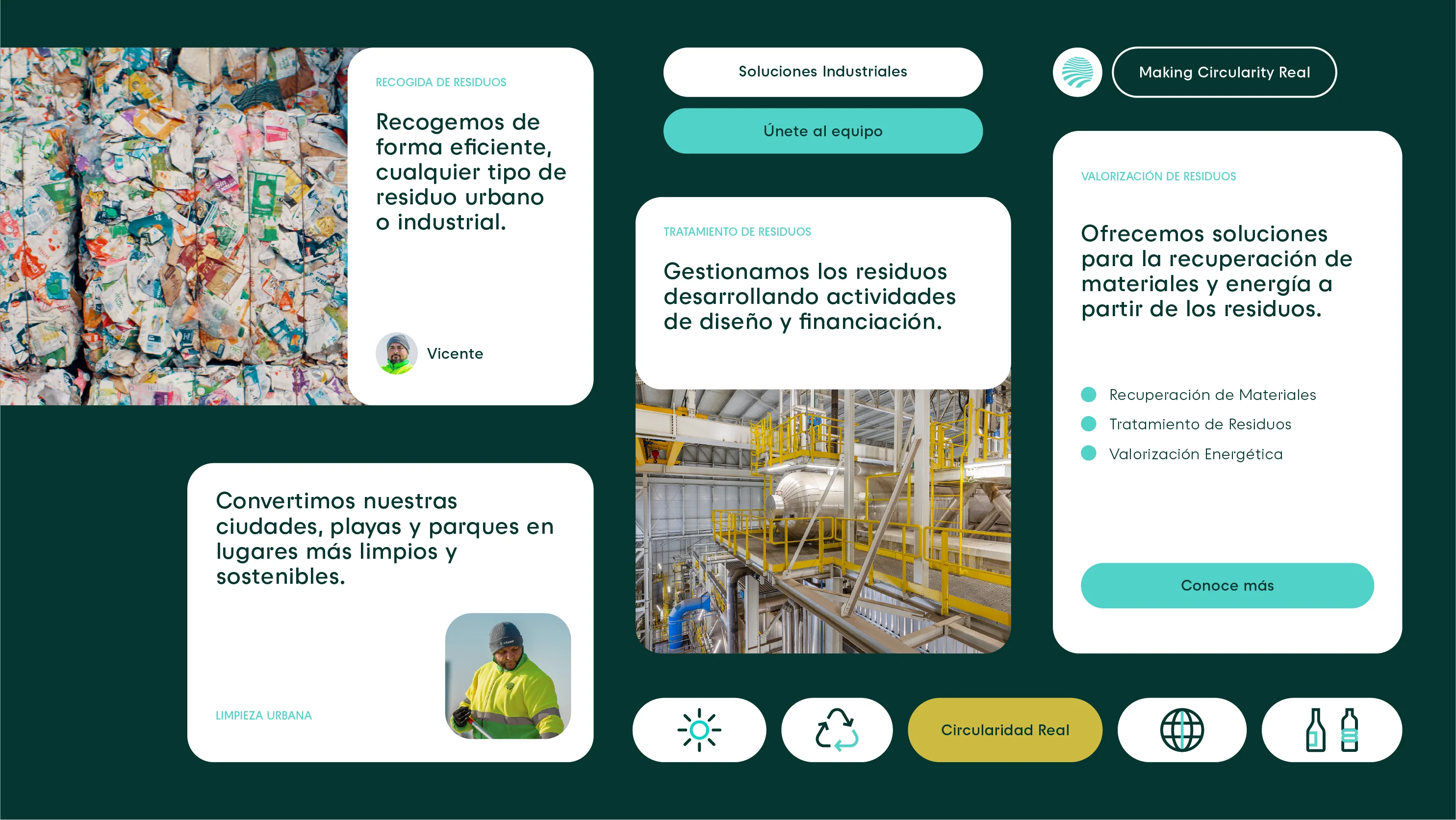
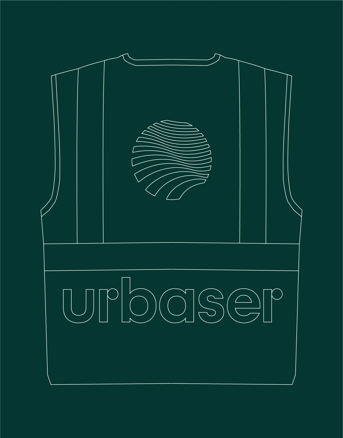
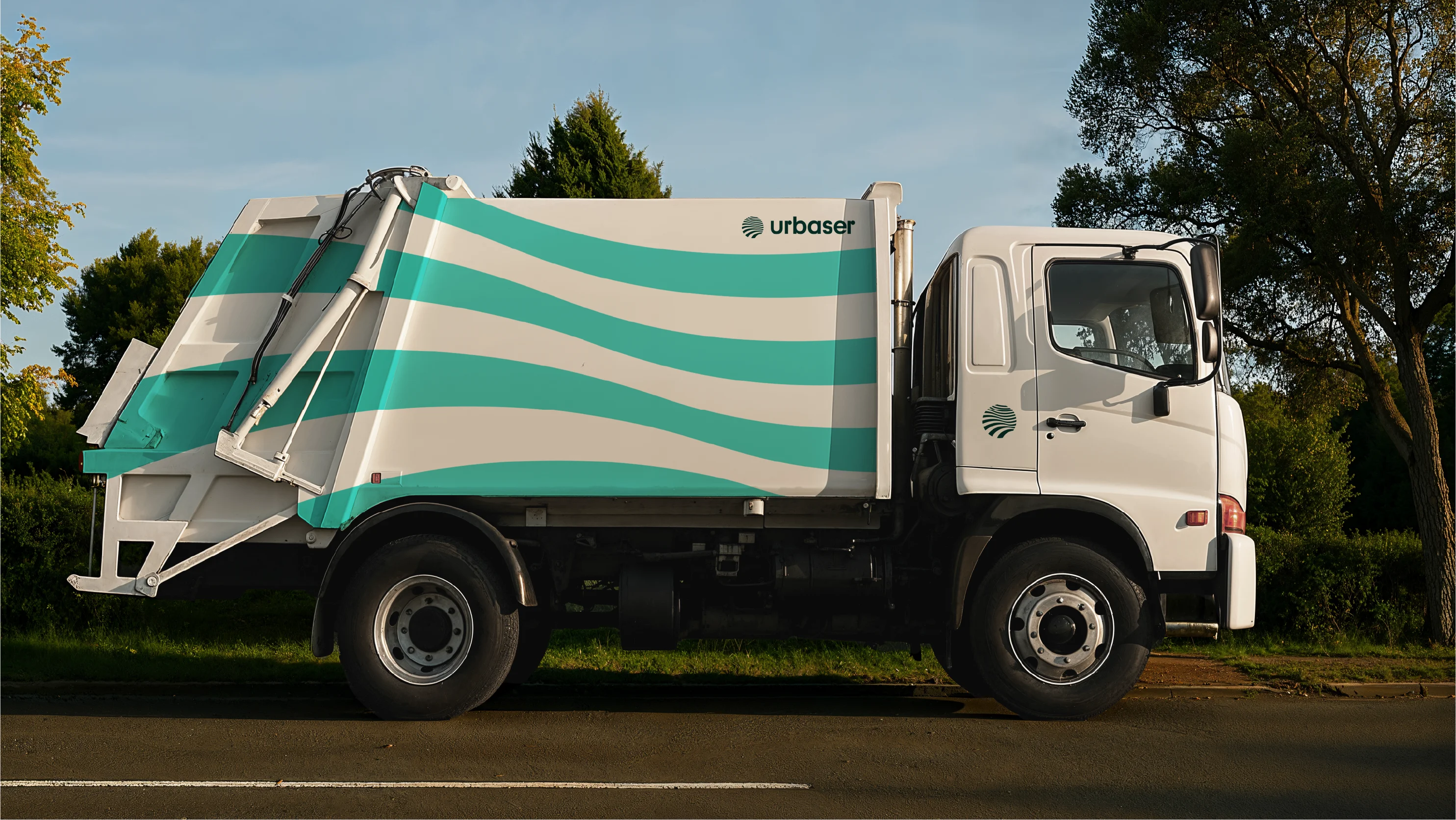
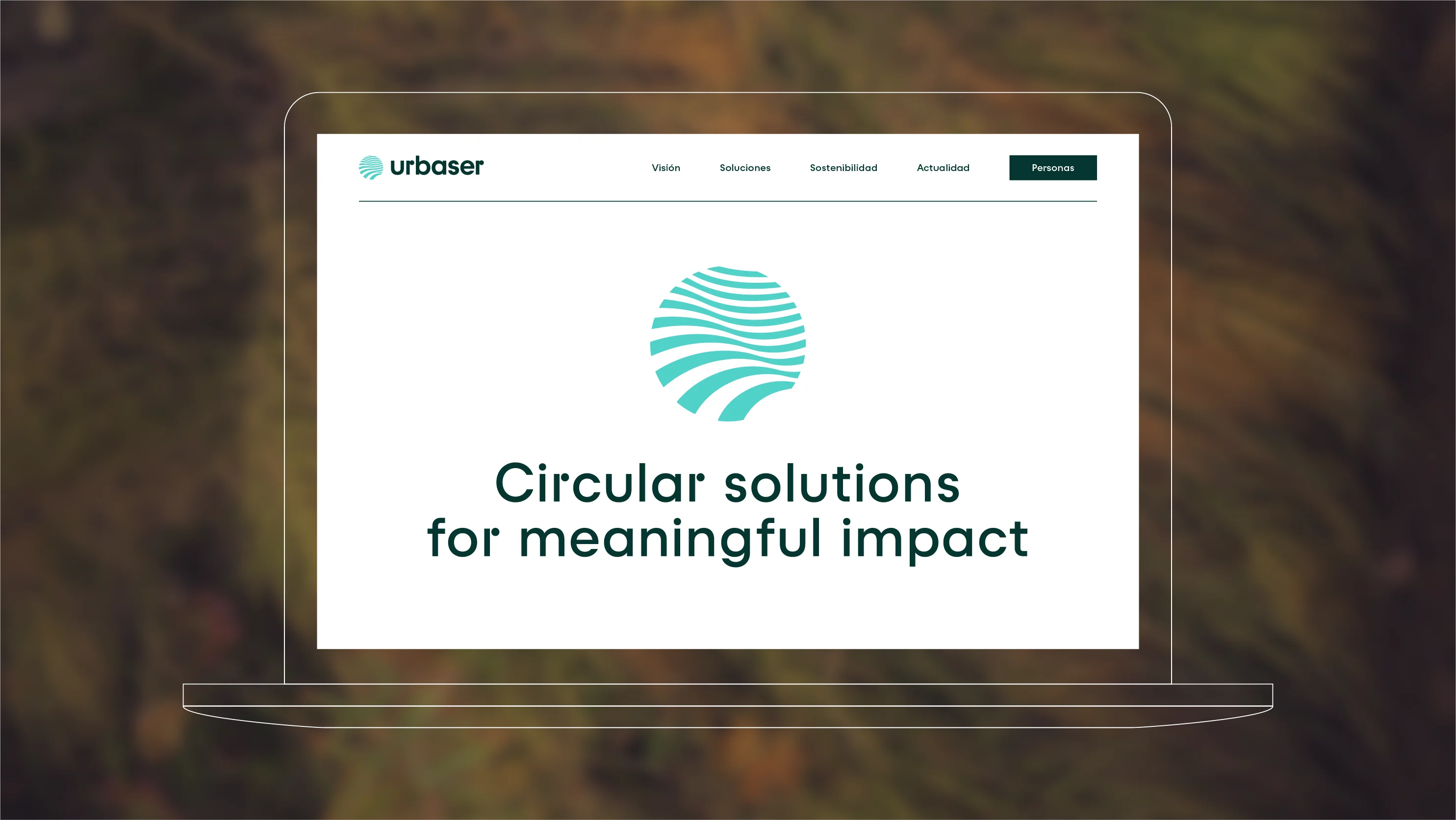
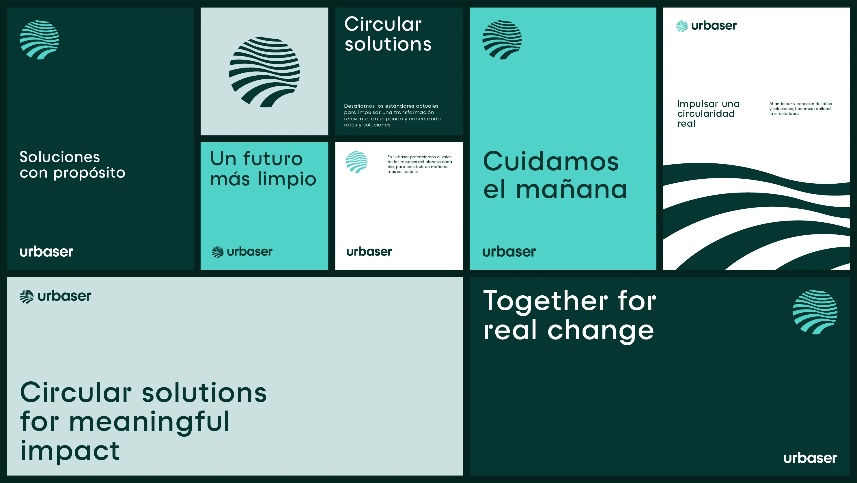
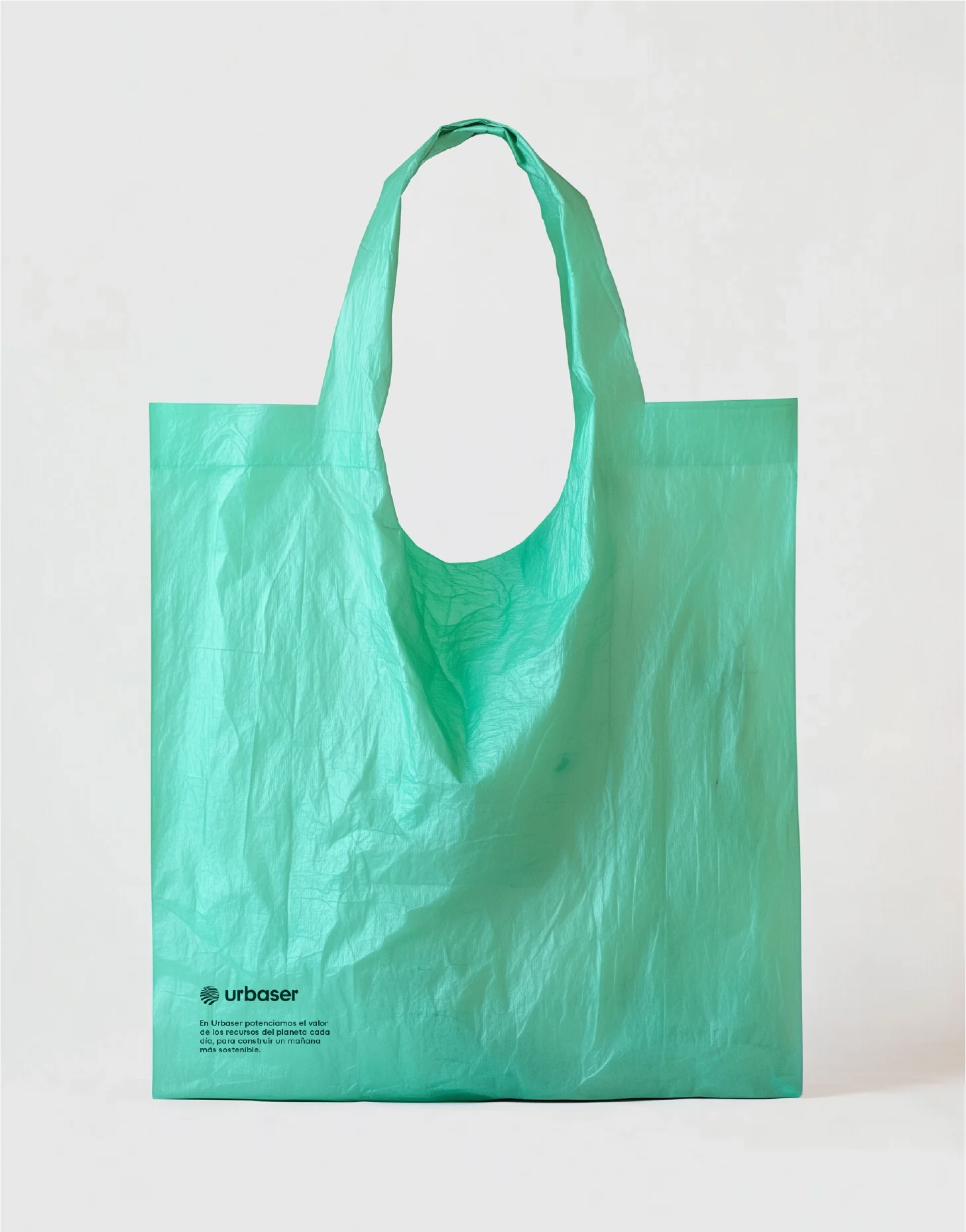
The evolved visual identity served as the meeting point between strategy and expression. Its symbol, inspired by the Earth, is more than just a shape: it embodies movement, action, and circularity. Its curved lines evoke nature’s infinite cycle and continuous regeneration.
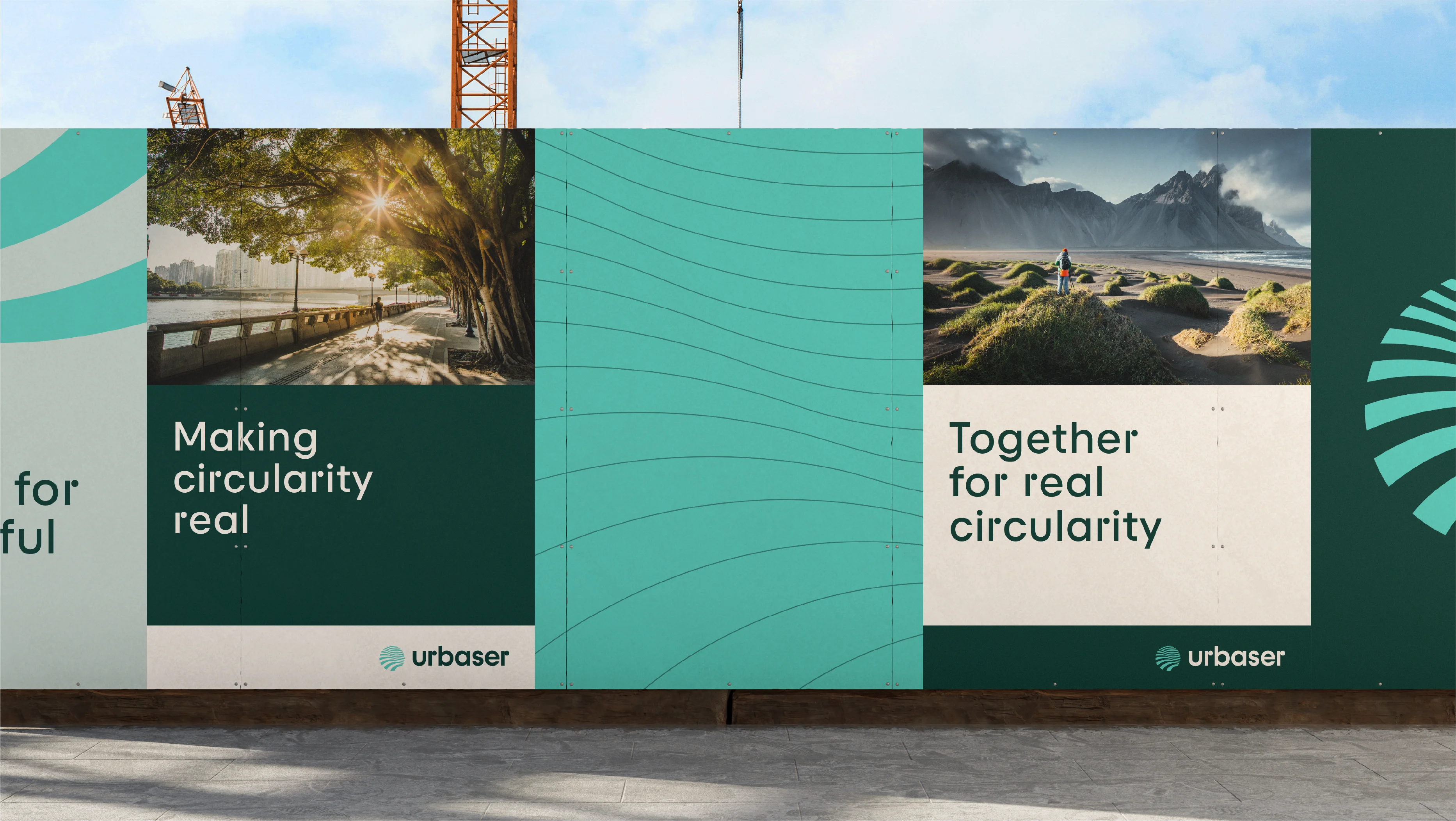
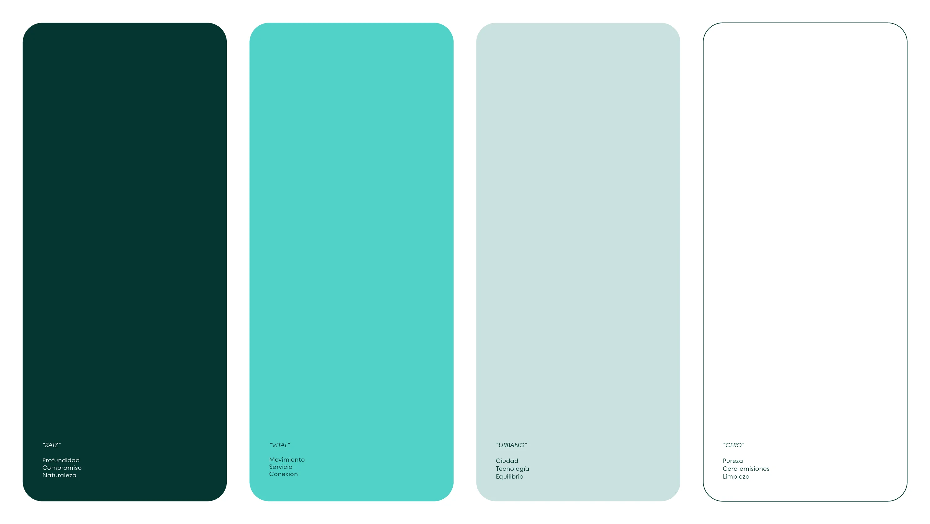
The colours reinforce the brand’s essence: green as a symbol of life and sustainability, and cyan, bringing freshness and dynamism, reflecting the company’s spirit of innovation. The Raptor V3 typeface, based on a geometric sans-serif design, balances precision and warmth, combining technical simplicity with rounded forms that convey accessibility and humanity.
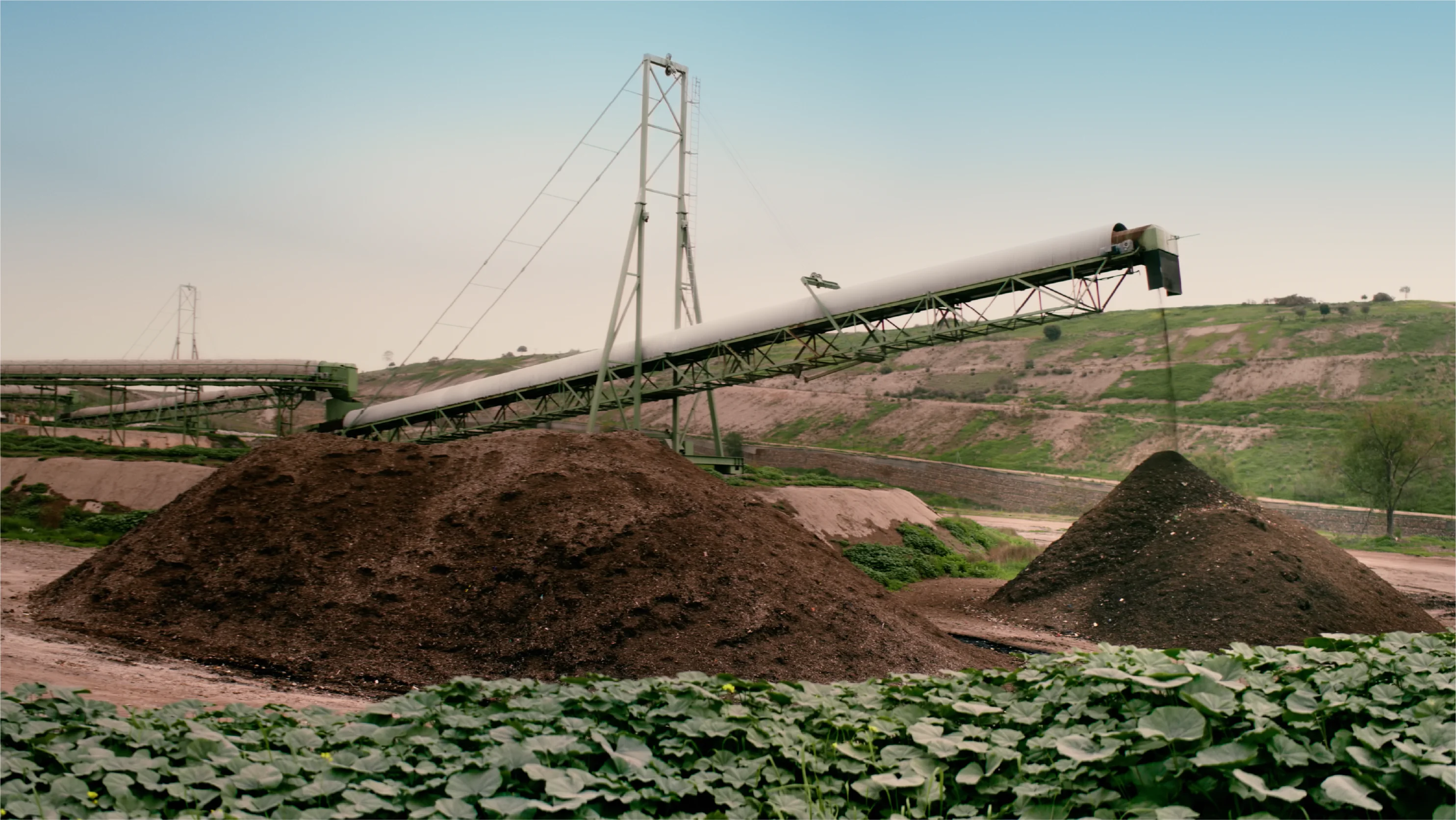
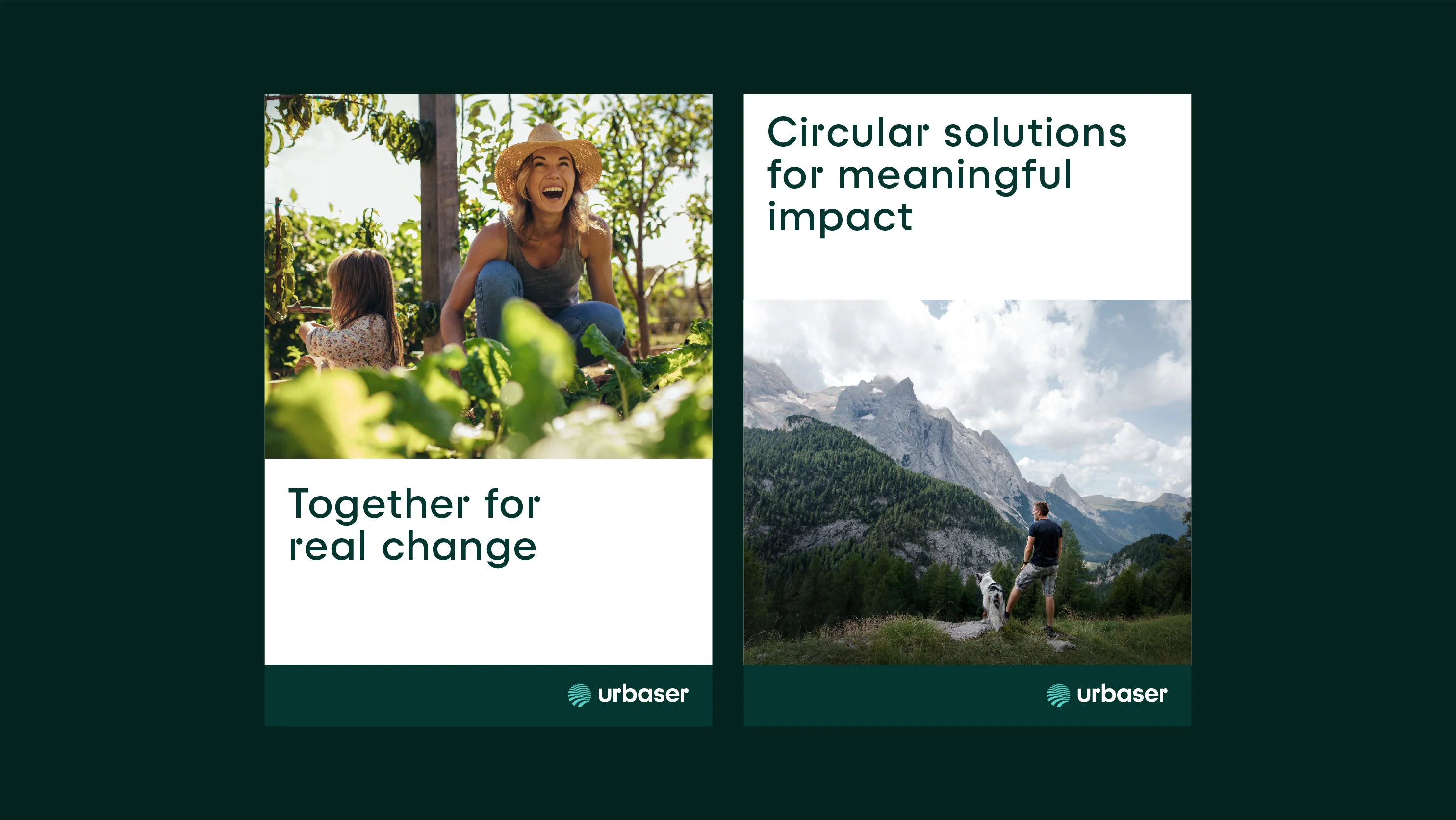
The photography bridges two worlds: nature and the city, telling a story of transformation and environmental responsibility. Each image reinforces Urbaser’s purpose: to care for the planet for future generations.
As a whole, this identity consolidates Urbaser’s commitment to sustainability and circularity, connecting its environmental solutions with an inspiring and tangible vision for the future.

Talent at the heart of transformation: Living our values
Throughout the rebranding process, employees have been positioned as a fundamental pillar of transformation and future growth. For this reason, BrandFor’s support also focused on developing an internal activation plan which, through the concept “Living our values”, demonstrates Urbaser’s ongoing commitment to its people, fostering a sense of belonging, identification, and pride, and enabling the team to embrace, embody, and champion the brand’s values from within.