
Truliving.
Live your stay. Lead your way
The accommodation model of the future: spaces that adapt to the way you live.
BrandFor Value Journey
Brand Diagnosis, Brand Strategy, Brand Architecture, Visual Identity, Verbal Identity, Naming
Sector
Short-term rental
As lifestyles continue to evolve towards greater flexibility and dynamism, Gmp, one of Spain’s leading real estate investment groups, takes a strategic step into an emerging category designed to respond to this new reality: flex living.
An accommodation model that combines short and mid-term stays, responding to growing professional mobility, remote working, the globalisation of talent and the arrival of students and expatriates in cities such as Madrid. Launched in September 2025, Truliving aims to lead and redefine the concept of a temporary home through an approach that combines quality, flexibility and community building.
Truliving, a new way to stay, at your pace, your way
Truliving represented a comprehensive brand creation project, built around the ambition of connecting with a contemporary, dynamic and tailored way of living, placing people at the centre of the experience.
The brand name Truliving is direct, honest and universal, while its strategic essence is articulated around a set of core values: flexibility, proximity, ease and superior value. A brand that adapts and responds to the needs of those looking for a place where they can feel at home, whatever stage of life they are in and for however long they stay.
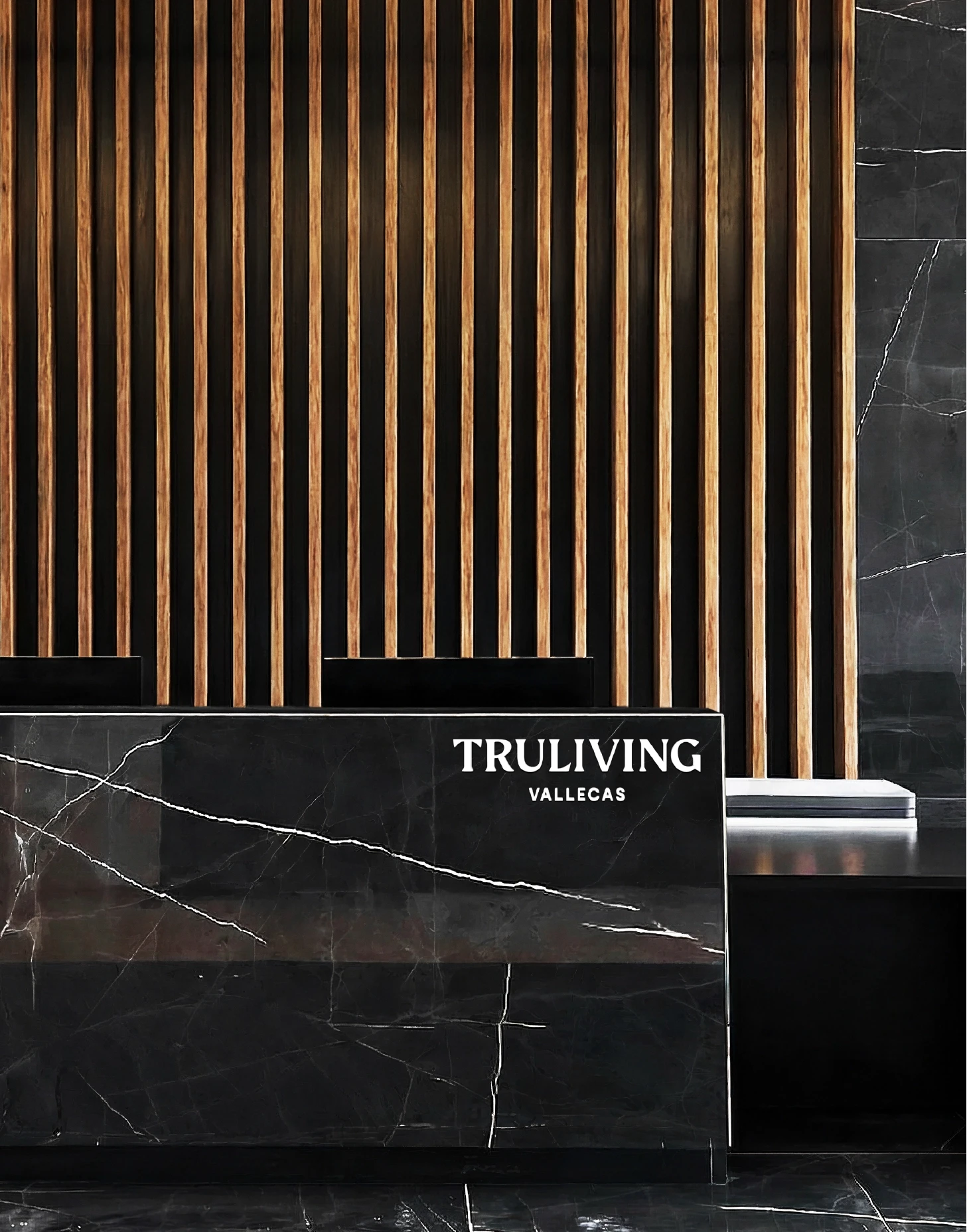
The starting point was a real experience: Truliving Vallecas, the brand’s first asset, with 285 residential units across 15,000 square metres in Madrid, a premium service offering and a Breeam Excellent certification. Behind it stood a clear ambition for growth: two new developments in Sanchinarro and Valdebebas, representing more than €140 million in investment and an additional 724 units. A brand that needed to live up to the scale of the project.
Spaces that adapt to people, not the other way around
Truliving’s brand idea, “Live your stay. Lead your way”, reflects the freedom to choose how you want to live, embodying the mindset of a new generation that values both quality and freedom of movement, without friction. As José Luis García de la Calle, COO of Gmp at the time of launch, explained: “We want to offer a superior and differentiated experience to those seeking an innovative alternative for their temporary accommodation needs”. Translating that commitment to quality and wellbeing through the brand identity became our primary objective.
A promise of freedom and autonomy, where every stay becomes a warm and human environment in which to feel at home, wherever you are.
When an object turns a space into a home
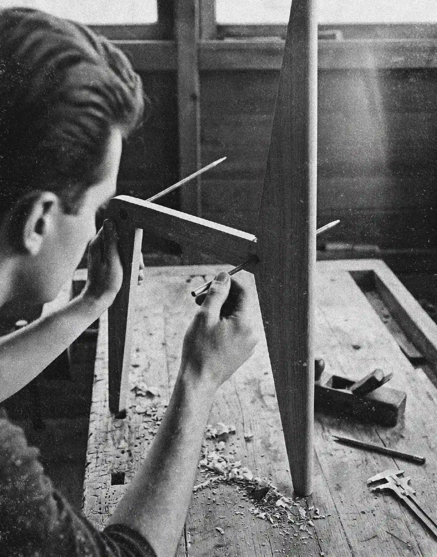
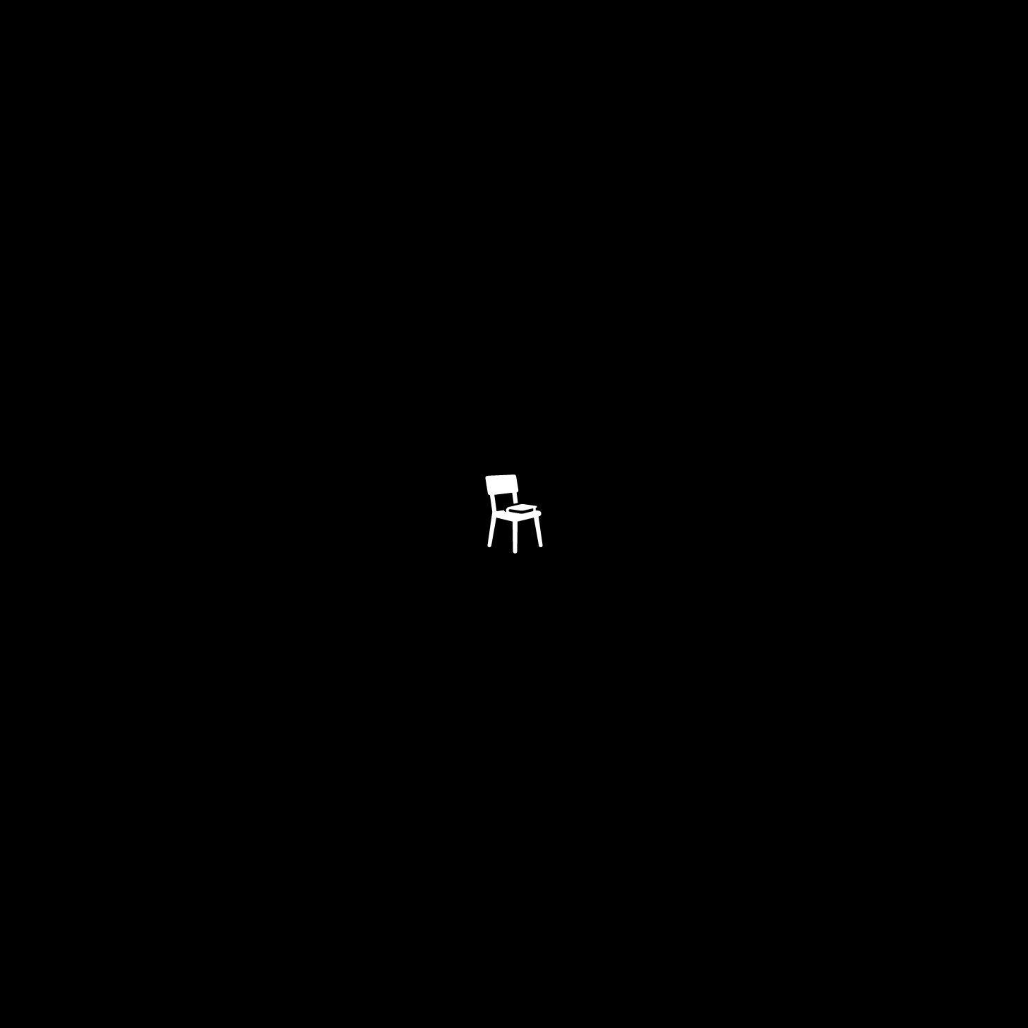
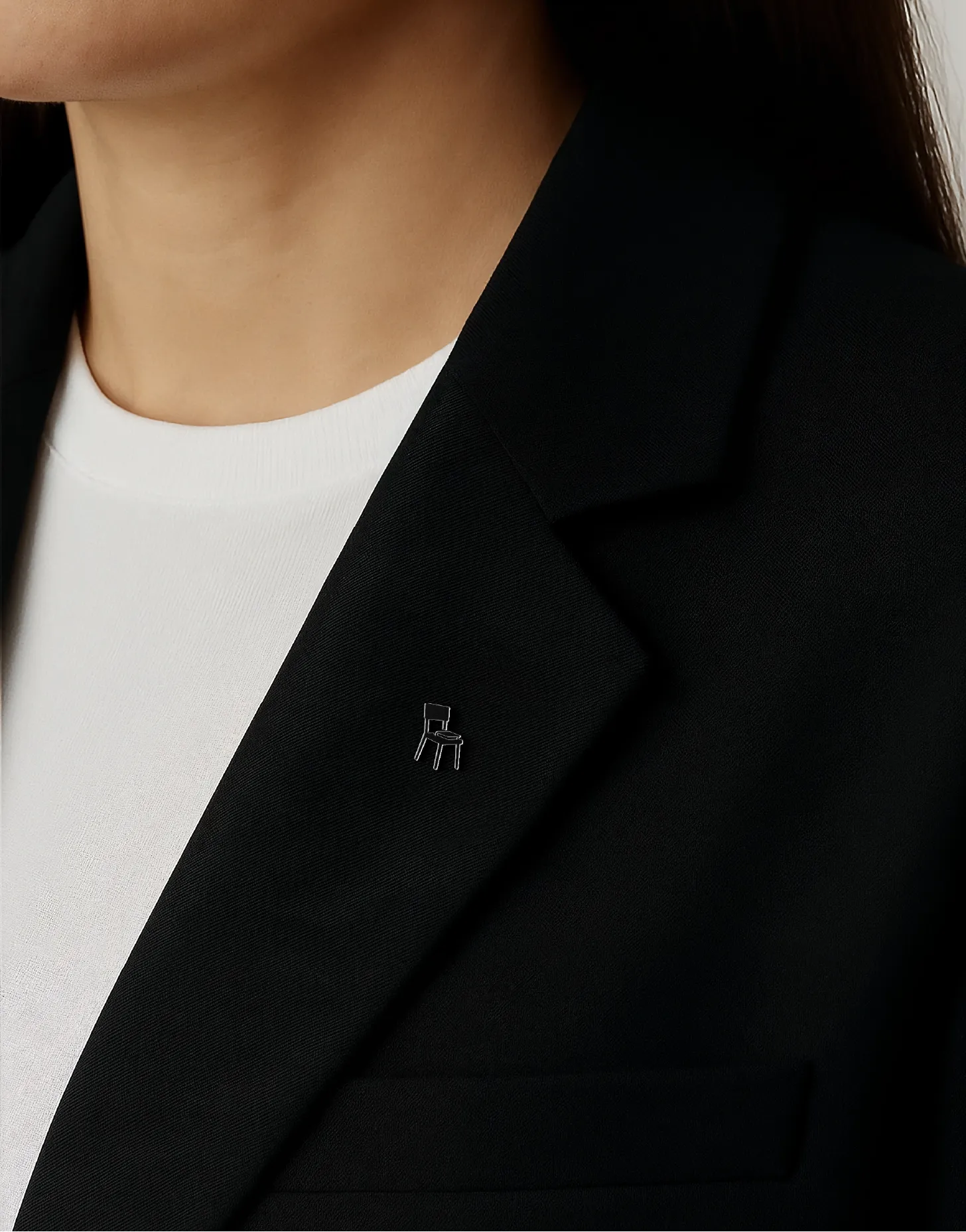
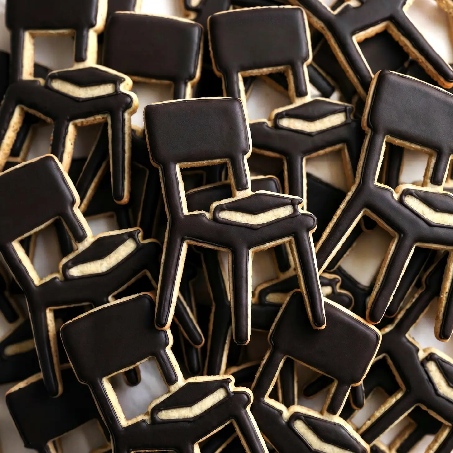
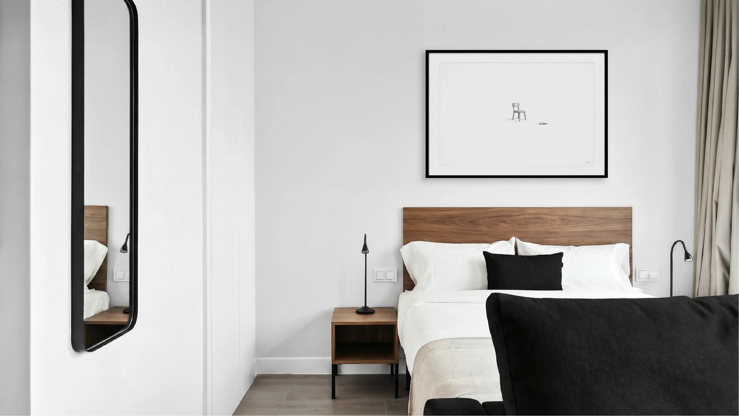
That sense of belonging needed to be translated into a symbol capable of humanising the space. The chair, inspired by the structural thinking and material honesty of Jean Prouvé’s Tout Bois chair, incorporates a book as a small gesture of human presence within the environment, an intimate and silent sign of life: someone has been there and made the place their own. The object is conceived almost as a habitable piece of architecture on a smaller scale: functional, essential and deeply human, breaking away from the feeling of a pre-staged rental environment.
Both the concept itself and the way the chair is used as a signature element transform what could have been a generic resource into a distinctive way of portraying the brand.
Silence can be an identity too
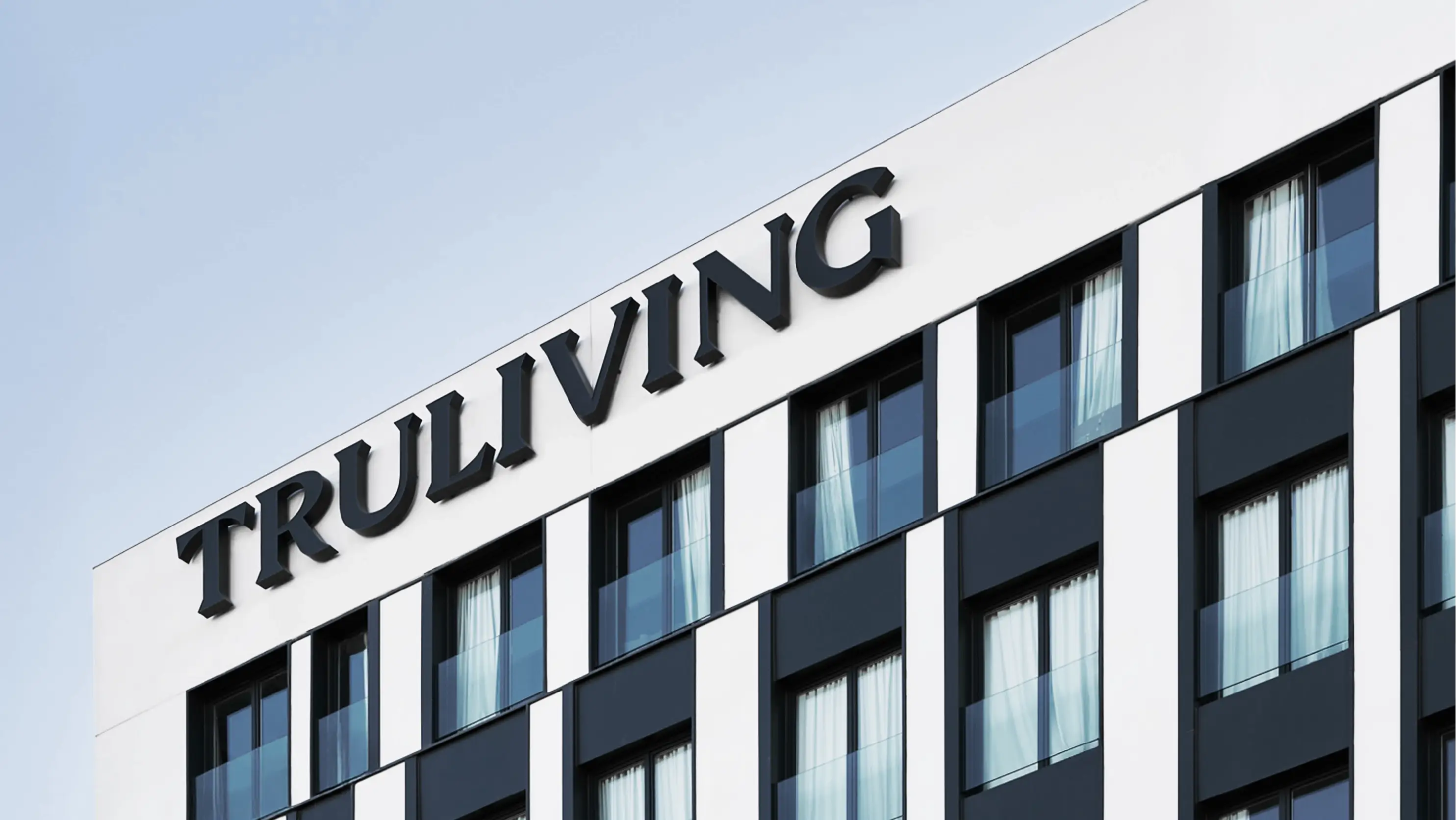
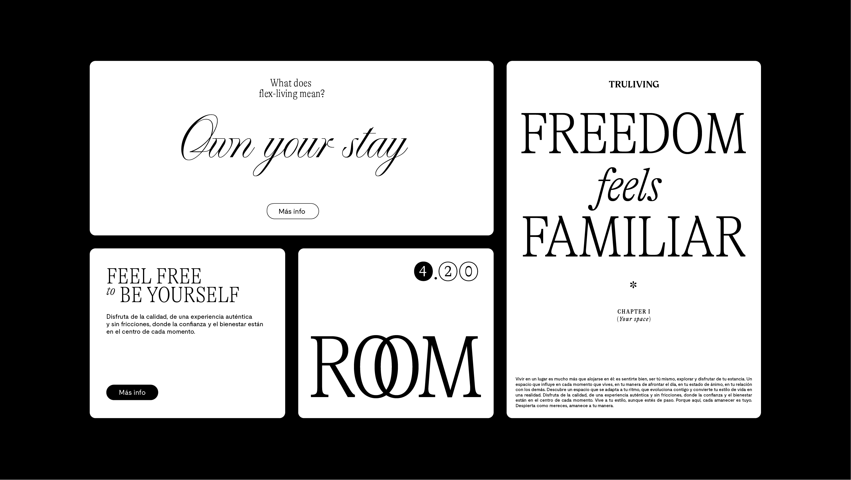
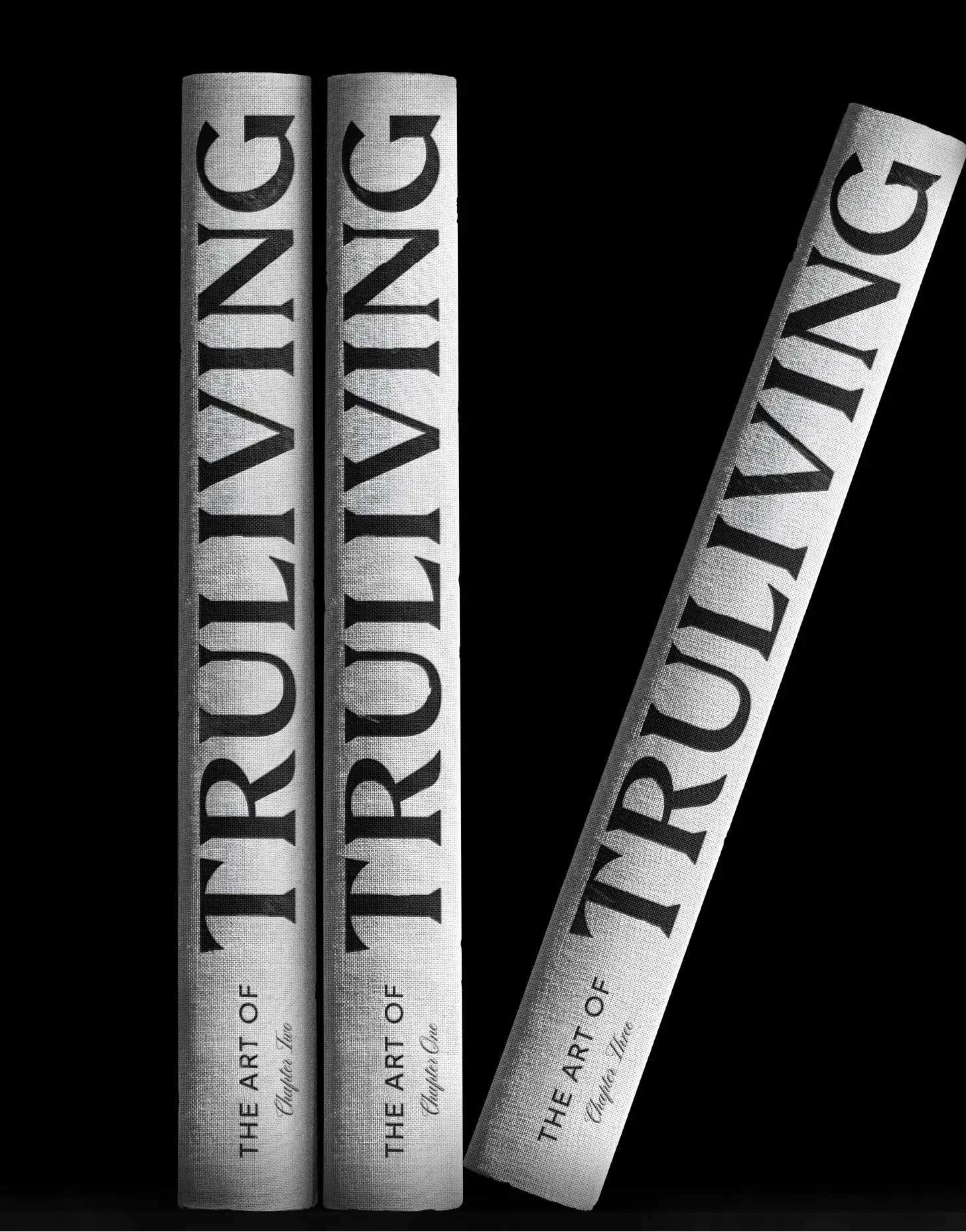
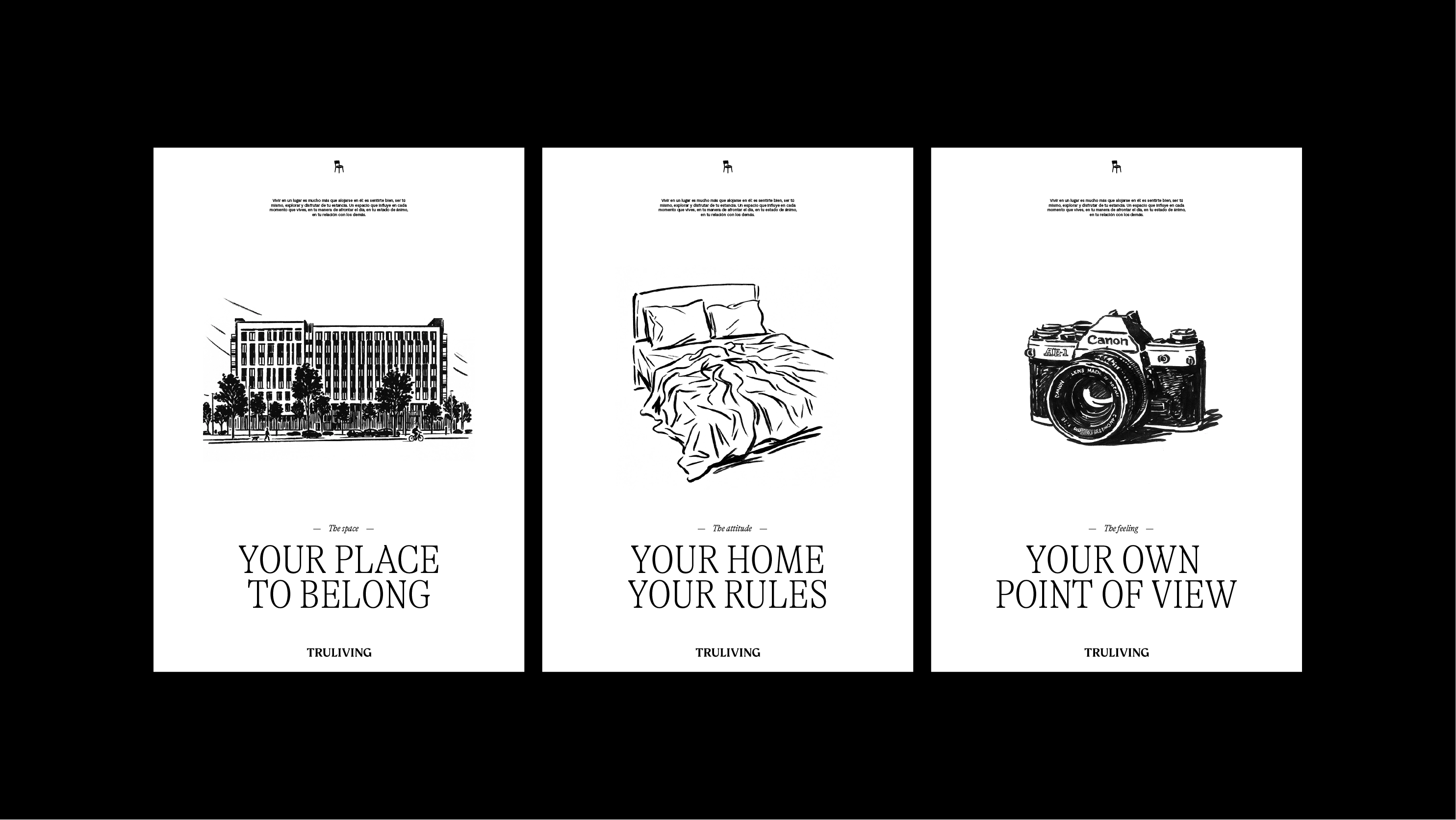
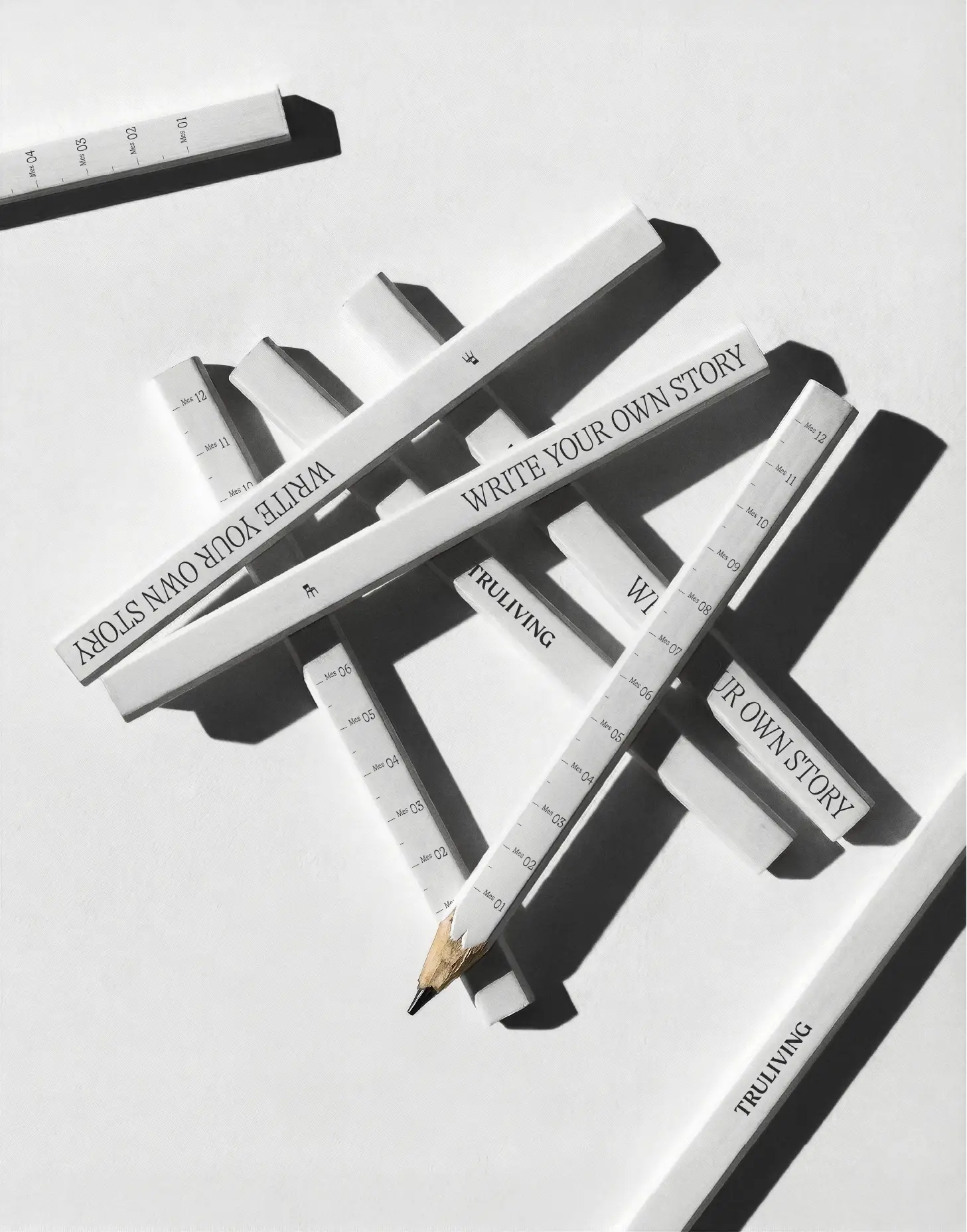
Truliving’s visual identity is built upon an editorial, literary and architectural aesthetic, deliberately distancing itself from the conventional codes of temporary rentals and moving closer to the language of premium hospitality, contemporary design and lifestyle publications.
The black and white system acts as the brand’s most institutional dimension: the structure that organises, guides and brings coherence to the experience. The visual expression combines editorial typography with compositions rich in negative space, projecting a personality that is inspiring, decisive, empathetic and confident.
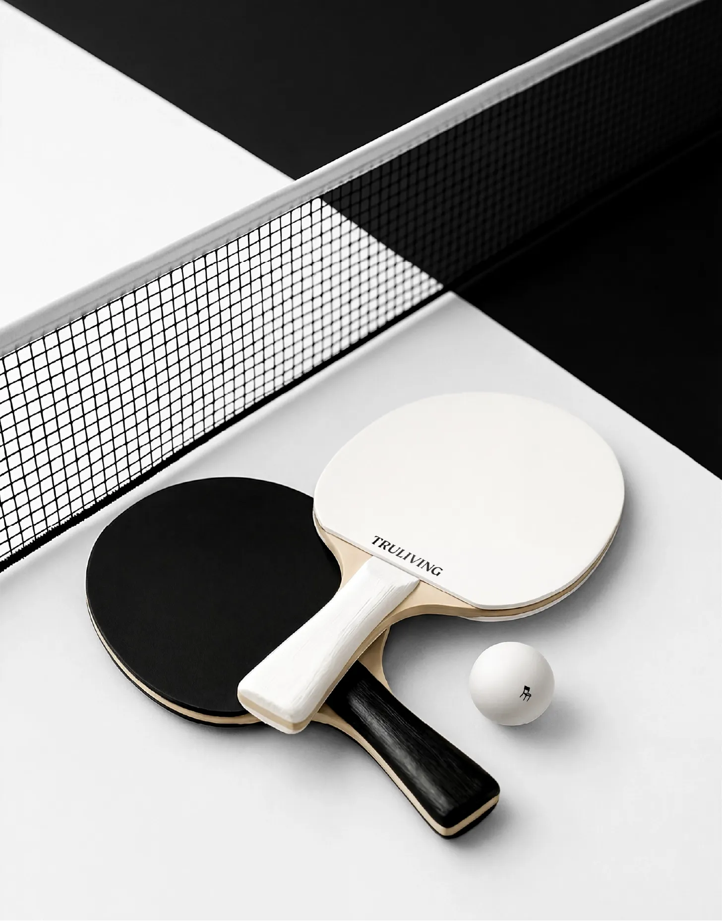
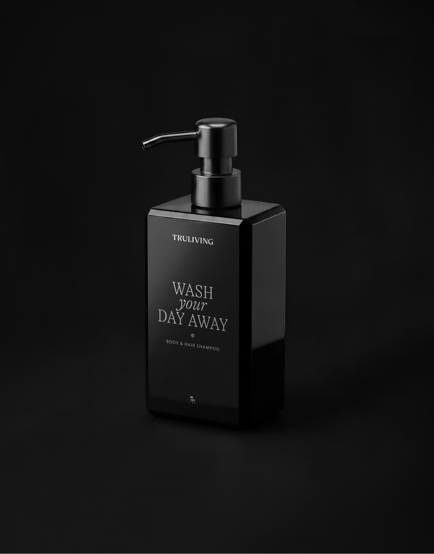
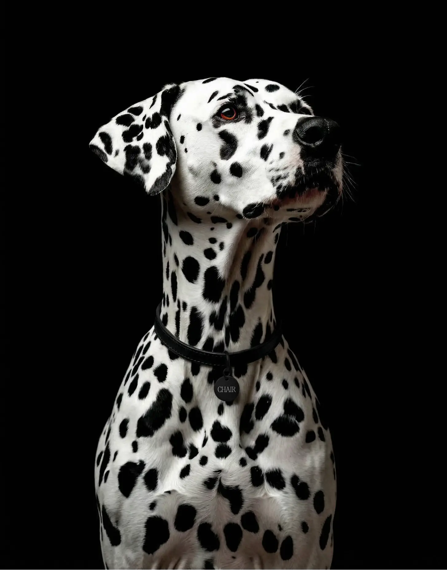
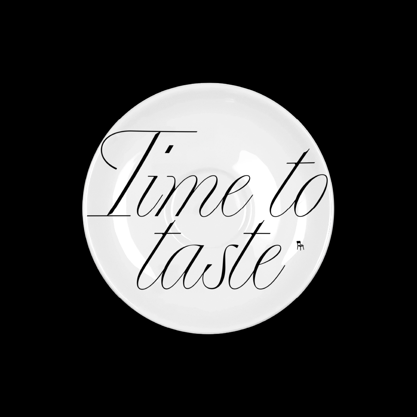
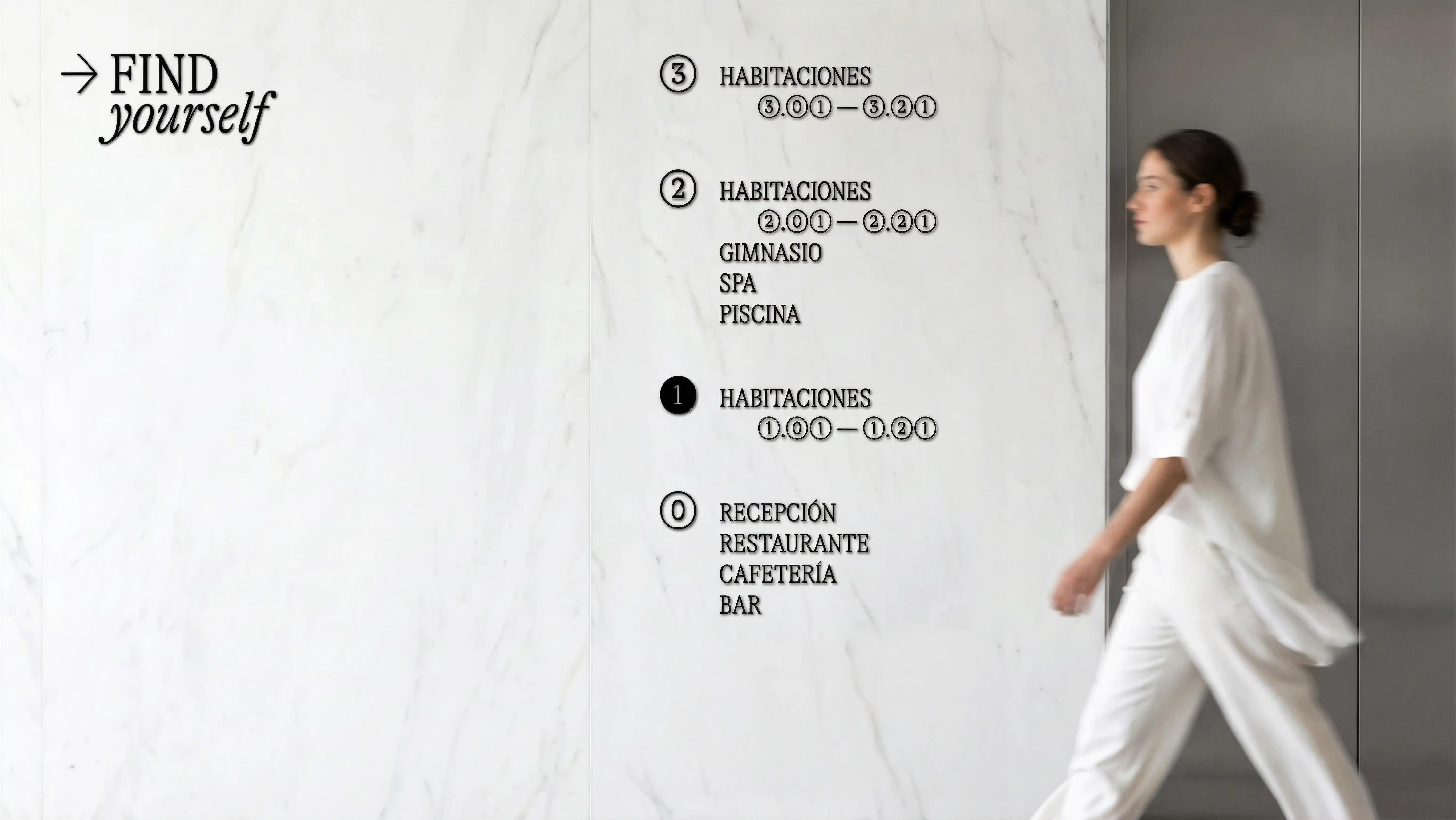
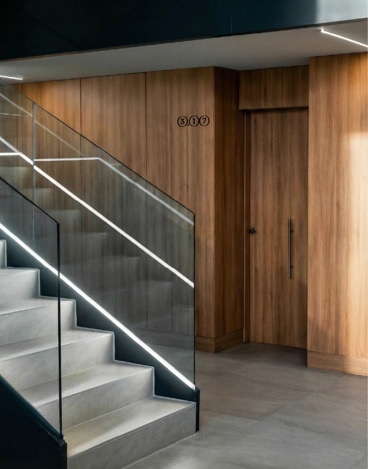
The chair, now established as a recognisable signature within the system, appears throughout as a symbol of belonging and human presence. Even the smallest details (a pin, a soap, a typographic composition or a wayfinding sign) are approached through the same principle: transforming functional elements into gestures of identity.
Temporary spaces. Personal stories
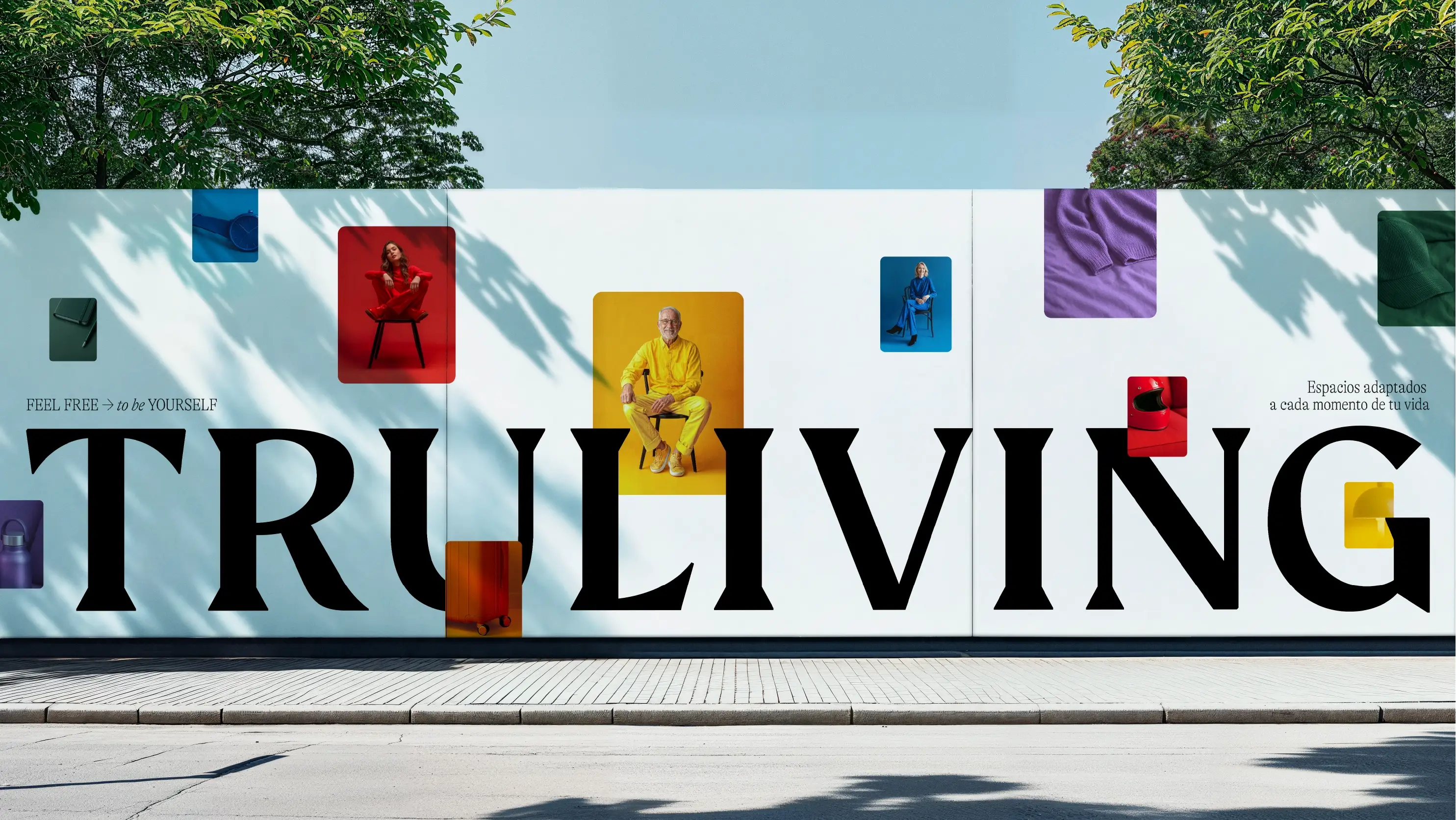
If the black and white system represents the more structural dimension of Truliving, colour introduces what truly activates the space: people and their stories.
Here, the identity evolves into a more emotional and spontaneous expression, designed to coexist with a young and international audience that understands spaces not only as places to stay, but also as settings for identity, community and self-expression. For this reason, the universality of the visual language was essential: simple, recognisable and emotionally shared concepts capable of transcending different cultural contexts without losing their distinctiveness.
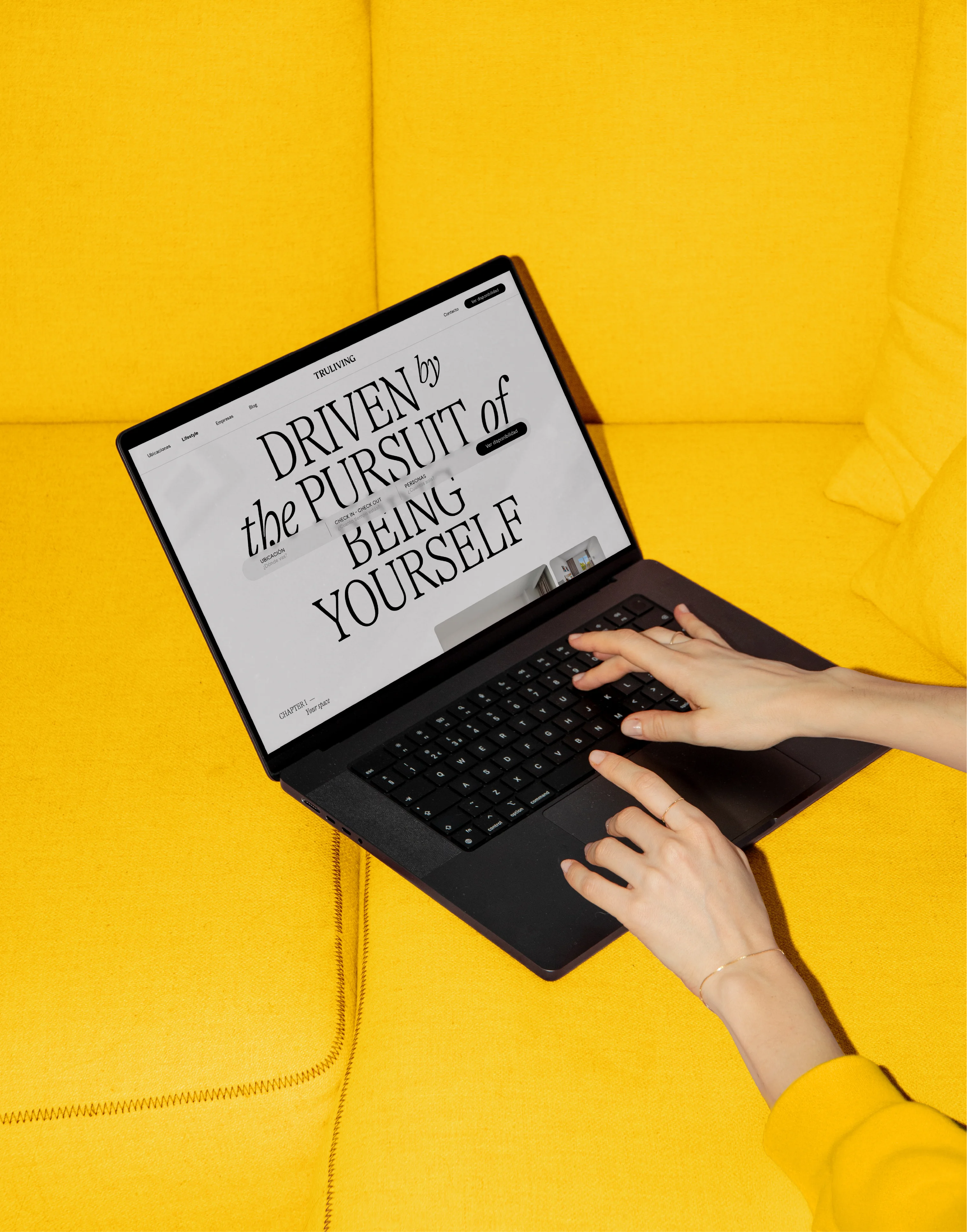
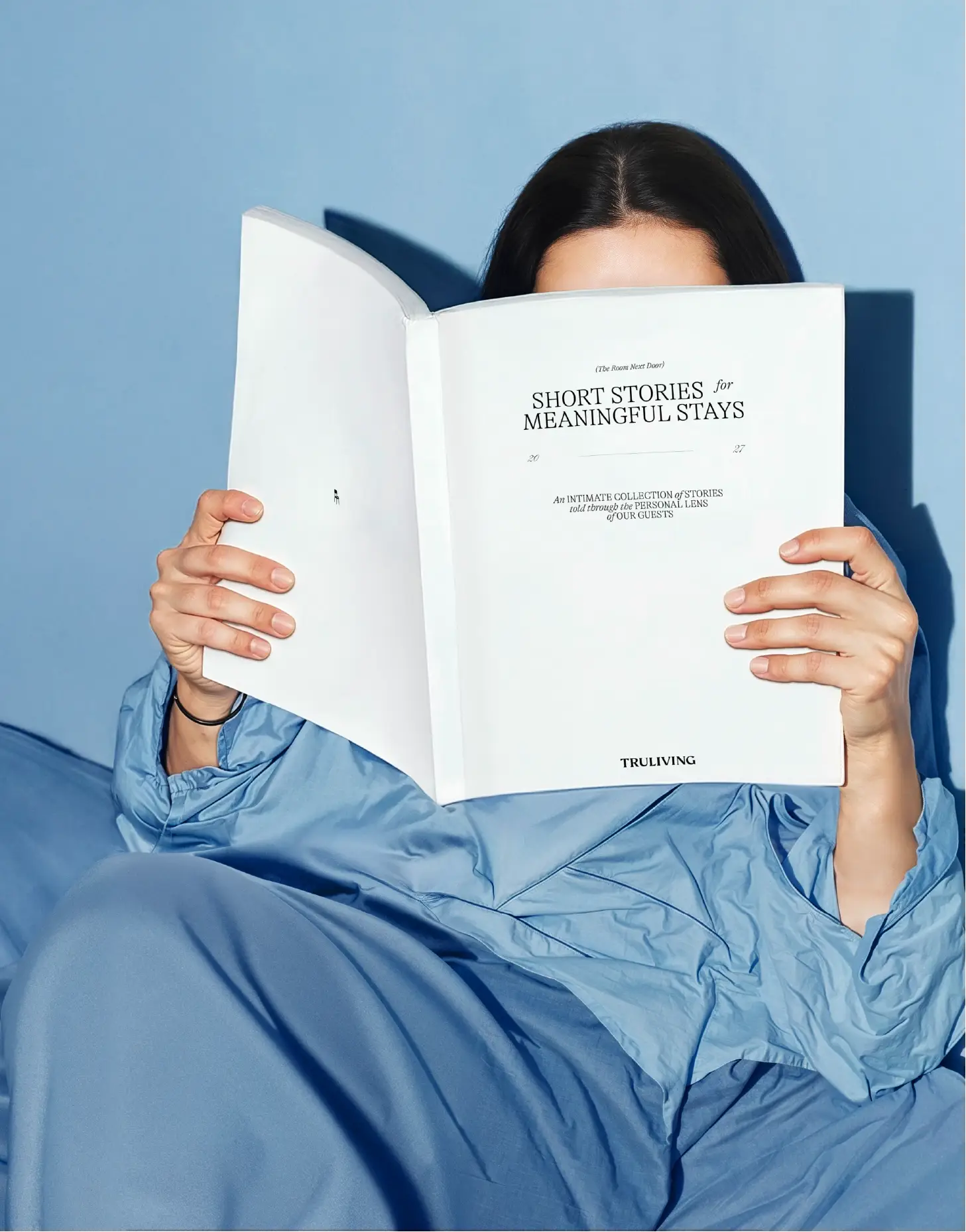
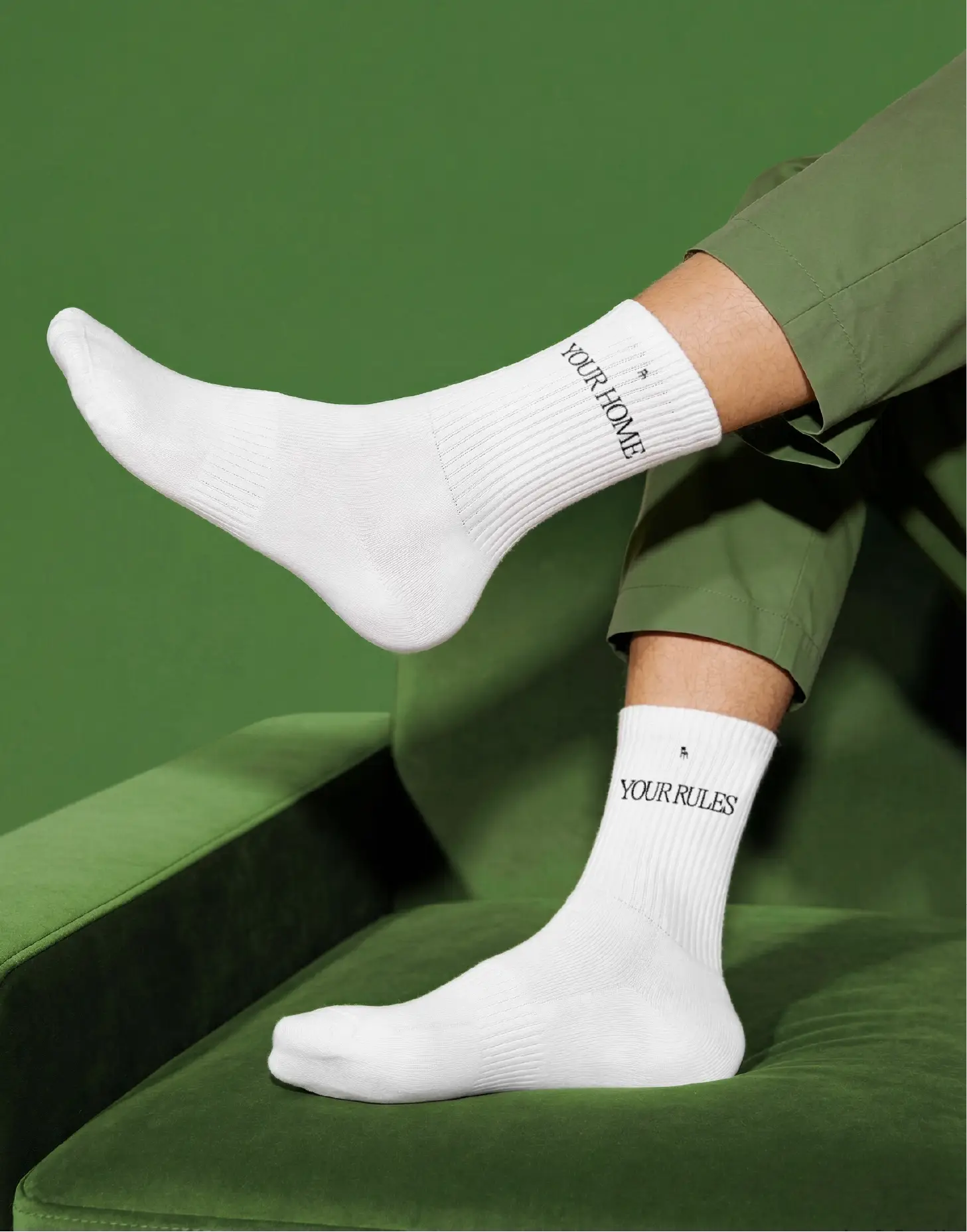
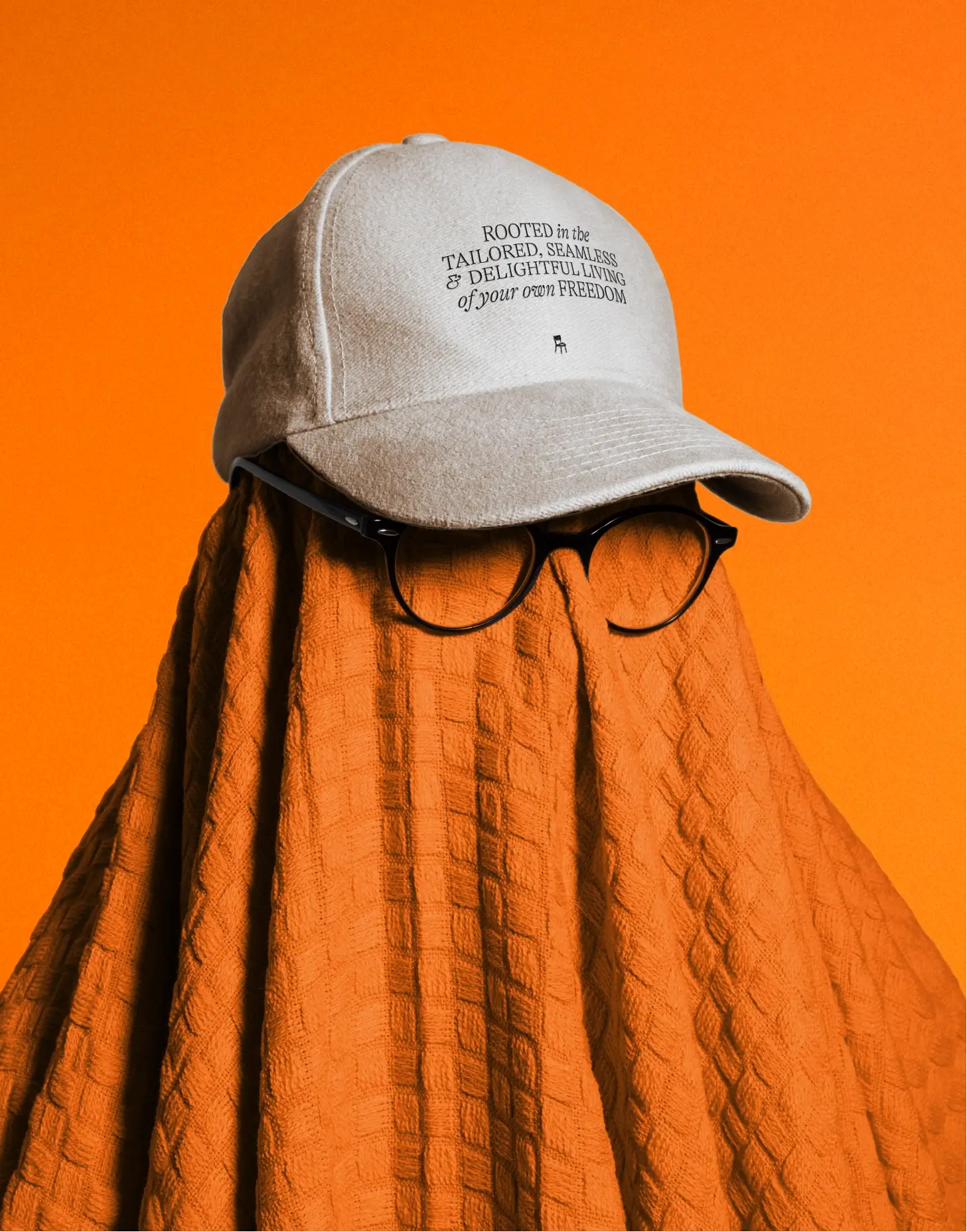
In contrast to the architectural restraint of the core system, colour brings energy, appropriation and personality. Everyday objects, domestic scenes and small personal rituals transform a temporary stay into a more human and emotional experience.
The chair acquires a new meaning here, moving beyond its role as a symbol of identity to become a living and participatory element within the experience itself.
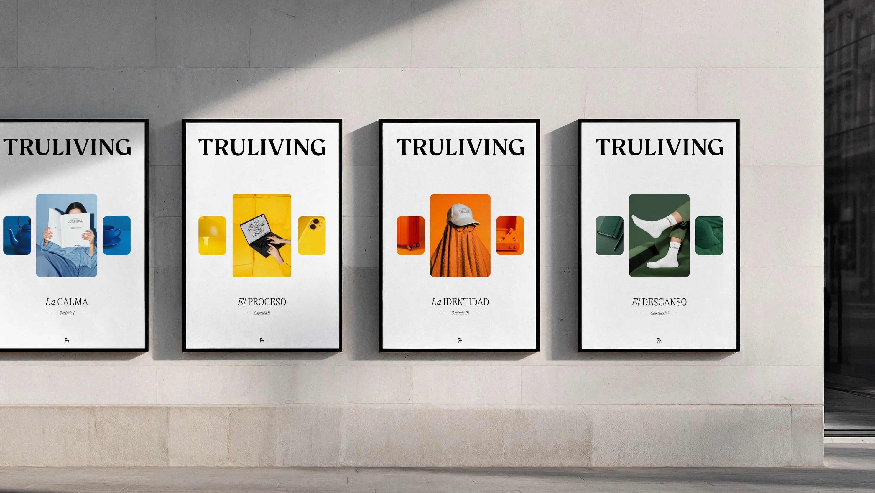
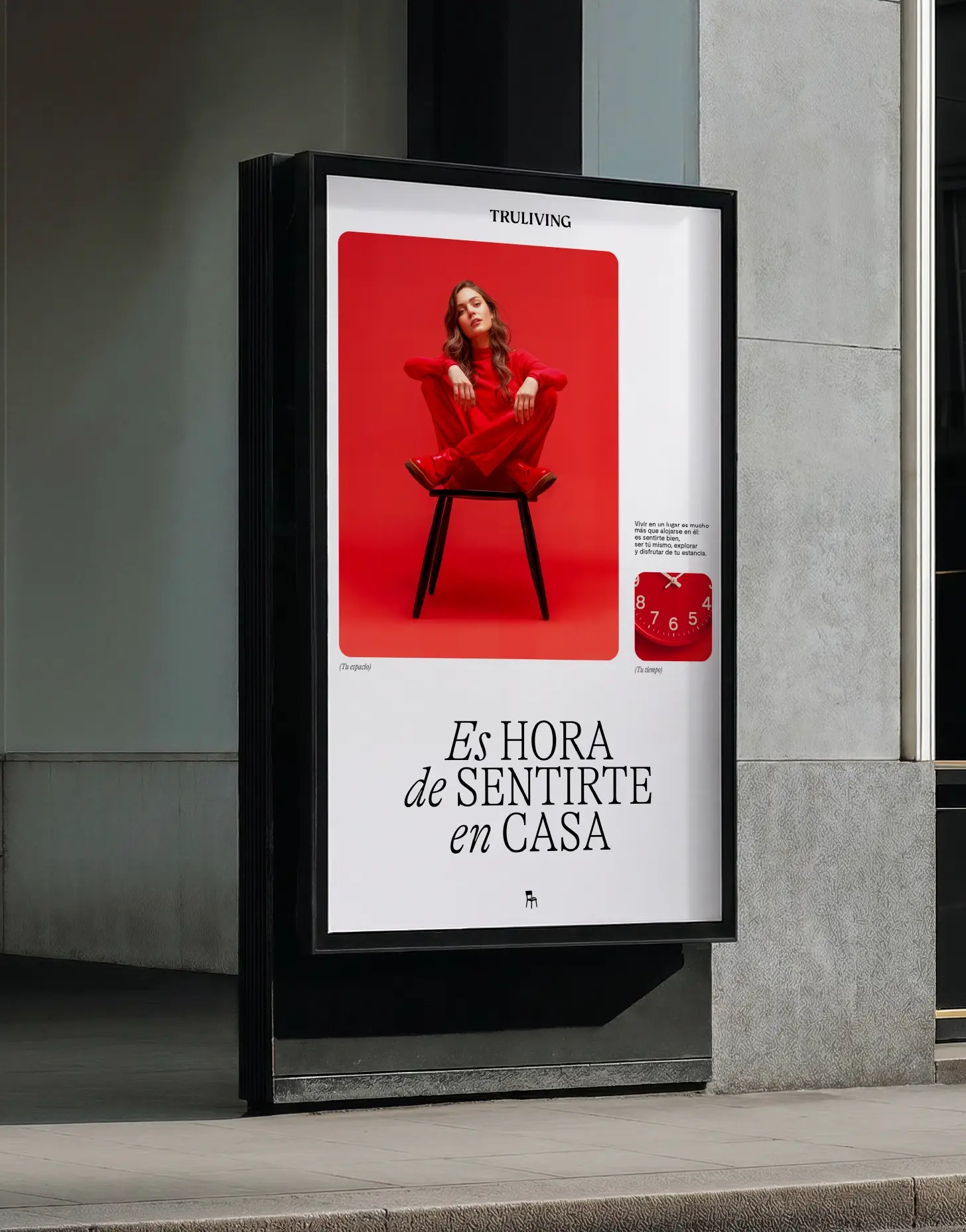
Because belonging is not determined by how long you stay in a place, but by how that place makes you feel. Truliving proposes a new way of temporary living: freer, more human and deeply connected to people.